CSS column-fill Property
Use CSS column-fill property to specify whether the columns will be filled in a balanced manner or not. Property Values: balance. Try examples.
The column-fill property controls how content is distributed across the columns of a multi-column layout — either spread evenly across all columns, or poured sequentially into one column at a time.
It is one of the CSS3 properties and works together with column-count and columns to build newspaper-style layouts.
When to use it
column-fill only has a visible effect when the multi-column container has a fixed height (for example height: 200px). Without a height limit the browser has no reason to stop filling a column, so both values look identical.
There are two meaningful values:
balance(the default) tries to make every column roughly the same length, so the block of columns looks even and the content ends at about the same line in each. This is what you usually want for readable, newspaper-like text.autofills the first column to the container's full height, then moves to the next, and so on. The last column may be much shorter than the rest. Use it when the visual order of columns matters more than balance.
| Initial Value | balance |
|---|---|
| Applies to | Multicol elements. |
| Inherited | No. |
| Animatable | No. |
| Version | CSS3 |
| DOM Syntax | object.style.columnFill = "balance"; |
Syntax
column-fill: auto | balance | balance-all | initial | inherit;Example of the column-fill property with the balance value
<!DOCTYPE html>
<html>
  <head>
    <title>Title of the document</title>
    <style>
      .balance {
        column-count: 4;
        column-rule: 1px solid black;
        column-fill: balance;
      }
    </style>
  </head>
  <body>
    <h1>Column-fill property example</h1>
    <p class="balance">
      This is a bunch of text split into multiple columns. The CSS column-fill property is used to spread the contents evenly across all the columns. Lorem ipsum dolor sit amet, consectetur adipiscing elit. Sed do eiusmod tempor incididunt ut labore et dolore magna aliqua. Ut enim ad minim veniam, quis nostrud exercitation ullamco laboris nisi ut aliquip ex ea commodo consequat. Duis aute irure dolor in reprehenderit in voluptate velit esse cillum dolore eu fugiat nulla pariatur. Excepteur sint occaecat cupidatat non proident, sunt in culpa qui officia deserunt mollit anim id est laborum.
    </p>
  </body>
</html>Result
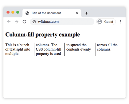
With balance, the text is distributed so that all four columns end at roughly the same height.
Example of the column-fill property with the auto value
<!DOCTYPE html>
<html>
  <head>
    <title>Title of the document</title>
    <style>
      .auto {
        height: 200px;
        column-count: 3;
        column-rule: 1px solid black;
        column-fill: auto;
      }
    </style>
  </head>
  <body>
    <h1>Column-fill property example</h1>
    <p class="auto">
      This is a bunch of text split into multiple columns. The CSS column-fill property is used to fill columns sequentially. Lorem ipsum dolor sit amet, consectetur adipiscing elit. Sed do eiusmod tempor incididunt ut labore et dolore magna aliqua. Ut enim ad minim veniam, quis nostrud exercitation ullamco laboris nisi ut aliquip ex ea commodo consequat. Duis aute irure dolor in reprehenderit in voluptate velit esse cillum dolore eu fugiat nulla pariatur. Excepteur sint occaecat cupidatat non proident, sunt in culpa qui officia deserunt mollit anim id est laborum.
    </p>
  </body>
</html>Here the container has a fixed height: 200px. With auto, the first column fills to that height before any text flows into the next, so the later columns may be shorter — or empty if the text runs out.
Values
| Value | Description |
|---|---|
| auto | Sequentially fills the columns. |
| balance | Equally divides the content between columns. In paged media, only the last page is balanced. |
| balance-all | Equally divides the content between columns. In paged media, all pages are balanced. |
| initial | Sets the property to its default value. |
| inherit | Inherits the property from its parent element. |
Browser support
column-fill is supported in all modern browsers. Note that balance-all has limited support, and in many engines auto behaves like balance unless the multi-column container is fragmented (for example, paginated or given a fixed height).
Related properties
column-count— set how many columns to create.columns— shorthand forcolumn-widthandcolumn-count.column-rule— draw a line between columns.