CSS order property
Use the order CSS property for specifying the order of an element inside a flexible container. See property values and try examples.
The order property controls the position of a flex item or grid item along its track, letting you change the visual order of items without changing their order in the HTML. It is part of the Flexible Box Layout module and is one of the CSS3 properties.
By default every item has order: 0, so items appear in source order. Items are laid out by ascending order value; items with the same order keep their source order relative to one another. This makes order useful for tasks like moving a sidebar before the main content on wide screens, or reordering cards inside a flexbox or CSS Grid layout, while leaving the markup unchanged.
order only affects direct children of a flex or grid container. If the element is not a flex item or grid item, order has no effect.
How values work
order accepts any integer, including negative values:
- An item with a lower
ordercomes first; a higherordercomes later. - Because the initial value is
0, setting one item to-1is a quick way to move it before all the others. - Items that share the same
ordervalue fall back to their DOM order, so you usually only need to setorderon the few items you want to move.
.first  { order: -1; } /* moves before all default (0) items */
.middle { order:  0; } /* default, can be omitted */
.last { order: 1; } /* moves after all default items */Accessibility concerns
order creates a disconnection between the content's visual display and its DOM order. Visual reordering does not change the DOM, so it does not change reading order for screen readers or tab order for keyboard users. Someone tabbing through the page or using a screen reader will follow the original source order, not the reordered layout — which can be confusing if the two differ significantly. Keep the DOM in a logical reading order and use order only for presentational tweaks.
| Initial Value | 0 |
|---|---|
| Applies to | Flex items and grid items. |
| Inherited | No. |
| Animatable | No. The order property is discrete and not animatable. |
| Version | CSS3 |
| DOM Syntax | Object.style.order = "4"; |
Syntax
CSS order syntax
order: number | initial | inherit;Example of the order property:
CSS order code example
<!DOCTYPE html>
<html>
  <head>
    <title>Title of the document</title>
    <style>
      #example {
        width: 400px;
        height: 200px;
        border: 1px solid #000;
        display: flex;
      }
      #example div {
        width: 100px;
        height: 100px;
        line-height: 100px;
        text-align: center;
        color: #fff;
        font-size: 30px;
        font-family: sans-serif;
      }
      div#blue {
        order: 2;
      }
      div#green {
        order: 3;
      }
      div#grey {
        order: 1;
      }
      div#yellow {
        order: 4;
      }
    </style>
  </head>
  <body>
    <h2>Order property example</h2>
    <div id="example">
      <div style="background-color: #1c87c9;" id="blue">1</div>
      <div style="background-color: #8ebf42;" id="green">2</div>
      <div style="background-color: #666;" id="grey">3</div>
      <div style="background-color: #f4f442;" id="yellow">4</div>
    </div>
  </body>
</html>Result
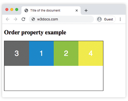
Example of the order property applied to the container class:
CSS order flexbox example
<!DOCTYPE html>
<html>
  <head>
    <title>Title of the document</title>
    <style>
      .container {
        padding: 0;
        margin: 0;
        list-style: none;
        display: flex;
        flex-flow: row wrap;
      }
      .box:nth-of-type(1) {
        order: 4;
      }
      .box:nth-of-type(2) {
        order: 1;
      }
      .box:nth-of-type(3) {
        order: 3;
      }
      .box:nth-of-type(4) {
        order: 5;
      }
      .box:nth-of-type(5) {
        order: 2;
      }
      .box {
        background: #1c87c9;
        padding: 5px;
        width: 100px;
        height: 100px;
        margin: 5px;
        line-height: 100px;
        color: #eee;
        font-weight: bold;
        font-size: 2em;
        text-align: center;
      }
    </style>
  </head>
  <body>
    <h2>Order property</h2>
    <ul class="container">
      <li class="box">1</li>
      <li class="box">2</li>
      <li class="box">3</li>
      <li class="box">4</li>
      <li class="box">5</li>
    </ul>
  </body>
</html>In both examples the order property rearranges the items on screen while the HTML stays in its original sequence — each item is simply assigned the number that places it where you want.
order is one of several flexbox alignment tools. Combine it with flex-direction to set the main axis, justify-content to space items along that axis, and align-items to align them on the cross axis.
Values
| Value | Description |
|---|---|
| number | Defines the order for the flex or grid item in the container. The default value is 0. |
| initial | Makes the property use its default value. |
| inherit | Inherits the property from its parent element. |