CSS Links
To style links with CSS use the following properties: text-decoration, color, background color. See examples.
A link (the HTML <a> element) is one of the most-clicked things on any page, so its styling matters for both looks and usability. In this chapter, we will explain how to style links with CSS and make them clear, accessible, and visually appealing.
The Link States (Pseudo-classes)
CSS exposes a link through five pseudo-classes, each matching the link in a particular state:
a:link— a normal, unvisited linka:visited— a link the user has already visiteda:hover— a link the mouse is overa:active— a link at the moment it is clickeda:focus— a link that has received keyboard focus (for example, via the Tab key)
You can target any of these on their own, but when you style several at once the order is important. Because :hover, :active, and :visited all have the same specificity, a later rule overrides an earlier one. The conventional, working order is LVHA — :link, :visited, :hover, :active:
a:link    { color: #1c87c9; }  /* normal   */
a:visited { color: #8e44ad; }  /* visited  */
a:hover   { color: #f4511e; }  /* mouse over */
a:active { color: #c0392b; } /* clicked */If you put :hover before :visited, the hover color would never show on visited links. A handy mnemonic is "LoVe HAte." Add :focus (usually alongside :hover) so keyboard users get the same feedback as mouse users — leaving it out is a common accessibility mistake.
We will cover the three properties used most often to style links:
Text Decoration
By default, a browser draws an underline under every link. To change or remove it, use the text-decoration property. Setting text-decoration: none removes the underline; setting it back to underline on :hover is a popular pattern that keeps the page tidy while still signalling clickability on interaction.
A word of caution: removing the underline entirely can make links hard to spot, especially for users who don't perceive color well. If you do remove it, make links stand out another way — with a distinct color, a font-weight, or by restoring the underline on hover and focus.
Example of using the text-decoration property to style a link:
CSS links text-decoration examples
<!DOCTYPE html>
<html>
  <head>
    <title>Title of the document</title>
    <style>
      a:link {
        text-decoration: none;
      }
      a:visited {
        text-decoration: none;
      }
      a:hover {
        text-decoration: underline;
      }
      a:active {
        text-decoration: underline;
      }
    </style>
  </head>
  <body>
    <a href="#"> This is some link.</a>
  </body>
</html>Let's explain the meaning of our code.
Here you can see that the link in its first and second states will be without an underline. The link is underlined when the user hovers over it or clicks it.
You can check it in your browser using your editors or our online editor.
These styles can be written in either the <head> section or in a CSS file that you will use for your webpage.
Color
We use the color property to set the color of a link.
For example, if we want our link to be black by default and #1c87c9 in its third state (a:hover), we need to write the following:
Example of using the color property to style a link:
CSS links color examples
<!DOCTYPE html>
<html>
  <head>
    <title>Title of the document</title>
    <style>
      a:link {
        color: #000000;
      }
      a:visited {
        color: #000000;
      }
      a:hover {
        color: #1c87c9;
      }
      a:active {
        color: #1c87c9;
      }
    </style>
  </head>
  <body>
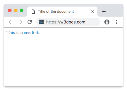
    <a href="#">This is some link.</a>
  </body>
</html>Result
Background Color
What can we do if we want our link to have a background?
We just need to apply the background-color property.
For example, our link will have a gray background, and on hover, it will change to #1c87c9.
When the first (a:link) and second (a:visited) states have the same background color, we can just use a.
Example of using the background-color property to style a link:
CSS links background-color examples
<!DOCTYPE html>
<html>
  <head>
    <title>Title of the document</title>
    <style>
      a {
        background-color: #555555;
      }
      a:hover {
        background-color: #1c87c9;
      }
      a:active {
        background-color: #1c87c9;
      }
    </style>
  </head>
  <body>
    <a href="#">This is some link.</a>
  </body>
</html>You can choose your preferred color using the Color Picker.
Putting It Together
In real projects you rarely style just one property. The example below combines color, the underline-on-hover pattern, a little padding so the background has room to breathe, and a :focus rule that mirrors :hover so keyboard users get visible feedback:
<!DOCTYPE html>
<html>
  <head>
    <title>Title of the document</title>
    <style>
      a:link,
      a:visited {
        color: #1c87c9;
        text-decoration: none;
        padding: 2px 4px;
        border-radius: 4px;
      }
      a:hover,
      a:focus {
        color: #ffffff;
        background-color: #1c87c9;
        text-decoration: underline;
      }
      a:active {
        color: #ffffff;
        background-color: #14679b;
      }
    </style>
  </head>
  <body>
    <a href="#">This is some link.</a>
  </body>
</html>Notice how grouping a:link, a:visited with a comma applies the same default to both states, and how pairing a:hover, a:focus keeps the experience identical for mouse and keyboard users.
Accessibility Tips
- Never rely on color alone. Users with color-blindness may not distinguish a blue link from black text. Keep an underline, or pair color with another cue.
- Always style
:focus. If you remove the default focus outline, replace it with your own visible style — otherwise keyboard users can't tell where they are. See theoutlineproperty. - Keep enough contrast. Link text should stand out clearly against its background and against surrounding body text.
Summary
- A link has five states, each with its own pseudo-class:
:link,:visited,:hover,:active, and:focus. - When styling several states, follow the LVHA order so later rules don't accidentally override earlier ones.
text-decorationcontrols the underline,colorsets the text color, andbackground-coloradds a background.- Always style
:focusand avoid signalling links with color alone to keep them accessible.