CSS justify-content Property
Learn about justify-content property which defines the position of the items of the container. See also property values with examples.
The justify-content property distributes the space left over along the main axis of a flex (or grid) container, controlling how its items are spaced and aligned when they don't fill the entire line. It is a sub-property of the Flexible Box Layout module and one of the CSS3 properties.
This page explains what the main axis is, walks through each value with a runnable example, and lists the gotchas to watch for.
Why the main axis matters
justify-content only has an effect along the main axis — the direction your flex items flow. That direction is set by flex-direction:
flex-direction: row(the default) → the main axis runs left-to-right, sojustify-contentmoves items horizontally.flex-direction: column→ the main axis runs top-to-bottom, so the very samejustify-contentvalue now moves items vertically.
To align items on the cross axis (the perpendicular direction) use align-items instead, and to space wrapped flex lines use align-content. A common beginner mistake is reaching for justify-content to center something vertically in a default row container — that's the job of align-items.
justify-content only takes effect when the container is a flex (or grid) container — i.e. the display property is set to flex or grid. On a plain block container it does nothing.
| Initial Value | flex-start |
|---|---|
| Applies to | Flex containers. |
| Inherited | No. |
| Animatable | No. |
| Version | CSS3 |
| DOM Syntax | object.style.justifyContent = "center"; |
Syntax
CSS justify-content syntax
justify-content: flex-start | flex-end | center | space-between | space-around | space-evenly | initial | inherit;Example of the justify-content property:
CSS justify-content code example
<!DOCTYPE html>
<html>
  <head>
    <title>Title of the document </title>
    <style>
      .center {
        width: 400px;
        height: 150px;
        border: 1px solid #666;
        display: flex;
        justify-content: center;
      }
      .center div {
        width: 70px;
        height: 70px;
        background-color: #ccc;
        border: 1px solid #666;
      }
    </style>
  </head>
  <body>
    <h2>Justify-content property example</h2>
    <p>Here the "justify-content: center" is set:</p>
    <div class="center">
      <div>1</div>
      <div>2</div>
      <div>3</div>
    </div>
  </body>
</html>Result
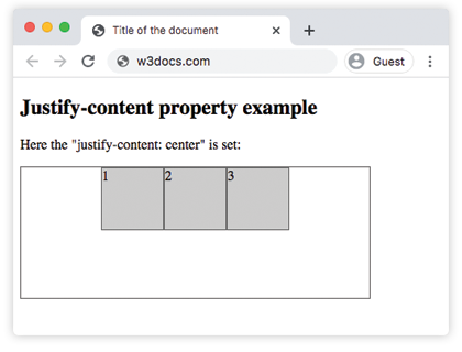
Example of the justify-content property with the "flex-start" value:
CSS justify-content flex-start example
<!DOCTYPE html>
<html>
  <head>
    <title>Title of the document </title>
    <style>
      .start {
        width: 400px;
        height: 150px;
        border: 1px solid #666;
        display: flex;
        justify-content: flex-start;
      }
      .start div {
        width: 70px;
        height: 70px;
        background-color: #ccc;
        border: 1px solid #666;
      }
    </style>
  </head>
  <body>
    <h2>Justify-content property example</h2>
    <p>Here the "justify-content: flex-start" is set:</p>
    <div class="start">
      <div>1</div>
      <div>2</div>
      <div>3</div>
    </div>
  </body>
</html>Example of the justify-content property with the "flex-end" value:
CSS justify-content flex-end example
<!DOCTYPE html>
<html>
  <head>
    <title>Title of the document </title>
    <style>
      .end {
        width: 400px;
        height: 150px;
        border: 1px solid #666;
        display: flex;
        justify-content: flex-end;
      }
      .end div {
        width: 70px;
        height: 70px;
        background-color: #ccc;
        border: 1px solid #666;
      }
    </style>
  </head>
  <body>
    <h2>Justify-content property example</h2>
    <p>Here the "justify-content: flex-end" is set:</p>
    <div class="end">
      <div>1</div>
      <div>2</div>
      <div>3</div>
    </div>
  </body>
</html>Example of the justify-content property with the "space-between" value:
CSS justify-content space-between example
<!DOCTYPE html>
<html>
  <head>
    <title>Title of the document </title>
    <style>
      .space-between {
        width: 400px;
        height: 150px;
        border: 1px solid #666;
        display: flex;
        justify-content: space-between;
      }

      .space-between div {
        width: 70px;
        height: 70px;
        background-color: #ccc;
        border: 1px solid #666;
      }
    </style>
  </head>
  <body>
    <h2>Justify-content property example</h2>
    <p>Here the "justify-content: space-between" is set:</p>
    <div class="space-between">
      <div>1</div>
      <div>2</div>
      <div>3</div>
    </div>
  </body>
</html>Example of the justify-content property with the "space-around" value:
CSS justify-content space-around example
<!DOCTYPE html>
<html>
  <head>
    <title>Title of the document </title>
    <style>
      .space-around {
        width: 400px;
        height: 150px;
        border: 1px solid #666;
        display: flex;
        justify-content: space-around;
      }
      .space-around div {
        width: 70px;
        height: 70px;
        background-color: #ccc;
        border: 1px solid #666;
      }
    </style>
  </head>
  <body>
    <h2>Justify-content property example</h2>
    <p>Here the "justify-content: space-around" is used:</p>
    <div class="space-around">
      <div>1</div>
      <div>2</div>
      <div>3</div>
    </div>
  </body>
</html>Example of the justify-content property with the "space-evenly" value:
With space-evenly the gaps before the first item, between every item, and after the last item are all equal. (With space-around the outer gaps are only half the size of the gaps between items, while space-between has no outer gaps at all.)
<!DOCTYPE html>
<html>
  <head>
    <title>Title of the document </title>
    <style>
      .space-evenly {
        width: 400px;
        height: 150px;
        border: 1px solid #666;
        display: flex;
        justify-content: space-evenly;
      }
      .space-evenly div {
        width: 70px;
        height: 70px;
        background-color: #ccc;
        border: 1px solid #666;
      }
    </style>
  </head>
  <body>
    <h2>Justify-content property example</h2>
    <p>Here the "justify-content: space-evenly" is used:</p>
    <div class="space-evenly">
      <div>1</div>
      <div>2</div>
      <div>3</div>
    </div>
  </body>
</html>Things to keep in mind
justify-contentdoes nothing unless the parent is a flex or grid container (display: flex/display: grid).- The three "space" keywords differ only in the outer gaps:
space-betweenhas none,space-aroundgives half-size outer gaps,space-evenlymakes every gap equal. - The axis it acts on follows flex-direction. Swap to
columnand the same value works top-to-bottom. - It only matters when there is leftover free space. If the items already fill (or overflow) the main axis, the alignment has nothing to distribute.
Values
| Value | Description | Play it |
|---|---|---|
| flex-start | The items start from the beginning of the container. | Play it » |
| flex-end | The items are placed at the end of the container. | Play it » |
| center | The items are placed at the center of the container. | Play it » |
| space-around | There is space before, between and after the items. | Play it » |
| space-between | There is space between the items. | Play it » |
| space-evenly | There is equal space before, between, and after the items. | Play it » |
| initial | Makes the property use its default value. | Play it » |
| inherit | Inherits the property from its parent element. |
Practice
Related properties
- align-items — aligns items along the cross axis.
- align-content — spaces wrapped flex lines along the cross axis.
- flex-direction — sets which axis is the main axis.
- The Ultimate Guide to Flexbox — the full flexbox model in one place.