CSS grid-template-areas Property
Learn how to use CSS grid-template-areas to name grid regions, build page layouts visually, and rearrange them with media queries.
The grid-template-areas property lets you lay out a CSS grid visually by drawing the layout with names instead of numbers. You apply it to a grid container and pass it one quoted string per grid row. Inside each string you write a name for every column cell, and cells that share the same name combine into a single rectangular named area.
Each grid item is then placed by referring to one of those names with the grid-area property — for example grid-area: header; drops that item into wherever you spelled header in the template. Because the strings line up under each other like an ASCII picture, the source code ends up looking like the page it produces, which makes complex layouts far easier to read and rearrange than setting grid-row-start, grid-column-start, and their shorthand siblings by hand.
Property reference
| Initial value | none |
| Applies to | Grid containers |
| Inherited | No |
| Animatable | No |
| Version | CSS Grid Layout Module Level 1 |
Syntax
grid-template-areas: none | <string>+;none is the default and means no named areas are defined. Otherwise the value is one or more quoted strings — one per row.
How to read the strings
A few rules make the syntax click:
- One string = one row. Three quoted strings create three rows; the number of token names in each string determines the number of columns.
- Every string must contain the same number of tokens, otherwise the browser treats the whole declaration as invalid and ignores it.
- A repeated name spans cells. Writing the same name in two or more adjacent cells — horizontally, vertically, or in a rectangle — merges them into one area. The shape must be rectangular; an L-shape is invalid.
- A dot (
.) marks an empty cell that belongs to no named area. Multiple consecutive dots (e.g....) count as a single empty cell and are a common convention for readability. - Naming an area does not size its tracks. Use grid-template-columns and grid-template-rows — or the grid-template shorthand — to control dimensions.
.container {
  display: grid;
  grid-template-columns: 1fr 3fr 1fr;
  grid-template-rows: auto 1fr auto;
  grid-template-areas:
    "header header header"
    "menu   main   right"
    "footer footer footer";
}Here header and footer each span all three columns, while menu, main, and right sit side by side in the middle row.
Values
| Value | Description |
|---|---|
none | No named grid areas are defined. Grid items are placed by other means (line numbers, span, or auto-placement). |
<string>+ | One or more quoted strings that draw the template. Each string represents a row; each whitespace-separated token in a string represents a cell. Repeated tokens form rectangular named areas; a . token is an unnamed (empty) cell. |
Basic layout example
The classic page-shell layout — header, sidebar, content, and footer — is the simplest demonstration of why named areas exist.
<!DOCTYPE html>
<html>
  <head>
    <title>Title of the document</title>
    <style>
      .box1 { grid-area: header; }
      .box2 { grid-area: menu; }
      .box3 { grid-area: main; }
      .box4 { grid-area: right; }
      .box5 { grid-area: footer; }

      .grid-container {
        display: grid;
        grid-template-areas:
          "header header header header header header"
          "menu   main   main   main   right  right"
          "menu   footer footer footer footer footer";
        gap: 10px;
        background-color: #ccc;
        padding: 10px;
      }
      .grid-container > div {
        background-color: #eee;
        text-align: center;
        padding: 20px 0;
        font-size: 30px;
      }
    </style>
  </head>
  <body>
    <h2>Grid-template-areas property example</h2>
    <div class="grid-container">
      <div class="box1">Header</div>
      <div class="box2">Menu</div>
      <div class="box3">Main</div>
      <div class="box4">Right</div>
      <div class="box5">Footer</div>
    </div>
  </body>
</html>Result
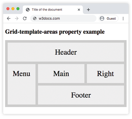
Empty cells with dots
A dot token places an item into no named area, leaving that cell unoccupied. In the example below, item1 spans the first two columns of a five-column grid; the remaining three cells in that single row are empty.
<!DOCTYPE html>
<html>
  <head>
    <title>Title of the document</title>
    <style>
      .box { grid-area: item1; }

      .grid-container {
        display: grid;
        grid-template-areas: "item1 item1 . . .";
        gap: 10px;
        background-color: #ccc;
        padding: 10px;
      }
      .grid-container > div {
        background-color: #eee;
        text-align: center;
        padding: 30px 0;
        font-size: 20px;
      }
    </style>
  </head>
  <body>
    <h2>Grid-template-areas property example</h2>
    <div class="grid-container">
      <div class="box">1</div>
      <div>2</div>
      <div>3</div>
      <div>4</div>
      <div>5</div>
      <div>6</div>
    </div>
  </body>
</html>Responsive layouts with media queries
grid-template-areas pairs naturally with media queries: just rewrite the strings inside the breakpoint block and the layout redraws with no markup changes and no need to renumber grid lines.
/* Mobile: single-column stack */
.page {
  display: grid;
  grid-template-columns: 1fr;
  grid-template-areas:
    "header"
    "menu"
    "main"
    "footer";
}

/* Desktop: sidebar left, content right */
@media (min-width: 700px) {
  .page {
    grid-template-columns: 200px 1fr;
    grid-template-rows: auto 1fr auto;
    grid-template-areas:
      "header header"
      "menu   main"
      "footer footer";
  }
}Each grid item keeps its grid-area name; only the template changes. This is the primary reason named areas are preferred over numeric line placement in responsive designs.
Common gotchas
Areas must be rectangular
If the same name appears in an L-shape, a diagonal, or any non-rectangular pattern across cells, the browser treats the entire grid-template-areas declaration as invalid and falls back to none. Every named area must form an unbroken rectangle.
/* INVALID — "content" forms an L-shape */
.bad {
  grid-template-areas:
    "header  header"
    "content sidebar"
    "content content"; /* content is now L-shaped → invalid */
}

/* VALID — "content" is rectangular */
.good {
  grid-template-areas:
    "header  header"
    "content sidebar"
    "footer  footer";
}All rows must have the same column count
Every quoted string must have the same number of whitespace-separated tokens. Pad shorter rows with dot tokens so columns align:
/* INVALID — row 2 has only 2 tokens, row 1 has 3 */
.bad {
  grid-template-areas:
    "a a b"
    "c c";
}

/* VALID — three tokens in every row */
.good {
  grid-template-areas:
    "a a b"
    "c c .";
}Naming an area does not size its tracks
Named areas tell the browser which cells belong together, not how big those cells are. Always pair grid-template-areas with grid-template-columns and grid-template-rows:
.container {
  display: grid;
  grid-template-columns: 180px 1fr;       /* sidebar fixed, content fluid */
  grid-template-rows: 60px 1fr 40px;      /* header, body, footer heights */
  grid-template-areas:
    "header header"
    "nav    content"
    "nav    footer";
}Unmatched grid items auto-place
If a child's grid-area name does not match any area in the template, the browser auto-places it using the grid-auto-flow algorithm — it lands in the next available implicit cell rather than disappearing.
The grid-template shorthand
The grid-template property combines grid-template-rows, grid-template-columns, and grid-template-areas in one declaration:
.container {
  display: grid;
  grid-template:
    "header header" 60px
    "nav    content" 1fr
    "footer footer" 40px
    / 180px 1fr;
}The row size follows each string on the same line; column sizes come after the final /. The result is identical to writing the three properties separately.