CSS perspective Property
Use the perspective CSS property to give a 3D element a perspective. See property values and examples.
The perspective property defines how far the viewer is positioned from the z = 0 plane of an element's 3D children. In plain terms, it controls how strong the 3D effect looks: it turns a flat rotation into something that appears to recede into the screen, the way objects shrink as they move away from your eye in real life.
You set it on a parent element. The value is the simulated distance from the viewer to the screen. Smaller values (like 100px) place the viewer very close, so the perspective is dramatic and exaggerated. Larger values (like 1000px) place the viewer far away, so the effect is subtle and almost flat. This page explains how the property behaves and shows the difference between none and a real length.
Because the child sits in 3D space, parts of it with z > 0 are closer to the viewer and look larger, while parts with z < 0 are farther away and look smaller.
When would I use this?
You reach for perspective whenever you rotate an element in 3D (using transform: rotateX(), rotateY(), or translateZ()) and you want that rotation to look like real depth instead of a flat shear. Common cases include flip cards, 3D cubes and carousels, and tilt-on-hover effects.
The perspective property accepts a single <length>. Zero is valid (it disables the effect, like none), and negative values are not allowed — they are treated as invalid and ignored.
To control where the vanishing point sits (the position the viewer is looking at), pair this property with perspective-origin. For the 3D rotations themselves, see the transform property, and to keep nested children in the same 3D space, use transform-style.
The perspective property is one of the CSS3 properties.
perspective property vs. the perspective() transform function. The perspective property does not affect the element it is set on — it only applies a perspective view to that element's 3D-transformed children. The perspective() value used inside the transform property applies depth directly to the element itself. Use the property when you have several children sharing one viewer position; use the function when a single element needs its own depth.
Modern browsers fully support this property without vendor prefixes.
| Initial Value | none |
|---|---|
| Applies to | Transformable elements. |
| Inherited | No. |
| Animatable | Yes. The transformation of the perspective is animatable. |
| Version | CSS3 |
| DOM Syntax | object.style.perspective = "70px"; |
Syntax
CSS perspective syntax
perspective: length | none | initial | inherit;Example with no perspective (perspective: none)
With perspective: none on the parent, the child's rotateX(40deg) is rendered as a flat 2D shear — there is no sense of depth. This is the baseline to compare against.
CSS perspective code example
<!DOCTYPE html>
<html>
  <head>
    <title>Title of the element</title>
    <style>
        .element1 {
        padding: 50px;
        position: absolute;
        border: 1px solid #666;
        background-color: #1c87c9;
        background: #8ebf42;
        -webkit-transform-style: preserve-3d;/* Safari 3-8  */
        -webkit-transform: rotateX(40deg);/* Safari 3-8  */
        transform-style: preserve-3d;
        transform: rotateX(40deg);
      }
      .element2 {
        position: relative;
        height: 160px;
        width: 160px;
        margin-left: 20px;
        border: 1px solid #000;
        -webkit-perspective: none;/* Safari 4-8  */
        perspective: none;
      }
    </style>
  </head>
  <body>
    <h2>Perspective property example</h2>
    <h3>perspective: none:</h3>
    <div class="element2">
      Box2
      <div class="element1">Box1</div>
    </div>
  </body>
</html>Result
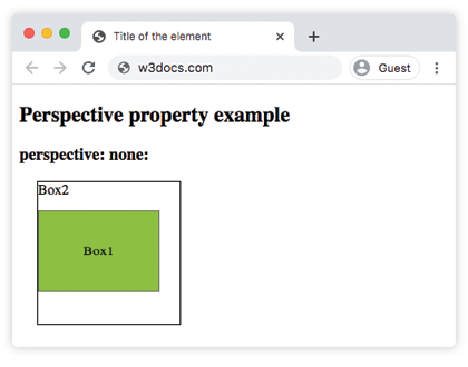
Example with perspective: 100px
Now the parent gets a perspective of 100px. Because the viewer is simulated as very close, the same rotateX(40deg) on the child reads as real depth — the top edge recedes into the screen and the box looks tilted in 3D space. Try increasing the value to 500px or 1000px and the tilt becomes gentler.
CSS perspective with px example
<!DOCTYPE html>
<html>
  <head>
    <title>Title of the element</title>
    <style>
        .element1 {
        padding: 50px;
        position: absolute;
        border: 1px solid #666;
        background-color: #1c87c9;
        background: #8ebf42;
        -webkit-transform-style: preserve-3d;/* Safari 3-8  */
        -webkit-transform: rotateX(40deg);/* Safari 3-8  */
        transform-style: preserve-3d;
        transform: rotateX(40deg);
      }
      .element2 {
        position: relative;
        height: 150px;
        width: 150px;
        margin-left: 50px;
        border: 1px solid #000;
        -webkit-perspective: 100px;/* Safari 4-8  */
        perspective: 100px;
      }
    </style>
  </head>
  <body>
    <h2>Perspective property example</h2>
    <h3>perspective: 100px:</h3>
    <div class="element2">
      Box2
      <div class="element1">Box1</div>
    </div>
  </body>
</html>Values
| Value | Description |
|---|---|
| length | Applies a perspective transform to the element and its content. |
| none | Applies no perspective transform. |
| initial | Makes the property use its default value. |
| inherit | Inherits the property from its parents element. |
Gotchas
- Set it on the parent, not the rotated element. A common mistake is putting
perspectiveon the same element you rotate — that does nothing. Either move it to the parent, or use theperspective()function insidetransformon the element itself. - Order matters with the
perspective()function. When you use the function, write it first:transform: perspective(500px) rotateX(40deg). Listed after the rotation, it applies to an already-rotated coordinate system and the result changes. - Nested 3D needs
transform-style: preserve-3d. Without it (the default isflat), grandchildren are flattened into their parent's plane and the depth is lost.
Related properties
- perspective-origin — sets the position of the vanishing point.
- transform — applies the 3D rotations and translations that
perspectivegives depth to. - transform-style — keeps nested elements in the shared 3D space.
- backface-visibility — hides the back of an element when it is rotated away from the viewer.