CSS box-sizing Property
The box-sizing property defines the calculation of the width and height of an element. See examples and try them yourself.
The box-sizing property controls how the width and height of an element are calculated — specifically, whether the padding and border are counted inside those dimensions or added on top of them. It is one of the CSS3 properties.
This page explains the difference between the two box models (content-box and border-box), why border-box is the modern default for most layouts, and how to apply it across an entire page.
How the box model affects size
By default (content-box), width and height set only the size of the content area. The padding and border are then added on top, so the rendered box is larger than the value you wrote:
- width + padding + border = rendered width of the element
- height + padding + border = rendered height of the element
For example, a box with width: 400px, padding: 50px on each side, and a 5px border on each side actually occupies 400 + 100 + 10 = 510px of horizontal space. This is a frequent source of layout bugs: two 50%-wide columns with any padding or border will not fit side by side, because each ends up wider than half the container.
With box-sizing: border-box, the padding and border are pulled inside the declared width and height instead. A width: 50% element stays exactly half the container's width no matter how much padding or border you add — which is why most stylesheets reset every element to border-box.
| Initial Value | content-box |
|---|---|
| Applies to | All elements that accept width and height. |
| Inherited | No. |
| Animatable | No. |
| Version | CSS3 |
| DOM Syntax | object.style.boxSizing = "border-box"; |
Syntax
Syntax of CSS box-sizing Property
box-sizing: content-box | border-box | initial | inherit;The example below shows two <div> elements with identical width, height, padding, and border declarations — they differ only in their box-sizing value, which is enough to make them render at different sizes:
Example of the box-sizing property
Example of CSS box-sizing Property with content-box and border-box values
<!DOCTYPE html>
<html>
  <head>
    <style>
      .div1 {
        box-sizing: content-box;
        width: 400px;
        height: 50px;
        padding: 50px;
        border: 5px double #1c87c9;
      }
      .div2 {
        box-sizing: border-box;
        width: 400px;
        height: 50px;
        padding: 50px;
        border: 5px dashed #8ebf42;
      }
    </style>
  </head>
  <body>
    <h2>Box-sizing Example</h2>
    <hr />
    <h3>box-sizing: content-box (default):</h3>
    <div class="div1">The width for this div is set as 400px. Thus, the full width is 400px + 10px (left and right border) + 100px (left and right padding) = 510px.</div>
    <br />
    <h3>box-sizing: border-box:</h3>
    <div class="div2">The width and height apply to all parts of the div element: The full width is 400px.</div>
  </body>
</html>Result
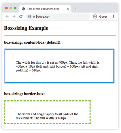
With content-box, the rendered box is wider than the declared width because padding and border are added to it. With border-box, the padding and border are absorbed into the declared width and height, so the box stays exactly the size you specified.
border-box is the value you'll reach for most often when building layouts. It makes element sizes predictable and removes a whole class of pitfalls — you can add padding or a border without recalculating widths.
Example of two bordered boxes placed side by side
Here border-box lets two 50%-wide floated boxes sit next to each other even though each has its own border and padding. With the default content-box, the borders and padding would push the combined width past 100% and force the second box onto a new line.
Example of CSS box-sizing Property with border-box value
<!DOCTYPE html>
<html>
  <head>
    <style>
      div.container {
        width: 100%;
        border: 2px double #1c87c9;
      }
      div.box {
        box-sizing: border-box;
        width: 50%;
        border: 3px solid #ccc;
        float: left;
        padding: 3px;
      }
    </style>
  </head>
  <body>
    <h2>Box-sizing Example</h2>
    <p>Here you can see two bordered boxes defined side by side.</p>
    <div class="container">
      <div class="box">Left part</div>
      <div class="box">Right part</div>
      <div style="clear:both;"></div>
    </div>
  </body>
</html>Applying border-box to the whole page
Rather than setting box-sizing on individual elements, most projects apply it once to every element with the universal selector. This is the single most common CSS reset in modern stylesheets:
*,
*::before,
*::after {
  box-sizing: border-box;
}The *::before and *::after selectors make sure generated content boxes follow the same rule. After this reset, width and height mean "the total size including padding and border" everywhere, which is what most people intuitively expect.
Browser support
box-sizing is supported in all modern browsers, including current versions of Chrome, Firefox, Safari, and Edge. It is a stable CSS3 feature and needs no vendor prefixes for today's browsers.
Values
| Value | Description |
|---|---|
| content-box | The width and height properties include the content, but the padding, border, or margin aren't included. It is the default value. |
| border-box | The width and height properties include the content, padding and border, but do not include the margin. |
| initial | Sets the property to its default value. |
| inherit | Inherits the property from its parent element. |