CSS text-fill-color Property
Use the text-fill-color CSS property to specify the color of the fill of the text. See property values and practice with examples.
The -webkit-text-fill-color property specifies the fill color of the characters in the text — the color painted inside each glyph.
This page explains what the property does, how it differs from the regular color property, why it is almost always paired with background-clip: text to make gradient text, and which browser-support caveats to plan for.
How it relates to the color property
On its own, -webkit-text-fill-color does the same job as color: it sets the text fill. If you do not set -webkit-text-fill-color, the value of the color property is used instead.
The difference appears when both are present, or when background-clip: text is in play. -webkit-text-fill-color always wins over color for the fill, which is exactly why it is used to override color when a background is clipped to the text:
p {
  color: #444;                       /* fallback if text-fill-color is unsupported */
  -webkit-text-fill-color: #1c87c9;  /* takes priority for the fill */
}Making gradient text
The most common reason to reach for this property is gradient text. The recipe is:
- Put a gradient (or any image) on the element's
background. - Clip that background to the shape of the text with
-webkit-background-clip: textandbackground-clip: text. - Set
-webkit-text-fill-color: transparentso the solid fill becomes see-through and the clipped background shows through the glyphs.
Without step 3 the opaque fill would paint over the background and you would never see the gradient. See CSS gradients for the gradient syntax and background-clip for how clipping to text works.
The -webkit-text-fill-color property is primarily used alongside -webkit-background-clip: text to create gradient text effects. Note: Safari supports background-clip: text but does not support the standard text-fill-color property. Use -webkit-text-fill-color for cross-browser compatibility.
The text-fill-color property is not fully standardized across all browsers. Do not rely on it for production sites without fallbacks, as it will not work for all users. Implementation details may vary, and behavior could change in the future.
| Initial Value | currentColor |
|---|---|
| Applies to | All elements. |
| Inherited | Yes. |
| Animatable | Yes. The color is animatable. |
| Version | Compatibility Standard |
| DOM Syntax | object.style.textFillColor = "#1c87c9"; |
Syntax
CSS -webkit-text-fill-color values
-webkit-text-fill-color: color | initial | inherit;Examples
A solid text fill
<!DOCTYPE html>
<html>
  <head>
    <title>Title of the document</title>
    <style>
      p {
        margin: 0;
        font-size: 1.5em;
        -webkit-text-fill-color: #1c87c9;
      }
    </style>
  </head>
  <body>
    <h2>Text-fill-color property example</h2>
    <p>Lorem Ipsum is simply dummy text...</p>
  </body>
</html>Result
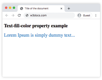
A vertical gradient with the "transparent" value
This sets the fill to transparent and clips a vertical linear-gradient to the heading text:
<!DOCTYPE html>
<html>
  <head>
    <title>Title of the document</title>
    <style>
      article {
        padding: 10px;
        margin: 15px auto;
        font-size: 18px;
      }
      p {
        color: #444;
        line-height: 1.6;
        margin: 20px 0;
        background: #E7E7E2;
      }
      q {
        display: block;
        margin: 25px 0;
        text-transform: uppercase;
        text-align: center;
        font-family: sans-serif;
        font-size: 30px;
        color: #8e2b88;
        -webkit-text-fill-color: transparent;
        background: linear-gradient(to bottom, #ff0052, #8e2b88);
        -webkit-background-clip: text;
        background-clip: text;
      }
      q:before {
        content: '';
      }
    </style>
  </head>
  <body>
    <article>
      <p>
        Contrary to popular belief, Lorem Ipsum is not simply random text. It has roots in a piece of classical Latin literature from 45 BC, making it over 2000 years old.
      </p>
      <q>
        The text-fill-color property is used with -webkit- extension.
      </q>
      <p>
        There are many variations of passages of Lorem Ipsum available, but the majority have suffered alteration in some form, by injected humour, or randomised words which don't look even slightly believable. If you are going to use a passage of Lorem Ipsum, you need to be sure there isn't anything embarrassing hidden in the middle of text.
      </p>
    </article>
  </body>
</html>A multi-stop horizontal gradient
<!DOCTYPE html>
<html>
  <head>
    <title>Title of the document</title>
    <style>
      h1 {
        display: inline-block;
        font-family: sans-serif;
        font-weight: bold;
        font-size: 40pt;
        background: linear-gradient(to right, rgb(25, 76, 192), rgb(196, 26, 3) 20%, rgb(236, 190, 6) 40%, rgb(25, 76, 192) 60%, rgb(3, 116, 8) 80%, rgb(196, 26, 3));
        -webkit-background-clip: text;
        background-clip: text;
        -webkit-text-fill-color: transparent;
      }
    </style>
  </head>
  <body>
    <h1>Cascading Style Sheets (CSS)</h1>
  </body>
</html>Values
| Value | Description |
|---|---|
| color | Specifies foreground fill color of the element's text content. Color names, hexadecimal color codes, rgb(), rgba(), hsl(), hsla() can be used. |
| initial | Makes the property use its default value. |
| inherit | Inherits the property from its parent element. |
Browser support and fallbacks
-webkit-text-fill-color is part of the WHATWG Compatibility Standard rather than a core CSS specification, so it relies on the -webkit- prefix in every browser, including non-WebKit ones like Firefox. Because it is not a fully standardized property, always supply a fallback:
- Set the regular
colorproperty to a usable solid color. Browsers that ignore-webkit-text-fill-colorfall back tocolor, so the text stays readable. - Avoid
-webkit-text-fill-color: transparentwithout a clipped background — ifbackground-clip: textis unsupported, the text becomes invisible. Pairtransparentwith acolorfallback, or feature-detect with@supports (background-clip: text) or (-webkit-background-clip: text).
Related properties
color— the standard way to set text color and the fallback for this property.background-clip— clips the background to the text so a gradient can show through.- CSS gradients — the gradients used in the examples above.
text-stroke— adds an outline around glyphs, often combined with a fill color.- CSS color names — the named colors you can pass as a value.