CSS perspective-origin Property
Use the perspective-origin CSS property to decide at which perspective the element should be shown to the user. See property values and examples.
The CSS perspective-origin property sets the position from which the viewer appears to be looking at a 3D-transformed element. In other words, it moves the vanishing point — the spot toward which faces angled away from the screen seem to converge. It is one of the CSS3 properties.
How it works
A 3D scene needs two ingredients to look correct:
- The
perspectiveproperty, which sets how strong the 3D effect is (the smaller the value, the more dramatic the foreshortening). - The
perspective-originproperty, which sets where the camera is.perspectivedecides the depth of the vanishing point;perspective-origindecides its horizontal and vertical position.
By default the vanishing point sits in the dead center of the element (50% 50%), so a rotated child face looks symmetric. Shifting perspective-origin to one side is like walking around the object — the same child appears to be viewed from the left, the right, above, or below.
perspective-origin only takes effect when perspective is also set, either on the same element or on an ancestor. Without it, the property is parsed but does nothing.
The two-value syntax always reads horizontal first, vertical second (for example perspective-origin: 25% 75%). When you supply a single value, the missing one defaults to center. Keyword pairs such as top left are the exception — keywords may be written in either order because each keyword names a specific axis.
perspective-origin is applied to the parent but governs how its child elements are projected — the element you put it on is not itself transformed.
| Initial Value | 50% 50% |
|---|---|
| Applies to | Transformable elements. |
| Inherited | No. |
| Animatable | Yes. The transformation of the perspective is animatable. |
| Version | CSS3 |
| DOM Syntax | object.style.perspectiveOrigin = "20px 70%"; |
Syntax
CSS perspective-origin syntax
perspective-origin: x-position y-position | x | y | closest-side | farthest-side | initial | inherit;Example of the perspective-origin property:
CSS perspective-origin code example
<!DOCTYPE html>
<html>
  <head>
    <title>Title of the document</title>
    <style>
      .element1 {
        position: relative;
        height: 150px;
        width: 150px;
        margin-left: 60px;
        border: 1px solid #666;
        perspective: 130px;
        perspective-origin: 50% 50%;
      }
      .element2 {
        padding: 50px;
        position: absolute;
        border: 1px solid #000;
        background: #8ebf42;
        transform-style: preserve-3d;
        transform: rotateX(45deg);
      }
    </style>
  </head>
  <body>
    <h2>Perspective-origin property example</h2>
    <h3>Perspective-origin: 50% 50%:</h3>
    <div class="element1">
      Box1
      <div class="element2">Box2</div>
    </div>
  </body>
</html>Result
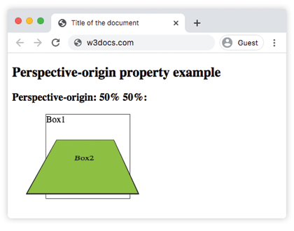
With the default 50% 50%, the vanishing point is centered, so the rotated Box2 looks evenly foreshortened. In the next examples we move that point to one edge and watch the apparent viewing angle change.
Example of the perspective-origin property with the "left" value:
CSS perspective-origin left value example
<!DOCTYPE html>
<html>
  <head>
    <title>Title of the document</title>
    <style>
      .element1 {
        position: relative;
        height: 150px;
        width: 150px;
        margin-left: 20px;
        border: 1px solid #666;
        perspective: 80px;
        perspective-origin: left;
      }
      .element2 {
        padding: 50px;
        position: absolute;
        border: 1px solid #000;
        background: #8ebf42;
        transform-style: preserve-3d;
        transform: rotateX(45deg);
      }
    </style>
  </head>
  <body>
    <h2>Perspective-origin property example</h2>
    <h3>Perspective-origin: left:</h3>
    <div class="element1">
      Box1
      <div class="element2">Box2</div>
    </div>
  </body>
</html>Example of the perspective-origin property with the "right" value:
CSS perspective-origin right value example
<!DOCTYPE html>
<html>
  <head>
    <title>Title of the document</title>
    <style>
      .element1 {
        position: relative;
        height: 150px;
        width: 150px;
        margin-left: 160px;
        border: 1px solid #666;
        perspective: 80px;
        perspective-origin: right;
      }
      .element2 {
        padding: 50px;
        position: absolute;
        border: 1px solid #000;
        background: #8ebf42;
        transform-style: preserve-3d;
        transform: rotateX(45deg);
      }
    </style>
  </head>
  <body>
    <h2>Perspective-origin property example</h2>
    <h3>Perspective-origin: right:</h3>
    <div class="element1">
      Box1
      <div class="element2">Box2</div>
    </div>
  </body>
</html>Example of the perspective-origin property defined as "bottom right":
CSS perspective-origin bottom example
<!DOCTYPE html>
<html>
  <head>
    <title>Title of the document</title>
    <style>
      .element1 {
        position: relative;
        height: 150px;
        width: 150px;
        margin-left: 60px;
        border: 1px solid #666;
        perspective: 130px;
        perspective-origin: bottom right;
      }
      .element2 {
        padding: 50px;
        position: absolute;
        border: 1px solid #000;
        background: #8ebf42;
        transform-style: preserve-3d;
        transform: rotateX(45deg);
      }
    </style>
  </head>
  <body>
    <h2>Perspective-origin property example</h2>
    <h3>Perspective-origin: bottom right:</h3>
    <div class="element1">
      Box1
      <div class="element2">Box2</div>
    </div>
  </body>
</html>Values
| Value | Description |
|---|---|
| x-position | The horizontal position of the vanishing point. Accepts a <length>, a percentage, or one of the keywords left (= 0), center (= 50%), or right (= 100%). |
| y-position | The vertical position of the vanishing point. Accepts a <length>, a percentage, or one of the keywords top (= 0), center (= 50%), or bottom (= 100%). |
| initial | Sets this property to its default value (50% 50%). |
| inherit | Inherits this property from its parent element. |
The percentage and length values are resolved against the element's own box, with the origin in the top-left corner. So 0 0 puts the vanishing point at the top-left, 100% 100% at the bottom-right, and negative or greater-than-100% values are allowed to push the camera outside the box.
Browser support
perspective-origin is supported in all modern browsers. There is no longer any need for vendor prefixes such as -webkit-perspective-origin for current versions of Chrome, Edge, Firefox, and Safari.
Related properties
perspective— sets the distance to the vanishing point and is required forperspective-originto have any effect.transform— applies therotateX,rotateY, andtranslateZtransforms that the perspective is applied to.transform-style— usepreserve-3dso nested children keep their 3D positions inside the perspective.backface-visibility— controls whether the reversed side of a rotated element is shown.