CSS border-image-repeat Property
The CSS border-image-repeat property is used to specify if the border image will be rounded, repeated or stretched. See an example and try it yourself.
The CSS border-image-repeat property controls how the side slices of a border-image are scaled to fill the edges of an element. It decides whether those slices are stretched, repeated (tiled), rounded so a whole number of tiles fit, or spaced out with gaps. It is one of the CSS3 properties.
When you supply a border image, the border-image-slice property cuts it into nine regions: four corners, four edges, and a middle. The corners are always placed once at each corner — but the four edge slices usually have to cover a distance that is not an exact multiple of the slice size. border-image-repeat is what tells the browser how to handle that mismatch.
The property may be defined using one or two values. If one value is specified, it applies the same behavior on all four sides. If two values are specified, the first applies to the top and bottom, and the second to the left and right.
| Initial Value | stretch |
|---|---|
| Applies to | All elements, except internal table elements when border-collapse is "collapse". It also applies to ::first-letter. |
| Inherited | No. |
| Animatable | No. |
| Version | CSS3 |
| DOM Syntax | object.style.borderImageRepeat = "round"; |
Syntax
Syntax of CSS border-image-repeat Property
border-image-repeat: stretch | repeat | round | space | initial | inherit;Example of the border-image-repeat property:
Example of CSS border-image-repeat Property with round value
<!DOCTYPE html>
<html>
  <head>
    <title>The title of the document</title>
    <style>
      .border {
        border: 10px solid transparent;
        padding: 20px;
        border-image: url(/uploads/media/default/0001/01/812bf6a749522b8185c1beee20dd99dd6c6c87da.jpeg) round;
        border-image-slice: 100;
        border-image-repeat: round;
        border-image-width: 10px;
      }
    </style>
  </head>
  <body>
    <h2>Border-image-repeat property example</h2>
    <p class="border">border-image-repeat: round;</p>
    <p>Here is the original image used:</p>
    <img src="/uploads/media/default/0001/01/812bf6a749522b8185c1beee20dd99dd6c6c87da.jpeg" style="width:50%" />
  </body>
</html>Result
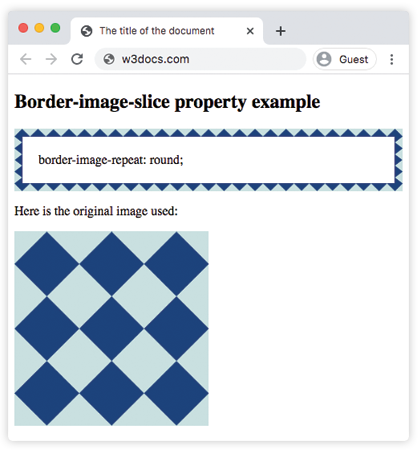
Example of the border-image-repeat property with the "round" and "repeat" values:
Example of CSS border-image-repeat Property with round and repeat values
<!DOCTYPE html>
<html>
  <head>
    <title>The title of the document</title>
    <style>
      .border1 {
        border: 10px solid transparent;
        padding: 20px;
        border-image: url(/uploads/media/default/0001/01/812bf6a749522b8185c1beee20dd99dd6c6c87da.jpeg) round;
        border-image-slice: 100;
        border-image-repeat: round;
        border-image-width: 10px;
      }
      .border2 {
        border: 10px solid transparent;
        padding: 20px;
        border-image: url(/uploads/media/default/0001/01/812bf6a749522b8185c1beee20dd99dd6c6c87da.jpeg) round;
        border-image-slice: 100;
        border-image-repeat: repeat;
        border-image-width: 10px;
      }
    </style>
  </head>
  <body>
    <h2>Border-image-repeat property example</h2>
    <p class="border1">border-image-repeat: round;</p>
    <p class="border2">border-image-repeat: repeat;</p>
    <p>Here is the original image used:</p>
    <img src="/uploads/media/default/0001/01/812bf6a749522b8185c1beee20dd99dd6c6c87da.jpeg" style="width:50%" />
  </body>
</html>Example of the border-image-repeat property with the "space" and "stretch" values:
Example of CSS border-image-repeat Property with space and stretch values
<!DOCTYPE html>
<html>
  <head>
    <style>
      .border1 {
        border: 10px solid transparent;
        padding: 20px;
        border-image: url(/uploads/media/default/0001/01/812bf6a749522b8185c1beee20dd99dd6c6c87da.jpeg) round;
        border-image-slice: 100;
        border-image-repeat: space;
        border-image-width: 10px;
      }
      .border2 {
        border: 10px solid transparent;
        padding: 20px;
        border-image: url(/uploads/media/default/0001/01/812bf6a749522b8185c1beee20dd99dd6c6c87da.jpeg) round;
        border-image-slice: 100;
        border-image-repeat: stretch;
        border-image-width: 10px;
      }
    </style>
  </head>
  <body>
    <h2>Border-image-repeat property example</h2>
    <p class="border1">border-image-repeat: space;</p>
    <p class="border2">border-image-repeat: stretch;</p>
    <p>Here is the original image used:</p>
    <img src="/uploads/media/default/0001/01/812bf6a749522b8185c1beee20dd99dd6c6c87da.jpeg" style="width:50%" />
  </body>
</html>How each value behaves
The four keywords differ only in how they handle the fact that an edge slice rarely tiles evenly into the side it has to fill:
stretch(the default) takes a single edge slice and scales it to span the whole side. There is no tiling, so a pattern with distinct motifs (dots, shapes, text) gets distorted, but a smooth gradient or solid texture survives unchanged.repeattiles the edge slice at its natural size and simply clips whatever doesn't fit. The tiles keep their proportions, but you may see a partial tile cut off at each corner — and the pattern is usually not centered.roundalso tiles, but first rescales the slice slightly so that a whole number of tiles fits exactly between the corners. Use this when you want a clean, symmetric repeat with no clipped tiles, and a little distortion is acceptable.spacetiles at the natural size likerepeat, but instead of clipping it drops the leftover partial tile and distributes the freed-up space as equal gaps between the full tiles. (spacehas the least browser support of the four.)
A practical rule of thumb: choose stretch for gradients and continuous textures, round for decorative patterns where symmetry matters, and repeat or space when you want the motif kept at exactly its original size.
Note:
border-image-repeathas no effect on its own — the element must already have a border-image-source set and a non-zero border width. It is most often written as part of the border-image shorthand rather than on its own.
Values
| Value | Description | Play it |
|---|---|---|
| stretch | Every gap between each border will be filled with stretched images. This is the default value. | Play it » |
| repeat | Every gap between each border will be filled with repeated images. For reaching proper fit, repeats may be clipped. | Play it » |
| round | Every gap between each border will be filled with repeated images. For reaching proper fit repeats may be stretched. | Play it » |
| space | Every gap between each border will be filled with repeated images. For reaching proper fit extra space will be distributed between repeats. | |
| initial | Sets the property to its default value. | Play it » |
| inherit | Inherits the property from its parent element. |
Practice
Related properties
The other border-image-* longhands work together with border-image-repeat:
- border-image — the shorthand that sets all of them at once.
- border-image-source — the image to use.
- border-image-slice — how the source is cut into nine regions.
- border-image-width — the width of the border-image area.
- border-image-outset — how far the image extends beyond the border box.