CSS border-right-style Property
CSS border-right-style property is used to specify the style of an element's right border. See all property values illustrated with examples.
The CSS border-right-style property sets the line style of an element's right border, such as solid, dashed, or dotted. The value is a single keyword chosen from the same set available to the border-style shorthand — the difference is that border-style styles all four sides at once, while border-right-style targets only the right edge.
This is the per-side counterpart of border-style. Use it when you want a different line style on the right than on the other sides — for example, a solid divider on the right of a sidebar while the top, bottom, and left stay borderless.
Why the border may not appear
A border has three independent parts: style, width, and color. The style is the only required part — if you don't set a style, the browser uses the default none and the border is not drawn at all, no matter what width or color you give it. So border-right-style is what actually makes the right border visible.
The default width of the right border is medium. Adjust it with border-right-width or border-width, and set its color with border-right-color. To set style, width, and color in one declaration, use the border-right shorthand.
Not all browsers render the styles identically. Chrome, for instance, renders dotted dots as small squares rather than circles, and the exact spacing of dots and dashes is left to the browser.
The specification does not specify the amount of spacing between the dots and the dashes.
The specification does not define how borders of different styles connect in the corners.
| Initial Value | none |
|---|---|
| Applies to | All elements. It also applies to ::first-letter. |
| Inherited | No |
| Animatable | No |
| Version | CSS1 |
| DOM Syntax | object.style.borderRightStyle = "dashed"; |
Syntax
Syntax of CSS border-right-style Property
border-right-style: none | hidden | dotted | dashed | solid | double | groove | ridge | inset | outset | initial | inherit;Example of the border-right-style property:
Example of CSS border-right-style Property with solid and dotted values
<!DOCTYPE html>
<html>
  <head>
    <style>
      h2 {
        border-right-style: solid;
      }
      p {
        border-right-style: dotted;
      }
    </style>
  </head>
  <body>
    <h2>A Heading with solid border-right-style.</h2>
    <p>A paragraph with dotted border-right-style.</p>
  </body>
</html>Look at an example where all the style values are used to see the difference between them:
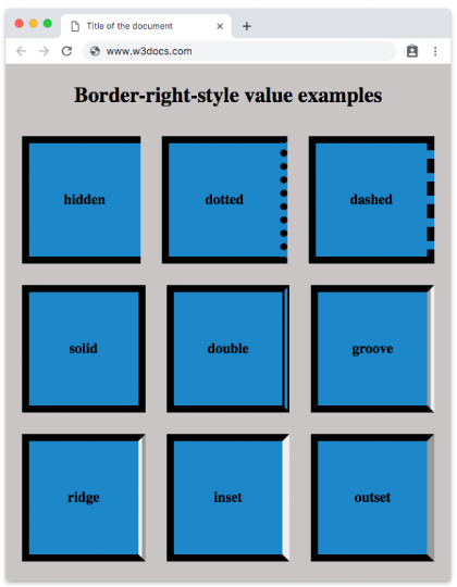
Depending on the value of the border-color, the effects of groove, ridge, inset and outset values can be changed.
Example of the border-right-style property with all the values:
Example of CSS border-right-style Property with hidden, dotted, dashed, solid, double, groove, ridge, inset and outset values
<!DOCTYPE html>
<html>
  <head>
    <title>Title of the document</title>
    <style>
      body {
        background: #c9c5c5;
        font-size: 20px;
        text-align: center;
      }
      main div {
        display: flex;
        align-items: center;
        justify-content: center;
        color: black;
        padding-top: 30px;
        padding-bottom: 30px;
        width: 200px;
        height: 100px;
        margin: 15px;
        font-weight: bold;
        background-color: #1c87c9;
        border: 10px solid;
      }
      .flex-center {
        display: flex;
        justify-content: center;
      }
      /* border-right-style example classes */
      .b1 {
        border-right-style: hidden;
      }
      .b2 {
        border-right-style: dotted;
      }
      .b3 {
        border-right-style: dashed;
      }
      .b4 {
        border-right-style: solid;
      }
      .b5 {
        border-right-style: double;
      }
      .b6 {
        border-right-style: groove;
      }
      .b7 {
        border-right-style: ridge;
      }
      .b8 {
        border-right-style: inset;
      }
      .b9 {
        border-right-style: outset;
      }
    </style>
  </head>
  <body>
    <h1>Border-right-style value examples</h1>
    <main class="flex-center">
      <div class="b1">
        hidden
      </div>
      <div class="b2">
        dotted
      </div>
      <div class="b3">
        dashed
      </div>
    </main>
    <main class="flex-center">
      <div class="b4">
        solid
      </div>
      <div class="b5">
        double
      </div>
      <div class="b6">
        groove
      </div>
    </main>
    <main class="flex-center">
      <div class="b7">
        ridge
      </div>
      <div class="b8">
        inset
      </div>
      <div class="b9">
        outset
      </div>
    </main>
  </body>
</html>Result
Values
| Value | Description | Play it |
|---|---|---|
| none | Defines that there won't be any border. Default value. | Play it » |
| hidden | Is the same with "none" except in border conflict resolution for table elements. | Play it » |
| dotted | Defines a dotted border. | Play it » |
| dashed | Defines a dashed border. | Play it » |
| double | Defines a double border. | Play it » |
| solid | Defines a solid border. | Play it » |
| groove | Defines a 3D grooved border. Its effect can be changed with the value of border-color. | Play it » |
| ridge | Defines a 3D ridged border. Its effect can be changed with the value of border-color. | Play it » |
| inset | Defines a 3D inset border. Its effect can be changed with the value of border-color. | Play it » |
| outset | Defines a 3D outset border. Its effect can be changed with the value of border-color. | Play it » |
| initial | Sets the property to its default value. | Play it » |
| inherit | Inherits the property from its parent element. |
none vs hidden
The two keywords look the same on a normal element — both draw no line. The difference only matters in collapsed-border tables: with border-collapse: collapse, a hidden border wins border-conflict resolution and suppresses the neighboring cell's border, whereas none has the lowest priority and is overridden by any adjacent border.
Related properties
- border-right — shorthand for the right border's width, style, and color.
- border-right-width and border-right-color — the other two parts of the right border.
- border-style — set the line style of all four sides at once.