CSS @media Rule
Use @media at-rule to apply part of a style sheet based on media queries. Learn how to use this property with the help of examples.
The @media at-rule applies a block of styles only when a media query evaluates to true — for example, only on screens narrower than a phone, or only when a document is printed. It is the foundation of responsive web design: one stylesheet that adapts to desktops, laptops, tablets, and mobile phones instead of shipping a separate site per device.
This page covers the @media syntax, the available media types and media features, how to combine conditions with logical operators, and runnable examples you can resize to see the effect.
How a media query is built
A media query has two parts:
- An optional media type —
all,print,screen, orspeech— that targets a category of device. - One or more media features in parentheses, such as
(min-width: 768px), that test a condition like thewidthof the viewport, itsheight, orientation, or resolution.
If the media type matches the current device and every feature evaluates to true, the styles inside the block apply. A media feature looks like a CSS property (name: value), but it tests a condition rather than styling an element directly.
When would I use this? Whenever you want layout, spacing, or visibility to change based on the device — stacking columns on phones, hiding a sidebar on small screens, or stripping background colors when a page is printed.
In JavaScript, the CSSMediaRule interface represents a single @media rule and can be used to read or modify rules created with @media.
Syntax
CSS @media
@media <media-query> {
  /* styles */
}Media queries can combine multiple conditions using logical operators: and, not, only, and a comma (,).
Example of the @media rule:
CSS @media code example
<!DOCTYPE html>
<html>
  <head>
    <title>Title of the document</title>
    <style>
      body {
        background-color: #1c87c9;
      }
      @media screen and (max-width: 411px) {
        body {
          background-color: #cce5ff;
        }
      }
      @media screen and (min-width: 768px) {
        body {
          background-color: #eee;
        }
      }
      @media screen and (max-width: 962px) and (min-width: 450px),
      (min-width: 1366px) {
        body {
          background-color: #333;
        }
      }
    </style>
  </head>
  <body>
    <h2>@media rule example</h2>
    <p>Resize the browser to see the effect.</p>
    <p>The background color changes based on the viewport width: light blue for screens up to 411px, light gray for 768px and wider, and dark gray for screens between 450px and 962px, or 1366px and wider.</p>
  </body>
</html>Result
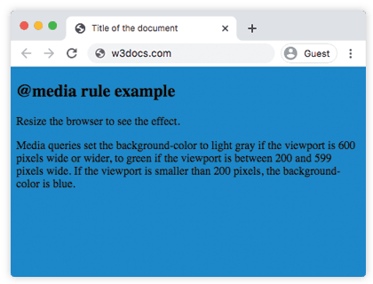
In the following example, when the browser's width is between 500 and 800px or above 1000px, the appearance of the <div> changes. Resize the browser window to see the effect.
Example of the @media rule with a changed appearance of <div>:
CSS @media multiple queries example
<!DOCTYPE html>
<html>
  <head>
    <title>Title of the document</title>
    <style>
      body {
        background-color: #1c87c9;
      }
      @media screen and (min-width: 200px) {
        body {
          background-color: #8ebf42;
        }
      }
      @media screen and (min-width: 600px) {
        body {
          background-color: #ccc;
        }
      }
      @media screen and (max-width: 800px) and (min-width: 500px),
      (min-width: 1000px) {
        div.box {
          font-size: 50px;
          padding: 50px;
          border: 8px solid #000;
          background: #eee;
        }
      }
    </style>
  </head>
  <body>
    <h2>@media rule example</h2>
    <p>Media queries set the background-color to grey if the viewport is 600 pixels wide or wider, to green if the viewport is between 200 and 599 pixels wide. If the viewport is smaller than 200 pixels, the background-color is blue.</p>
    <h3>Change the appearance of DIV on different screen sizes</h3>
    <div class="box">DIV</div>
  </body>
</html>Combining conditions with logical operators
Media queries can chain multiple conditions:
and— all conditions must be true:@media screen and (min-width: 768px).,(comma) — acts likeor; the styles apply if any comma-separated query matches:@media (max-width: 600px), (min-width: 1200px).not— negates an entire query:@media not all and (monochrome).only— hides the query from very old browsers that don't understand media features; it has no effect in modern browsers but is harmless to include.
Media Types
| Value | Description |
|---|---|
| all | This value is used for all devices. This is the default value of this property. |
| Is used for printers. | |
| screen | Is used for color computer screens. |
| speech | Is used for speakers. |
Example of using media for hiding an element on extra small devices:
CSS @media Rule
<!DOCTYPE html>
<html>
  <head>
    <meta name="viewport" content="width=device-width, initial-scale=1, maximum-scale=1, user-scalable=no" />
    <style>
      @media (max-width: 767px) {
        .hide-mobile {
          display: none;
        }
      }
    </style>
  </head>
  <body>
    <h1>Hi</h1>
    <p>There is some text for example.</p>
    <p class="hide-mobile">This text will be hidden on large devices.</p>
    <p>There is some text for example.</p>
  </body>
</html>Example of using media for changing the content background color on different devices.
CSS @media Rule
<!DOCTYPE html>
<html>
  <head>
    <title>Title of the document</title>
    <style>
      @media screen and (max-width: 767px) {
        .content {
          background-color: lightblue;
          padding: 30px;
        }
      }
      @media screen and (min-width: 768px) {
        .content {
          background-color: pink;
          padding: 10px;
        }
      }
      @media screen and (min-width: 800px) {
        .content {
          background-color: lightgreen;
          color: white;
          padding: 50px;
        }
      }
    </style>
  </head>
  <body>
    <div class="content">
      <h2>Resize the browser to see the effect.</h2>
      <p>
        CSS is a rule-based language, which means that you define
        rules specifying groups of styles applying to particular
        elements or groups of elements on the web page.
      </p>
    </div>
  </body>
</html>Media Features
Media features test a specific characteristic of the device or viewport. By far the most common in everyday responsive design are width-based ones — min-width and max-width — but the full list below covers everything from device orientation to color depth and input mechanism. Range features (width, height, aspect-ratio, color, resolution, monochrome) also accept min- and max- prefixes.
| Value | Description |
|---|---|
| width | The width of the viewport. |
| height | The height of the viewport. |
| orientation | The orientation of the viewport. |
| aspect-ratio | The ratio of the value of the "width" media feature to the value of the "height" media feature. |
| grid | Queries whether the output device is grid or bitmap. |
| color | The number of bits per color component of the output device. If device is not a color one, the value is 0. |
| color-gamut | The approximate range of colors that are supported by the user agent and output device. |
| inverted-colors | Queries whether the browser or underlying OS invert colors or not. |
| hover | Queries whether the primary input mechanism allows the user to hover over elements or not. |
| any-hover | Queries whether the available input mechanism allows the user to hover over elements or not. |
| any-pointer | Queries whether the available input mechanism is a pointing device or not. |
| light-level | The light level of surroundings. |
| max-aspect-ratio | The maximum ratio between the width and the height of the display area. |
| max-color | The maximum number of bits per color component for the output device. |
| max-height | The maximum height of the display area. |
| max-monochrome | The maximum number of bits per color on a monochrome device. |
| max-resolution | The maximum resolution of the device. |
| max-width | The maximum width of the display area. |
| min-aspect-ratio | The minimum ratio between the width and the height of the display area. |
| min-color | The minimum number of bits per color component for the output device. |
| min-height | The minimum height of the display area. |
| min-monochrome | The minimum number of bits per color on a monochrome device. |
| min-resolution | The minimum resolution of the device. |
| min-width | The minimum width of the display area. |
| overflow-block | Queries how the output device handles content that overflows the viewport along the block axis. |
| overflow-inline | Queries whether the content that overflows the viewport along the inline axis can be scrolled or not. |
| pointer | Queries whether the primary input mechanism is a pointing device or not. |
| resolution | Describes the resolution of the output device. |
| scripting | Queries whether scripting is available or not. |
| update | Queries how quickly the output device can modify the appearance of the content. |