CSS columns Property
The columns CSS property sets the width and the number of each column. See property values and try examples.
The CSS columns property is a shorthand that flows the content of a single element into multiple columns, like a newspaper. It sets two longhand properties at once:
column-count— the maximum number of columns.column-width— the minimum width each column should have (it is a suggested width, not a fixed one).
Instead of writing both lines:
.example {
  column-width: 100px;
  column-count: 3;
}you write one:
.example {
  columns: 100px 3;
}The two values may appear in either order, because one is a length and the other an integer, so the browser can tell them apart. You may also supply only one of them and let the other default to auto.
Why use columns?
Multi-column layout is ideal for long runs of text — articles, definitions, tag clouds — where you want the reader's eye to travel shorter lines. Unlike Flexbox or Grid, you do not split the markup into separate boxes; the browser balances one block of content across columns and reflows it as the container resizes.
How the two values interact
The values describe a target, and the browser picks the best fit:
column-widthis treated as a minimum. The browser packs in as many columns of at least that width as the container allows.column-countcaps that number. The browser never creates more columns than this, even if more would fit.
So columns: 100px 3 means: "make columns at least 100px wide, but never more than 3 of them." In a wide container you get 3 columns; as the container narrows, the count drops to 2, then 1, keeping each column ≥ 100px. This is what makes the layout responsive without media queries.
If the requested width and count cannot both fit in the element, the browser favors the width and reduces the column count to honor it.
The columns property is one of the CSS3 properties. To space and separate the columns it produces, pair it with column-gap and column-rule; to let a heading break out across all columns, use column-span.
| Initial Value | auto auto |
|---|---|
| Applies to | Block containers except table wrapper boxes. |
| Inherited | No. |
| Animatable | Yes. Only column-width is animatable. |
| Version | CSS3 |
| DOM Syntax | object.style.columns = "100px 2"; |
Syntax
Syntax of CSS columns Property
columns: [ <'column-width'> || <'column-count'> ] | auto | initial | inherit;Example of the columns property:
Example of CSS columns Property with column-width and column-count properties
<!DOCTYPE html>
<html>
  <head>
    <title>Title of the document</title>
    <style>
      .example {
        columns: 100px 3;
      }
    </style>
  </head>
  <body>
    <h2>Columns property example</h2>
    <div class="example">
      Lorem Ipsum is dummy text of the printing and typesetting industry. Lorem Ipsum has been the industry's standard dummy text ever since the 1500s when an unknown printer took a galley of type and scrambled it to make a type specimen book. It has survived not only five centuries, but also the leap into electronic typesetting, remaining essentially unchanged. It was popularised in the 1960s with the release of Letraset sheets containing Lorem Ipsum passages, and more recently with desktop publishing software like Aldus PageMaker including versions of Lorem Ipsum.
    </div>
  </body>
</html>Result
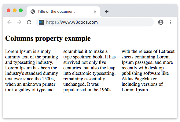
In the next example each column is at least 50px wide, and the number of columns is capped at 5. Because the columns are narrow, the browser can fit up to all 5 of them in a wide container — and fewer as it shrinks:
Example with a smaller width and a higher column cap
Example of CSS columns Property with column-width and column-count properties as a value
<!DOCTYPE html>
<html>
  <head>
    <title>Title of the document</title>
    <style>
      .example {
        columns: 50px 5;
      }
    </style>
  </head>
  <body>
    <h2>Columns property example</h2>
    <div class="example">
      Lorem Ipsum is dummy text of the printing and typesetting industry. Lorem Ipsum has been the industry's standard dummy text ever since the 1500s when an unknown printer took a galley of type and scrambled it to make a type specimen book. It has survived not only five centuries, but also the leap into electronic typesetting, remaining essentially unchanged. It was popularised in the 1960s with the release of Letraset sheets containing Lorem Ipsum passages, and more recently with desktop publishing software like Aldus PageMaker including versions of Lorem Ipsum.
    </div>
  </body>
</html>Values
| Value | Description |
|---|---|
auto | Both column-width and column-count are set to auto. This is the default. |
<length> | Sets the minimum width for columns. |
<integer> | Sets the maximum number of columns. |
initial | Sets the property to its default value. |
inherit | Inherits the property from its parent element. |
Common gotchas
- It is a suggestion, not a command.
column-widthis a minimum, so the rendered width is almost always larger than the value you give. To pin an exact width you have to control the container size as well. - Columns are balanced, not filled top-down. By default the browser tries to make all columns roughly the same height rather than filling the first one before starting the next.
- Watch out for breaks. Long words or unbreakable elements can overflow a narrow column;
break-inside: avoidhelps keep things like cards intact. - Only
column-widthanimates. The column count snaps between integers, so transitions on it are not smooth.