CSS stroke-dashoffset Property
How to use the stroke-dashoffset CSS property to specify where the dash of the stroke should begin. Read about the property and see the values with examples.
The stroke-dashoffset property defines the distance along an SVG path at which the dash pattern of a stroke begins. It works hand in hand with stroke-dasharray, which sets the lengths of the dashes and gaps. stroke-dasharray decides what the pattern looks like; stroke-dashoffset decides where along the path that pattern starts.
This page explains how the offset shifts the dash pattern, why animating it produces the popular "self-drawing line" effect, and the values it accepts.
stroke-dashoffset can be set two ways: as a presentation attribute on the SVG element (stroke-dashoffset="5") or as a CSS property (stroke-dashoffset: 5;). When both are present, the CSS rule wins over the presentation attribute, and an inline style declaration wins over both.
How the offset works
Imagine the dash pattern as a ruler laid along the path. stroke-dashoffset slides that ruler forward or backward before the path is painted:
- A positive value shifts the pattern backward along the path (the dash that was just before the start moves into view).
- A negative value shifts the pattern forward.
- The offset wraps around the total length of one dash-and-gap cycle, so an offset equal to the cycle length looks identical to
0.
Because the value is just a distance, the units (px, em) are optional in SVG user space — a bare number is interpreted in user units.
The stroke-dashoffset property can be used as both a CSS property and a presentation attribute. It can be applied to any element but can have an effect only on the following elements: <altGlyph>, <circle>, <ellipse>, <path>, <line>, <polygon>, <polyline>, <rect>, <text>, <textPath>, <tref>, and <tspan>.
"Px" or "em" units are not required.
| Initial Value | 0 |
|---|---|
| Applies to | Shapes and text content elements. |
| Inherited | Yes. |
| Animatable | Yes. |
| Version | SVG 1.1 Specification |
| DOM Syntax | Object.strokeDashoffset = 5; |
Syntax
CSS stroke-dashoffset syntax
stroke-dashoffset: length | percentage | initial | inherit;Example of the stroke-dashoffset property:
The stroke-dashoffset value shifts the starting point of the dash pattern along the path.
CSS stroke-dashoffset code example
<!DOCTYPE html>
<html>
  <head>
    <title>Title of the document</title>
  </head>
  <body>
    <h2>Stroke-dashoffset property example</h2>
    <svg viewBox="-3 0 33 10" >
      <line x1="0" y1="1" x2="30" y2="1" stroke="#1c87c9" />
      <line x1="0" y1="3" x2="30" y2="3" stroke="#ccc"
        stroke-dasharray="4 1" />
      <line x1="0" y1="5" x2="30" y2="5" stroke="#8ebf42"
        stroke-dasharray="3 1"
        stroke-dashoffset="3" />
      <line x1="0" y1="7" x2="30" y2="7" stroke="#FF0000"
        stroke-dasharray="3 1"
        stroke-dashoffset="-3" />
      <line x1="0" y1="9" x2="30" y2="9" stroke="#666"
        stroke-dasharray="3 1"
        stroke-dashoffset="1" />
      <path d="M0,5 h-3 M0,7 h3 M0,9 h-1" stroke="#000"/>
    </svg>
  </body>
</html>Result
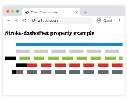
Each line above uses the same stroke-dasharray but a different offset, so the dashes line up at different starting points. The <path> of small tick marks shows exactly where each pattern begins.
The "self-drawing line" animation
The most common reason to use stroke-dashoffset is to animate an SVG so it appears to draw itself. The trick is to set both the dash array and the offset to the path's total length: this makes the whole stroke one giant gap (invisible). Animating the offset back to 0 slides the single dash into view, drawing the line from start to finish.
<!DOCTYPE html>
<html>
  <head>
    <style>
      .draw {
        fill: none;
        stroke: #1c87c9;
        stroke-width: 4;
        /* One dash and one gap, each as long as the path */
        stroke-dasharray: 300;
        stroke-dashoffset: 300;
        animation: draw 2s ease forwards;
      }
      @keyframes draw {
        to {
          stroke-dashoffset: 0;
        }
      }
    </style>
  </head>
  <body>
    <h2>Self-drawing line</h2>
    <svg viewBox="0 0 110 110" width="160">
      <path class="draw" d="M5,55 C5,5 105,5 105,55 S5,105 5,55" />
    </svg>
  </body>
</html>To make this exact for any shape, read the path length in JavaScript with path.getTotalLength() and use it for both stroke-dasharray and the starting stroke-dashoffset.
Common gotchas
- The pattern doesn't move at all.
stroke-dashoffsetonly does something when astroke-dasharrayis also set. With no dashes there is nothing to offset. - No visible stroke. The element needs a
strokecolor and a non-zerostroke-width; the offset has no effect on a stroke you cannot see. - The draw animation only "half draws". Make sure both
stroke-dasharrayand the initialstroke-dashoffsetare at least as long asgetTotalLength(); if they are shorter, the gap is too small to hide the whole path.
Values
| Value | Description |
|---|---|
| length | Sets the length of the property. "Px" or "em" units are not required. |
| percentage | The property is specified by percentage. |
| initial | Makes the property use its default value. |
| inherit | Inherits the property from its parents element. |