CSS column-rule-style Property
The column-rule-style CSS property sets the style of rule between columns. Learn the values illustrated with examples.
The CSS column-rule-style property sets the style of the line (rule) drawn between the columns of a multi-column layout. The column rule works just like a border: it sits in the column-gap and visually separates adjacent columns, and it accepts the same set of line styles a border does.
This property is one of the CSS3 properties.
column-rule-style is one of three sub-properties that make up the column-rule shorthand, alongside column-rule-width and column-rule-color. On its own it only controls the shape of the line — you generally combine all three to get a visible result.
When to use it
Reach for column-rule-style whenever you split flowing text into multiple columns and want a visible divider — like a newspaper or magazine layout. Because the rule lives inside the gap, it takes up no extra space and never pushes content apart, so it is a clean way to separate columns without changing the layout width.
To use this property you must first turn an element into a multi-column container with the columns or column-count properties — the rule has nothing to draw between if there is only one column.
Things to watch out for
- The rule is invisible by default because the initial style is
none. Even after setting a style, a rule will not render unless column-rule-width is greater than0(the default width ismedium, which is usually visible). - The 3D styles —
groove,ridge,inset, andoutset— depend on the rule color. With a very light ortransparentcolor the 3D effect can be hard to see; set column-rule-color explicitly. hiddenandnoneboth draw nothing, buthiddenstill reserves a width in the gap, whilenonecollapses to zero width — the difference only matters when other rule styles meet it.
The column-rule-style property has the following values:
- none
- hidden
- dotted
- dashed
- solid
- double
- groove
- ridge
- inset
- outset
| Initial Value | none |
|---|---|
| Applies to | Multicol elements. |
| Inherited | No. |
| Animatable | No. |
| Version | CSS3 |
| DOM Syntax | object.style.columnRuleStyle = "dashed" ; |
Syntax
Syntax of CSS column-rule-style Property
column-rule-style: none | hidden | dotted | dashed | solid | double | groove | ridge | inset | outset | initial | inherit;Example of the column-rule-style property:
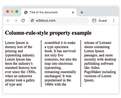
Example of CSS column-rule-style Property with dotted value
<!DOCTYPE html>
<html>
  <head>
    <title>Title of the document</title>
    <style>
      div {
        column-count: 3;
        column-gap: 30px;
        column-rule-style: dotted;
      }
    </style>
  </head>
  <body>
    <h2>Column-rule-style property example</h2>
    <div>
      Lorem Ipsum is dummy text of the printing and typesetting industry. Lorem Ipsum has been the industry's standard dummy text ever since the 1500s, when an unknown printer took a galley of type and scrambled it to make a type specimen book. It has survived not only five centuries, but also the leap into electronic typesetting, remaining essentially unchanged. It was popularised in the 1960s with the release of Letraset sheets containing Lorem Ipsum passages, and more recently with desktop publishing software like Aldus PageMaker including versions of Lorem Ipsum.
    </div>
  </body>
</html>Result
In the next example the rule between columns is double. Here the rule is given a color with the column-rule-color property and an explicit thickness with column-rule-width, so the double line is clearly visible.
Example of the column-rule-style property with the "double" value:
Example of CSS column-rule-style Property with double value
<!DOCTYPE html>
<html>
  <head>
    <title>Title of the document</title>
    <style>
      div {
        column-count: 3;
        column-gap: 30px;
        column-rule-style: double;
        column-rule-color: #1c87c9;
        column-rule-width: 5px;
        text-align: justify;
      }
    </style>
  </head>
  <body>
    <h1>Column-rule-style property example</h1>
    <div>
      Lorem Ipsum is dummy text of the printing and typesetting industry. Lorem Ipsum has been the industry's standard dummy text ever since the 1500s, when an unknown printer took a galley of type and scrambled it to make a type specimen book. It has survived not only five centuries, but also the leap into electronic typesetting, remaining essentially unchanged. It was popularised in the 1960s with the release of Letraset sheets containing Lorem Ipsum passages, and more recently with desktop publishing software like Aldus PageMaker including versions of Lorem Ipsum.
    </div>
  </body>
</html>Values
| Value | Description |
|---|---|
| none | No rule is defined. This is the default value. |
| hidden | Rule is hidden. |
| dotted | Rule is dotted. |
| dashed | Rule is dashed. |
| solid | Rule is solid. |
| double | Rule is double. |
| groove | Rule is 3D groove. Width and color values define the effect. |
| ridge | Rule is 3D ridge. Width and color values define the effect. |
| inset | Rule is 3D inset. Width and color values define the effect. |
| outset | Rule is 3D outset. Width and color values define the effect. |
| initial | Sets the property to its default value. |
| inherit | Inherits the property from its parent element. |
Related properties
- column-rule — shorthand that sets width, style, and color at once.
- column-rule-width — thickness of the rule.
- column-rule-color — color of the rule.
- column-gap — the gap the rule is drawn inside of.
- column-count and columns — create the multi-column layout in the first place.