CSS grid-row-start Property
Use the grid-row-start property to specify on which row to start displaying the item. See property description, values and examples.
The CSS grid-row-start property sets which grid row line a grid item starts on. In other words, it specifies the block-start line (the top edge in a left-to-right horizontal layout) of the item's grid area. You can give it a line number, a named line, or a span keyword that makes the item stretch across several rows.
This property only takes effect on grid items — direct children of an element whose display is grid or inline-grid. On any other element it is ignored. It is the longhand for the start side of the grid-row shorthand, and it pairs with grid-row-end to define the full vertical span. For horizontal placement, see the matching grid-column-start property.
This page covers the syntax of grid-row-start, each accepted value, worked examples (line numbers and span), and the gotchas to watch for.
| Initial Value | auto |
|---|---|
| Applies to | Grid items. |
| Inherited | No. |
| Animatable | Yes. The placement of items is animatable. |
| Version | CSS Grid Layout Module Level 1 |
| DOM Syntax | object.style.gridRowStart = "5"; |
Syntax
CSS grid-row-start syntax
grid-row-start: auto | <line> | span <number> | initial | inherit;Note: <line> is a placeholder for a line number or a custom line name.
Example of the grid-row-start property:
CSS grid-row-start code example
<!DOCTYPE html>
<html>
  <head>
    <title>Title of the document</title>
    <style>
      .grid-container {
        display: grid;
        grid-template-columns: auto auto auto auto;
        gap: 20px;
        background-color: #ccc;
        padding: 10px;
      }
      .grid-container > div {
        background-color: #eee;
        text-align: center;
        padding: 30px 0;
        font-size: 30px;
      }
      .box {
        grid-row-start: auto;
      }
    </style>
  </head>
  <body>
    <h2>Grid-row-start property example</h2>
    <div class="grid-container">
      <div>1</div>
      <div>2</div>
      <div class="box">3</div>
      <div>4</div>
      <div>5</div>
      <div>6</div>
    </div>
  </body>
</html>Result
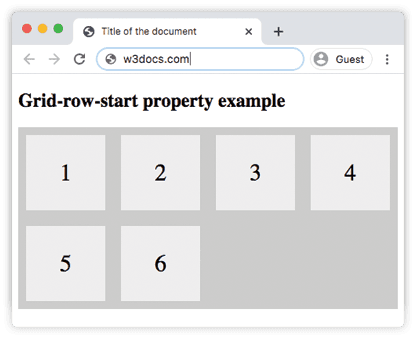
With grid-row-start: auto, box 3 simply takes its natural slot in the grid flow — auto lets the grid's auto-placement algorithm decide where the item goes.
Example of the grid-row-start property, where the third box starts from the first row:
CSS grid-row-start first row example
<!DOCTYPE html>
<html>
  <head>
    <title>Title of the document</title>
    <style>
      .grid-container {
        display: grid;
        grid-template-columns: auto auto auto auto;
        gap: 20px;
        background-color: #ccc;
        padding: 10px;
      }
      .grid-container > div {
        background-color: #eee;
        text-align: center;
        padding: 30px 0;
        font-size: 30px;
      }
      .box {
        grid-row-start: 1;
      }
    </style>
  </head>
  <body>
    <h2>Grid-row-start property example</h2>
    <div class="grid-container">
      <div>1</div>
      <div>2</div>
      <div class="box">3</div>
      <div>4</div>
      <div>5</div>
      <div>6</div>
    </div>
  </body>
</html>Setting grid-row-start: 1 pins box 3 to grid row line 1, so it starts at the very top row regardless of its source order.
Example of the grid-row-start property, where the fourth box starts from the second row:
CSS grid-row-start second row example
<!DOCTYPE html>
<html>
  <head>
    <title>Title of the document</title>
    <style>
      .grid-container {
        display: grid;
        grid-template-columns: auto auto auto auto;
        gap: 20px;
        background-color: #ccc;
        padding: 10px;
      }
      .grid-container > div {
        background-color: #eee;
        text-align: center;
        padding: 30px 0;
        font-size: 30px;
      }
      .box {
        grid-row-start: 2;
      }
    </style>
  </head>
  <body>
    <h2>Grid-row-start property example</h2>
    <div class="grid-container">
      <div>1</div>
      <div>2</div>
      <div>3</div>
      <div class="box">4</div>
      <div>5</div>
      <div>6</div>
    </div>
  </body>
</html>Example of the grid-row-start property with the span keyword:
CSS grid-row-start span example
<!DOCTYPE html>
<html>
  <head>
    <title>Title of the document</title>
    <style>
      .grid-container {
        display: grid;
        grid-template-columns: auto auto auto auto;
        gap: 20px;
        background-color: #ccc;
        padding: 10px;
      }
      .grid-container > div {
        background-color: #eee;
        text-align: center;
        padding: 30px 0;
        font-size: 30px;
      }
      .box {
        grid-row-start: span 2;
      }
    </style>
  </head>
  <body>
    <h2>Grid-row-start property example with span</h2>
    <div class="grid-container">
      <div>1</div>
      <div>2</div>
      <div class="box">3</div>
      <div>4</div>
      <div>5</div>
      <div>6</div>
    </div>
  </body>
</html>With span 2, box 3 stretches across two rows starting from its natural start line, pushing the items that follow into the next available cells. Use span when you care about how many rows an item should cover rather than which exact line it should start on.
Example of the initial and inherit values:
CSS grid-row-start initial/inherit example
.box-initial {
  grid-row-start: initial; /* Resets to the default 'auto' behavior */
}
.box-inherit {
  grid-row-start: inherit; /* Inherits the value from the parent grid item */
}Note:
initialis typically used to reset the property to its default behavior, whileinheritis useful when a child grid item needs to match the placement behavior of its parent.
Values
| Value | Description | Play it |
|---|---|---|
| auto | Spans one row. Exact placement depends on grid auto-placement rules. This is the default value of this property. | Play it » |
<line> | Specifies a line number or name where the item should start. | Play it » |
| initial | Makes the property use its default value. | |
| inherit | Inherits the property from its parent element. |
Note: When combined with
grid-row-end, ensure the start line is before the end line to prevent overlapping or collapsed grid items.
Tips and common pitfalls
- Negative line numbers count from the end.
grid-row-start: -1refers to the last row line, which is handy for anchoring an item to the bottom of an explicitly sized grid. autois not the same as1.autohands placement to the grid's auto-placement algorithm, while1always pins the item to the first row line.- Explicitly placed items can leave gaps. Pinning an item to a specific line can push other items around and create empty cells, depending on
grid-auto-flow. - Set the matching end line for clarity. When you control the start with
grid-row-start, also setting grid-row-end (or using the grid-row shorthand) makes the item's span explicit and easier to maintain.
Browser support
grid-row-start is part of CSS Grid Layout and is supported in all modern browsers — Chrome, Firefox, Safari, and Edge.
Related properties
- grid-row — shorthand for
grid-row-startandgrid-row-end. - grid-row-end — sets the end (block-end) line of the item.
- grid-column-start — the horizontal counterpart of this property.
- grid-template-rows — defines the rows (and named lines) that
grid-row-startrefers to.