CSS transform Property
How to use the transform CSS property to transform the element in 2D and 3D space. See transform functions and try examples.
The CSS transform property lets you visually reposition, resize, rotate, or distort an element without affecting the surrounding layout. It is one of the CSS3 properties, and it accepts either the none keyword or one or more transform functions — for example rotate(), scale(), translate(), or skew().
A key thing to understand: a transform changes how an element is painted, but the space it originally occupied in the document flow stays the same. Neighboring elements do not reflow when you transform an element, which is exactly why transforms are cheap to animate — the browser can offload them to the GPU.
This page covers the syntax, the full set of 2D and 3D transform functions, how the point an element transforms around (transform-origin) affects the result, and how transforms pair with transitions and animations for motion.
Transforms apply to transformable elements — block, flex, grid, and inline-block boxes, plus SVG elements. They do not apply to non-replaced inline elements such as a bare <span> (give it display: inline-block first).
You can chain several functions in one declaration. They are applied right to left, so the rightmost function runs first:
/* first rotate, then translate the rotated box */
transform: translate(10px, 40px) rotate(50deg);| Initial Value | none |
|---|---|
| Applies to | Transformable elements. |
| Inherited | No. |
| Animatable | Yes. |
| Version | CSS3 |
| DOM Syntax | Object.style.transform = "rotate(10deg)"; |
Syntax
CSS transform values
transform: none | transform-functions | initial | inherit;Example of the transform property:
CSS transform code example
<!DOCTYPE html>
<html>
  <head>
    <title>Title of the document</title>
    <style>
      div {
        border: 2px dashed #666;
        background-color: #8ebf42;
        transform: translate(10px, 40px) rotate(50deg);
        width: 130px;
        height: 80px;
      }
    </style>
  </head>
  <body>
    <h2>Transform property example</h2>
    <div>An element</div>
  </body>
</html>Result
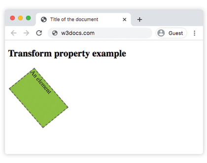
Example with several transform functions
CSS transform several values example
<!DOCTYPE html>
<html>
  <head>
    <title>Title of the document</title>
    <style>
      div {
        margin: 35px 20px;
      }
      div.box1 {
        width: 130px;
        height: 80px;
        border: 1px solid #000;
        background-color: #1c87c9;
        transform: rotate(30deg);
      }
      div.box2 {
        width: 120px;
        height: 80px;
        border: 1px solid #000;
        background-color: #8ebf42;
        transform: skewY(30deg);
      }
      div.box3 {
        width: 160px;
        height: 80px;
        border: 1px solid #000;
        background-color: #FFFF00;
        transform: scaleY(1.5);
      }
      div.box4 {
        width: 160px;
        height: 80px;
        border: 1px solid #000;
        background-color: #ccc;
        transform: rotate(160deg);
      }
      div.box5 {
        width: 160px;
        height: 80px;
        border: 1px solid #000;
        background-color: #990099;
        transform: translateX(50px);
      }
      div.box6 {
        width: 160px;
        height: 80px;
        border: 1px solid #000;
        background-color: #FF0000;
        transform: skew(170deg, 170deg);
      }
    </style>
  </head>
  <body>
    <h2>Transform property example</h2>
    <h3>transform: rotate(30deg):</h3>
    <div class="box1"></div>
    <h3>transform: skewY(30deg):</h3>
    <div class="box2"></div>
    <h3>transform: scaleY(1.5):</h3>
    <div class="box3"></div>
    <h3>transform: rotate(160deg):</h3>
    <div class="box4"></div>
    <h3>transform: translateX(50px):</h3>
    <div class="box5"></div>
    <h3>transform: skew(170deg,170deg):</h3>
    <div class="box6"></div>
  </body>
</html>Transform functions
translate()
translate(tx, ty) moves an element sideways and up/down without affecting other elements. tx is the horizontal shift, ty the vertical one; a positive ty moves the element down. Use translateX() or translateY() for a single axis. Because it does not trigger layout, translate() is the preferred way to move an element in animations:
transform: translate(50px, 20px); /* right 50px, down 20px */
transform: translateX(-30px); /* left 30px */scale()
scale(x, y) resizes an element relative to its current size. 1 keeps it unchanged, 2 doubles it, 0.5 halves it, and a negative value mirrors it. Pass one argument to scale both axes equally:
transform: scale(1.5);   /* 150% in both directions */
transform: scale(2, 0.5);/* twice as wide, half as tall */rotate()
rotate(angle) spins an element around its origin. A positive angle rotates clockwise, a negative angle counter-clockwise. The angle is given in deg, rad, grad, or turn:
transform: rotate(45deg);
transform: rotate(-0.25turn); /* same as rotate(-90deg) */skew()
skew(ax, ay) tilts (slants) an element along the x- and y-axes. skewX() and skewY() skew along a single axis. A 0deg skew leaves the axis untouched:
transform: skewX(20deg);
transform: skew(20deg, 10deg);matrix()
matrix(a, b, c, d, e, f) combines every 2D transform — scale, skew, rotate, and translate — into a single function. You rarely write it by hand; browsers compute it internally, and it is the form you see when reading a computed style.
transform-origin
By default every transform pivots around the center of the element. The transform-origin property changes that anchor point, which dramatically changes the result of a rotate() or scale(). For example, transform-origin: top left makes rotate(45deg) swing the element around its top-left corner instead of its middle.
2D vs 3D transforms
The functions above operate in the 2D plane. Their 3D counterparts — translateZ(), rotateX(), rotateY(), rotate3d(), and so on — move and rotate elements through the z-axis (toward or away from the viewer). 3D transforms only look three-dimensional when a perspective is applied to the element or its parent; without perspective, a rotateY() simply appears to squash the element horizontally.
Animating transforms
The transform property is animatable, so it is the workhorse of smooth UI motion. Combine it with a transition for hover effects, or with an animation and keyframes for continuous movement:
.card {
  transition: transform 0.3s ease;
}
.card:hover {
  transform: scale(1.05) translateY(-4px);
}Values
| Value | Description | Play it |
|---|---|---|
| none | No transform is applied. | Play it » |
| translate() | Translates the element by a vector [tx, ty]. Tx is the translation along the x-axis. Ty is the translation along the y-axis. | Play it » |
| translateX() | Translates the element along the x-axis. | Play it » |
| translateY() | Translates the element along the y-axis. | Play it » |
| scale(x, y) | Scales an element up or down. | Play it » |
| scaleX() | Scales an element along the x-axis. | Play it » |
| scaleY() | Scales an element along the y-axis. | Play it » |
| rotate(angle) | Rotates an element in two-dimensional space. The angle is specified in the parameter. | Play it » |
| skew() | Defines a 2D skew transformation along the x-axis and the y-axis. | Play it » |
| skewX() | Defines a 2D skew transformation along the x-axis. | Play it » |
| skewY() | Defines a 2D skew transformation along the y-axis. | Play it » |
| matrix() | Defines a 2D transformation, using a matrix of six values. | Play it » |
| translateZ() | Translates an element by the given amount along the z-axis. | |
| translate3d() | Defines a three dimensional translation. | |
| scaleZ() | Scales an element in the third dimension, along the z-axis. | |
| scale3d() | Defines a three dimensional scale transformation. | |
| rotateX() | Rotates an element about the x-axis in three-dimensional space. | Play it » |
| rotateY() | Rotates an element about the y-axis in three-dimensional space. | Play it » |
| rotateZ() | Rotates an element about the z-axis in three-dimensional space. | Play it » |
| rotate3d() | Defines a three dimensional rotate transformation. | |
| matrix3d() | Defines a 3D transformation, using a 4x4 matrix of 16 values. | |
| perspective() | Defines a perspective view for the three dimensional element. | |
| initial | Makes the property use its default value. | |
| inherit | Inherits the property from its parent element. |