CSS column-rule-width Property
The CSS column-rule-width property sets the thickness of the rule drawn between multi-column layout columns, with examples.
The CSS column-rule-width property sets the thickness of the rule (the dividing line) that is drawn between the columns of a multi-column layout. It works just like a border width — but instead of surrounding a box, the rule sits in the gap between columns. It is one of the CSS3 properties.
On its own, column-rule-width does nothing visible. The rule only appears when column-rule-style is set to something other than none (the initial value), because a line with no style has nothing to draw. You also need more than one column — the rule is only painted in gaps that actually separate columns, and never in the empty space left when the content doesn't fill every column.
This property accepts one of the following:
thin— a thin rule.medium— a medium rule. This is the initial value.thick— a thick rule.<length>— an explicit width such as2pxor0.2em. Percentages and negative values are not allowed.
The specification deliberately leaves the exact pixel thickness of thin, medium, and thick up to the browser. It only guarantees the ordering: thin ≤ medium ≤ thick. When you need a predictable result across browsers, use a <length>.
In most stylesheets you will set the width, style, and color together with the column-rule shorthand instead of writing three separate declarations:
/* These two rules are equivalent */
column-rule: 15px groove #1c87c9;

column-rule-width: 15px;
column-rule-style: groove;
column-rule-color: #1c87c9;| Initial Value | medium |
|---|---|
| Applies to | Multicol elements. |
| Inherited | No. |
| Animatable | Yes. The width and color of the rule are animatable. |
| Version | CSS3 |
| DOM Syntax | object.style.columnRuleWidth = "5px"; |
Syntax
Syntax of CSS column-rule-width Property
column-rule-width: medium | thin | thick | length | initial | inherit;Example of the column-rule-width property:
Example of CSS column-rule-width Property with thick value
<!DOCTYPE html>
<html>
  <head>
    <title>Title of the document</title>
    <style>
      div {
        column-count: 3;
        column-gap: 40px;
        column-rule-style: dotted;
        column-rule-color: #666;
        column-rule-width: thick;
        text-align: justify;
      }
    </style>
  </head>
  <body>
    <h1>Column-rule-width property example</h1>
    <div>
      Lorem Ipsum is dummy text of the printing and typesetting industry. Lorem Ipsum has been the industry's standard dummy text ever since the 1500s, when an unknown printer took a galley of type and scrambled it to make a type specimen book. It has survived not only five centuries, but also the leap into electronic typesetting, remaining essentially unchanged. It was popularised in the 1960s with the release of Letraset sheets containing Lorem Ipsum passages, and more recently with desktop publishing software like Aldus PageMaker including versions of Lorem Ipsum.
    </div>
  </body>
</html>Result
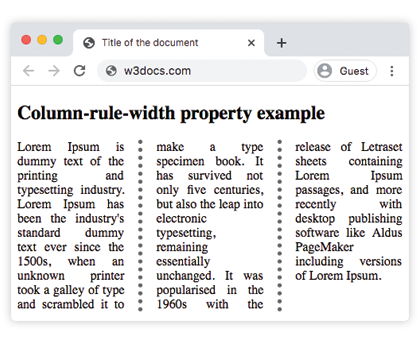
Example of the column-rule-width property with the "thin" value:
Example of CSS column-rule-width Property with thin value
<!DOCTYPE html>
<html>
  <head>
    <title>Title of the document</title>
    <style>
      div {
        column-count: 3;
        column-gap: 40px;
        column-rule-style: solid;
        column-rule-width: thin;
        text-align: justify;
      }
    </style>
  </head>
  <body>
    <h1>Column-rule-width property example</h1>
    <div>
      Lorem Ipsum is dummy text of the printing and typesetting industry. Lorem Ipsum has been the industry's standard dummy text ever since the 1500s, when an unknown printer took a galley of type and scrambled it to make a type specimen book. It has survived not only five centuries, but also the leap into electronic typesetting, remaining essentially unchanged. It was popularised in the 1960s with the release of Letraset sheets containing Lorem Ipsum passages, and more recently with desktop publishing software like Aldus PageMaker including versions of Lorem Ipsum.
    </div>
  </body>
</html>Example of the column-rule-width property specified as "15px":
Example of CSS column-rule-width Property with length value
<!DOCTYPE html>
<html>
  <head>
    <title>Title of the document</title>
    <style>
      div {
        column-count: 3;
        column-gap: 40px;
        column-rule-style: groove;
        column-rule-color: #1c87c9;
        column-rule-width: 15px;
        text-align: justify;
      }
    </style>
  </head>
  <body>
    <h1>Column-rule-width property example</h1>
    <div>
      Lorem Ipsum is dummy text of the printing and typesetting industry. Lorem Ipsum has been the industry's standard dummy text ever since the 1500s when an unknown printer took a galley of type and scrambled it to make a type specimen book. It has survived not only five centuries, but also the leap into electronic typesetting, remaining essentially unchanged. It was popularised in the 1960s with the release of Letraset sheets containing Lorem Ipsum passages, and more recently with desktop publishing software like Aldus PageMaker including versions of Lorem Ipsum.
    </div>
  </body>
</html>Values
| Value | Description | Play it |
|---|---|---|
| medium | The rule is medium. This is the default value. | |
| thick | The rule is thick. | |
| thin | The rule is thin. | |
| length | Specifies the width of the rule. | |
| initial | Sets the property to its default value. | |
| inherit | Inherits the property from its parent element. |
Things to keep in mind
- The rule does not take up layout space. Like a box-shadow, the rule is painted inside the
column-gap. A rule that is wider than the gap will overlap the column content rather than push the columns apart, so make sure the gap is wide enough for the width you choose. - No rule without a style. If
column-rule-styleisnone(or unset), changing the width has no visible effect at all. This is the most common reason a rule "doesn't show up". - Lengths only — no percentages. Unlike many CSS sizes,
column-rule-widthrejects percentage and negative values; an invalid value makes the whole declaration ignored. - It is animatable. Transitioning the width produces a smooth thickening or thinning of the divider.
Related properties
The multi-column rule is controlled by a small family of properties that you will usually use together:
column-rule— the shorthand for width, style, and color.column-rule-style— the line style; required for the width to show.column-rule-color— the color of the rule.column-countandcolumn-gap— define how many columns there are and the space the rule lives in.