CSS background-origin Property
The CSS background-origin property specifies the the background positioning area of a background image. See an example and try it yourself.
The CSS background-origin property specifies the background positioning area — the box from which a background-image is positioned and starts to draw.
Every element is built from three nested boxes: the content box (where text and child elements live), the padding box (content plus padding), and the border box (padding box plus the border). The background-origin value picks which of these boxes acts as the origin point (the upper-left corner) for the image, and which area the background-position is measured against.
By default a background image is positioned relative to the padding box, so it sits behind the padding but stays under the border. Switching to content-box pulls the image inside the padding; switching to border-box lets it extend under the border. Use it when you want a background image to align precisely with the content, or to deliberately tuck it beneath (or out from under) the border.
Don't confuse it with background-clip.
background-origindecides where the image starts;background-clipdecides where the painted background is cut off (clipped). They take the same keywords but answer different questions, and they are often used together.
The background-origin property has no effect on a fixed background: if background-attachment is fixed, the image is positioned relative to the viewport and background-origin is ignored. It is one of the CSS3 properties.
| Initial Value | padding-box |
|---|---|
| Applies to | All elements. It also applies to ::first-letter and ::first-line. |
| Inherited | No. |
| Animatable | No. |
| Version | CSS3 |
| DOM Syntax | object.style.backgroundOrigin = "content-box"; |
Syntax
Syntax of CSS background-origin Property
background-origin: padding-box | border-box | content-box | initial | inherit;Example of the background-origin property:
Example of CSS background-origin Property with padding-box value
<!DOCTYPE html>
<html>
  <head>
    <title>The title of the document</title>
    <style>
      .example1 {
        border: 5px dashed #666;
        padding: 35px;
        background: url("/uploads/media/default/0001/01/25acddb3da54207bc6beb5838f65f022feaa81d7.jpeg");
        background-repeat: no-repeat;
        background-origin: padding-box;
      }
    </style>
  </head>
  <body>
    <h2>Background-origin property example</h2>
    <p>Here the background-origin is set to "padding-box".</p>
    <div class="example1">
      <h2>Hello world.</h2>
      <p> Some text for example.</p>
    </div>
  </body>
</html>Result
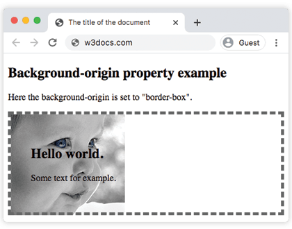
Here is an example showing the difference between padding-box and content-box.
Example of the background-origin property with the "padding-box" and "content-box" values:
Example of CSS background-origin Property with padding-box and content-box values
<!DOCTYPE html>
<html>
  <head>
    <title>The title of the document</title>
    <style>
      .example1 {
        border: 5px dashed #666;
        padding: 35px;
        background: url("/uploads/media/default/0001/01/b408569013c0bb32b2afb0f0d45e93e982347951.jpeg");
        background-repeat: no-repeat;
        background-origin: padding-box;
      }
      .example2 {
        border: 5px dashed #666;
        padding: 35px;
        background: url("/uploads/media/default/0001/01/b408569013c0bb32b2afb0f0d45e93e982347951.jpeg");
        background-repeat: no-repeat;
        background-origin: content-box;
      }
    </style>
  </head>
  <body>
    <h2>Background-origin property example</h2>
    <p>Here the background-origin is set to "padding-box" which is the default value of this property.</p>
    <div class="example1">
      <h2>Hello  world</h2>
      <p> Some text for example.</p>
    </div>
    <p>Here the background-origin is set to "content-box".</p>
    <div class="example2">
      <h2>Hello  world</h2>
      <p> Some text for example.</p>
    </div>
  </body>
</html>In the example below, see how to set two background images for a div element with different values.
Example of the background-origin property with different values:
Example of CSS background-origin Property with content-box and border-box values
<!DOCTYPE html>
<html>
  <head>
    <title>The title of the document</title>
    <style>
      #example1 {
        border: 5px double black;
        padding: 25px;
        background: url("/uploads/media/default/0001/02/55a2f152f59bf42a99b576d44a4578ec9daa0ab6.png"), url("/uploads/media/default/0001/02/aa55a168be25d7d121dcab8d67ad72ce021dcde3.png");
        background-repeat: no-repeat;
        background-origin: content-box, border-box;
      }
      #example2 {
        border: 5px double black;
        padding: 25px;
        background: url("/uploads/media/default/0001/02/55a2f152f59bf42a99b576d44a4578ec9daa0ab6.png"), url("/uploads/media/default/0001/02/aa55a168be25d7d121dcab8d67ad72ce021dcde3.png");
        background-repeat: no-repeat;
        background-origin: content-box, padding-box;
      }
      #example3 {
        border: 5px double black;
        padding: 25px;
        background: url("/uploads/media/default/0001/02/55a2f152f59bf42a99b576d44a4578ec9daa0ab6.png"), url("/uploads/media/default/0001/02/aa55a168be25d7d121dcab8d67ad72ce021dcde3.png");
        background-repeat: no-repeat;
        background-origin: content-box, content-box;
      }
    </style>
  </head>
  <body>
    <h2>Background-origin property example</h2>
    <p>Here the background-origin: content-box, border-box; is set:</p>
    <div id="example1">
      <h2>Hello World</h2>
      <p>The first background-image starts from the upper left corner of the content.</p>
      <p>The second background-image starts from the upper left corner of the border.</p>
    </div>
    <p>Here the background-origin: content-box, padding-box:</p>
    <div id="example2">
      <h2>Hello World</h2>
      <p>The first background image starts from the upper left corner of the content.</p>
      <p>The second background-image starts from the upper left corner of the padding edge.</p>
    </div>
    <p>Here the background-origin: content-box, content-box; is set:</p>
    <div id="example3">
      <h2>Hello World</h2>
      <p>Both background images start from the upper left corner of the content.</p>
    </div>
  </body>
</html>Multiple backgrounds
When an element has several comma-separated background images, you can give a different origin to each one — the values map to the images in order. In the example above, background-origin: content-box, border-box; applies content-box to the first image and border-box to the second. If you supply fewer values than images, CSS repeats the list to fill the remaining images.
Tips and gotchas
- No effect without a background image.
background-originonly changes where an image starts; it does nothing to a flat background color. To control where a color is painted, use background-clip instead. - It needs space to be visible. With zero
paddingand noborder, the content box, padding box, and border box coincide, so all three values look identical. The effect only shows once the element has padding and/or a border. fixedoverrides it. As noted above,background-attachment: fixedmakes the image position relative to the viewport, which disablesbackground-origin.- Pair it with background-clip. A common pattern is
background-origin: border-box; background-clip: padding-box;— the image is laid out from the border but trimmed at the padding edge.
Browser support
background-origin is supported in all modern browsers — Chrome, Firefox, Safari, Edge, and Opera. No vendor prefix is required for current versions.
Values
| Value | Description | Play it |
|---|---|---|
| border-box | The background-position is relative to the border box and background-image starts from the upper left corner of the border. | Play it » |
| padding-box | The background-position is relative to the padding box and background-image starts from the upper left corner of the padding edge. This is the default value. | Play it » |
| content-box | The background-position is relative to the content box and background-image starts from the upper left corner of the content. | Play it » |
| initial | Sets the property to its default value. | Play it » |
| inherit | Inherits the property from its parent element. |