CSS column-span Property
The column-span CSS property defines how to span the element across one column or all columns. Learn about values and see examples.
The CSS column-span property controls whether an element stays inside a single column of a multi-column layout or stretches across all of them. It is one of the CSS3 properties.
This page covers what column-span does, the values it accepts, runnable examples for each, when to reach for it, and the gotchas that trip people up.
What problem it solves
When you split text into multiple columns with column-count or columns, every child of the multi-column container flows column by column — including headings. A section heading that you want to act as a banner over the whole block would otherwise sit cramped inside the first column.
column-span: all lifts an element out of the column flow so it spans the full width, while content above and below it keeps flowing in columns. This is exactly how magazine and newspaper layouts handle a headline above multi-column body text.
.article {
  column-count: 3;
}
.article h2 {
  column-span: all; /* headline runs the full width above the 3 columns */
}An element can span columns only if it is a block-level, in-flow element. Floated, absolutely positioned, or inline elements ignore column-span.
| Initial Value | none |
|---|---|
| Applies to | in-flow block-level elements |
| Inherited | No. |
| Animatable | No. |
| Version | CSS Multi-column Layout Module Level 1 |
| DOM Syntax | object.style.columnSpan = "all"; (Note: CSS properties use camelCase in JavaScript) |
Syntax
Syntax of CSS column-span Property
column-span: none | all | initial | inherit;Example: none value
<!DOCTYPE html>
<html>
  <head>
    <title>Title of the document</title>
    <style>
      div {
        column-count: 4;
      }
      h2 {
        column-span: none;
      }
    </style>
  </head>
  <body>
    <div>
      <h2>Lorem Ipsum is simply dummy text</h2> Lorem Ipsum is dummy text of the printing and typesetting industry. Lorem Ipsum has been the industry's standard dummy text ever since the 1500s, when an unknown printer took a galley of type and scrambled it to make a type specimen book. It has survived not only five centuries, but also the leap into electronic typesetting, remaining essentially unchanged. It was popularised in the 1960s with the release of Letraset sheets containing Lorem Ipsum passages, and more recently with desktop publishing software like Aldus PageMaker including versions of Lorem Ipsum.
    </div>
  </body>
</html>Result
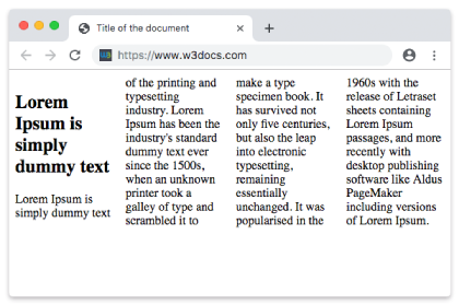
With none, the heading is treated like any other content and stays inside the first column. In the next example, the same heading spans across all four columns.
Example: all value
<!DOCTYPE html>
<html>
  <head>
    <title>Title of the document</title>
    <style>
      div {
        column-count: 4;
      }
      h2 {
        column-span: all;
      }
    </style>
  </head>
  <body>
    <div>
      <h2>Lorem Ipsum is simply dummy text</h2>
      Lorem Ipsum is dummy text of the printing and typesetting industry. Lorem Ipsum has been the industry's standard dummy text ever since the 1500s, when an unknown printer took a galley of type and scrambled it to make a type specimen book. It has survived not only five centuries, but also the leap into electronic typesetting, remaining essentially unchanged. It was popularised in the 1960s with the release of Letraset sheets containing Lorem Ipsum passages, and more recently with desktop publishing software like Aldus PageMaker including versions of Lorem Ipsum.
    </div>
  </body>
</html>Example: initial value
initial resets column-span to its default, which is none — so the heading behaves exactly like the first example and stays inside one column.
<!DOCTYPE html>
<html>
  <head>
    <title>Title of the document</title>
    <style>
      div {
        column-count: 4;
      }
      h2 {
        column-span: initial;
      }
    </style>
  </head>
  <body>
    <div>
      <h2>Lorem Ipsum is simply dummy text</h2>
      Lorem Ipsum is dummy text of the printing and typesetting industry. Lorem Ipsum has been the industry's standard dummy text ever since the 1500s, when an unknown printer took a galley of type and scrambled it to make a type specimen book. It has survived not only five centuries, but also the leap into electronic typesetting, remaining essentially unchanged. It was popularised in the 1960s with the release of Letraset sheets containing Lorem Ipsum passages, and more recently with desktop publishing software like Aldus PageMaker including versions of Lorem Ipsum.
    </div>
  </body>
</html>Example: inherit value
inherit takes the computed column-span value from the parent element. Note that column-span is not inherited by default, so you only use this keyword when you explicitly want a child to copy its parent's setting.
<!DOCTYPE html>
<html>
  <head>
    <title>Title of the document</title>
    <style>
      div {
        column-count: 4;
      }
      h2 {
        column-span: inherit;
      }
    </style>
  </head>
  <body>
    <div>
      <h2>Lorem Ipsum is simply dummy text</h2>
      Lorem Ipsum is dummy text of the printing and typesetting industry. Lorem Ipsum has been the industry's standard dummy text ever since the 1500s, when an unknown printer took a galley of type and scrambled it to make a type specimen book. It has survived not only five centuries, but also the leap into electronic typesetting, remaining essentially unchanged. It was popularised in the 1960s with the release of Letraset sheets containing Lorem Ipsum passages, and more recently with desktop publishing software like Aldus PageMaker including versions of Lorem Ipsum.
    </div>
  </body>
</html>When to use column-span
- Headlines and section titles that should sit above multi-column body text, like a newspaper masthead.
- Pull quotes or callouts you want to break the column rhythm for emphasis.
- Wide media — a full-width image, table, or chart that would look squeezed inside a single narrow column.
For everything else, leave it at the default none so content flows naturally between columns.
Things to watch out for
- Only
noneandallare spanning values. There is nocolumn-span: 2to span an arbitrary number of columns — it is all or nothing. - A spanning element splits the column box. Content before it fills the columns, then the element runs full width, then the remaining content starts a fresh set of columns below it.
column-spanworks only inside a multi-column container. Withoutcolumn-countorcolumnson the parent, the property has no effect.column-span: allcan interfere withbreak-insideand column balancing in some browsers, so test long content.
Related properties
column-count— sets how many columns the content is divided into.column-width— sets the ideal width of each column.columns— shorthand forcolumn-widthandcolumn-count.column-gap— sets the space between columns.column-rule— draws a line between columns.
Values
| Value | Description |
|---|---|
| none | This is the default value. The element does not span across all columns; it remains in one column. |
| all | The element spans across all columns. |
| initial | Sets the property to its default value (none). |
| inherit | Inherits the property from its parent element. |