CSS border-bottom-right-radius Property
CSS border-bottom-right-radius rounds the bottom-right corner of an element. Covers syntax, values, and live examples.
The border-bottom-right-radius CSS property rounds only the bottom-right corner of an element's border box. It is one of the four longhand properties — alongside border-top-left-radius, border-top-right-radius, and border-bottom-left-radius — that the border-radius shorthand bundles together. Use the longhand when you want to round a single corner and leave the rest square. It is part of the CSS3 properties.
How it works
The corner is drawn as a quarter of an ellipse defined by a horizontal radius and a vertical radius:
- One value sets both radii, producing a perfectly circular (symmetric) corner.
- Two values set the horizontal radius first and the vertical radius second, producing an elliptical corner.
- Percentages are resolved against the element's box: the horizontal radius is a percentage of the width, the vertical radius a percentage of the height.
If no value is set, the radius is 0, leaving a sharp square corner. A background color or image is clipped to the rounded corner; you can change where the clip happens with the background-clip property.
A few things to keep in mind:
- Negative values are invalid — the corner stays at
0. - The property is animatable, so corners can morph smoothly on
:hoveror via keyframes. - Browser support is universal in modern browsers and every version of Internet Explorer from IE9 onward.
border-bottom-right-radius is a longhand. If the border-radius shorthand is declared after it in the same rule, the shorthand resets all four corners and overrides this value. Order your declarations accordingly.
| Initial Value | 0 |
|---|---|
| Applies to | All elements. It also applies to ::first-letter. |
| Inherited | No. |
| Animatable | Yes. The radius of the bottom right border is animatable. |
| Version | CSS3 |
| DOM Syntax | object.style.borderBottomRightRadius = "15px"; |
Syntax
CSS border-bottom-right-radius Property
border-bottom-right-radius: length | % | initial | inherit;Example of the border-bottom-right-radius property:
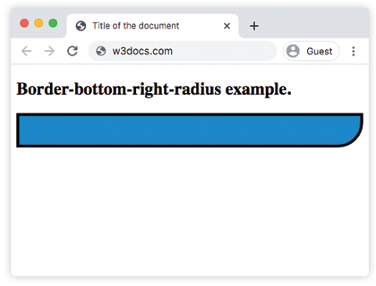
CSS border-bottom-right-radius Property example with one value
<!DOCTYPE html>
<html>
  <head>
    <title>Title of the document</title>
    <style>
      div {
        height: 40px;
        background: #1c87c9;
        border: 4px solid #000000;
        border-bottom-right-radius: 35px;
      }
    </style>
  </head>
  <body>
    <h2>Border-bottom-right-radius example.</h2>
    <div></div>
  </body>
</html>Result
Example of the border-bottom-right-radius property with two values:
CSS border-bottom-right-radius Property example with two values
<!DOCTYPE html>
<html>
  <head>
    <title>Title of the document</title>
    <style>
      div {
        height: 40px;
        background: #eee;
        border: 4px solid #666;
        border-bottom-right-radius: 30px 15px;
      }
    </style>
  </head>
  <body>
    <h2>Border-bottom-right-radius example.</h2>
    <div></div>
  </body>
</html>Example of the border-bottom-right-radius property with the "percentage" value:
CSS border-bottom-right-radius Property example with a percentage value
<!DOCTYPE html>
<html>
  <head>
    <title>Title of the document</title>
    <style>
      div {
        height: 40px;
        background: #8ebf42;
        border: 4px solid #000000;
        border-bottom-right-radius: 30% 50%;
      }
    </style>
  </head>
  <body>
    <h2>Border-bottom-right-radius example.</h2>
    <div></div>
  </body>
</html>Values
| Value | Description | Play it |
|---|---|---|
| length | Specifies shaping of the bottom-right corner by "px". | Play it » |
| % | Specifies the shaping of the bottom-right corner in percentage. | Play it » |
| initial | Sets the property to its default value. | Play it » |
| inherit | Inherits the property from its parent element. |
Related properties
- border-radius — the shorthand that sets all four corners at once.
- border-top-left-radius, border-top-right-radius, border-bottom-left-radius — the other three corner longhands.
- background-clip — controls how a background is clipped against rounded corners.