CSS transform-style Property
How to use the transform-style CSS property to position the children element in 3D-space. See functions and practice with examples.
The CSS transform-style property controls whether the children of a transformed element are kept in the same 3D rendering space as their parent, or flattened into the parent's plane. It is what turns a stack of nested transformed boxes into a true 3D scene instead of a flat picture.
This property is one of the CSS3 properties, and it only has a visible effect on elements that are themselves transformed with the transform property.
What "3D rendering context" means
When you rotate an element in 3D (for example transform: rotateY(50deg)), the browser has to decide whether that element's descendants are part of the same 3D world or merely painted onto the surface of the parent like a sticker.
flat(the default) flattens every child onto the parent's 2D plane. The child can still be transformed, but it lives in its own flattened space — it cannot poke "in front of" or "behind" its parent in 3D.preserve-3dkeeps the children in the parent's 3D coordinate system, so theirrotateX/rotateY/translateZvalues are interpreted relative to the same vanishing point. This is what lets you build cubes, card flips, and layered 3D scenes.
transform-style works hand in hand with perspective: set perspective on the ancestor to define how strong the 3D effect looks, and transform-style: preserve-3d on the parent so its children actually live in that 3D space.
preserve-3d is overridden by several other properties: applying overflow (other than visible), clip-path, filter, opacity below 1, or mask to the same element forces a grouping that flattens the children. If your 3D scene suddenly looks flat, check for one of these on the preserve-3d element.
For maximum browser compatibility, the -webkit- prefix (Safari, older Chrome and Opera) can be used alongside the unprefixed property. Modern browsers support transform-style without a prefix.
| Initial Value | flat |
|---|---|
| Applies to | Transformable elements. |
| Inherited | No. |
| Animatable | No. |
| Version | CSS3 |
| DOM Syntax | object.style.transformStyle = "flat"; |
Syntax
CSS transform-style values
transform-style: flat | preserve-3d | initial | inherit;Example of the transform-style property:
CSS transform-style code example
<!DOCTYPE html>
<html>
<head>
<title>Title of the document</title>
<style>
#element {
position: relative;
height: 250px;
width: 250px;
margin: 50px;
padding: 10px;
border: 2px solid #666666;
background-color: #eeeeee;
}
#element1 {
padding: 50px;
position: absolute;
border: 2px solid #000000;
background-color: #8ebf42;
-webkit-transform: rotateY(50deg);
-webkit-transform-style: preserve-3d;
transform: rotateY(50deg);
transform-style: preserve-3d;
}
#element2 {
padding: 50px;
position: absolute;
border: 2px solid #000000;
background-color: #1c87c9;
-webkit-transform: rotateY(-100deg);
transform: rotateY(-100deg);
}
</style>
</head>
<body>
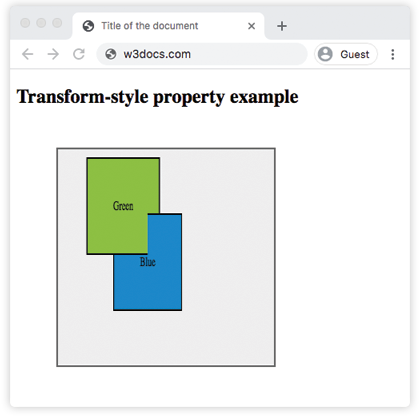
<h2>Transform-style property example</h2>
<div id="element">
<div id="element1">
Green
<div id="element2">Blue</div>
</div>
</div>
</body>
</html>Result
Example of the transform-style property with the "flat" value:
Example of CSS transform-style property with flat value
<!DOCTYPE html>
<html>
  <head>
    <title>Title of the document</title>
    <style>
      .element {
        position: relative;
        height: 250px;
        margin: 50px;
        padding: 10px;
        border: 2px solid #cccccc;
        background-color: #eeeeee;
      }
      .element1 {
        margin: 20px;
        border: 1px dotted;
        height: 150px;
        width: 150px;
        background-color: green;
        transform: rotateX(15deg);
        transform-style: flat;
      }
      .element2 {
        margin: 20px;
        border: 1px dotted;
        height: 200px;
        width: 200px;
        background-color: lightgreen;
        transform: rotateX(45deg);
      }
    </style>
  </head>
  <body>
    <h2>Transform-style property example</h2>
    <div class="element">
      <div class="element1">
        Green
        <div class="element2">Blue</div>
      </div>
    </div>
  </body>
</html>Values
| Value | Description |
|---|---|
| flat | Defines that children of the elements will not be positioned three dimensional space. This is the default value of this property. |
| preserve-3d | Defines that children of the elements will be positioned in three dimensional space. |
| initial | Sets this property to its default value. |
| inherit | Inherits this property from its parent element. |
When to use it
Reach for transform-style: preserve-3d whenever you nest 3D transforms and want the inner elements to share one perspective:
- Card flip — a card with a front and back face: the container gets
preserve-3d, and the back face is rotatedrotateY(180deg)so it sits behind the front. - 3D cube / carousel — six faces each
translateZand rotated out from a common center. - Layered parallax scenes — children pushed forward and back with
translateZunder a sharedperspective.
Keep the default flat when you only apply a single 2D-feeling transform (scale, rotate in-plane, skew) and don't need depth — it's cheaper to render and avoids surprises from the flattening rules above.
Related properties worth pairing with transform-style:
- perspective — sets how pronounced the 3D effect is.
- perspective-origin — moves the vanishing point.
- transform-origin — changes the pivot of each transform.
- backface-visibility — hides the reverse side of a rotated element (essential for card flips).