CSS isolation Property
Learn how CSS isolation: isolate creates a new stacking context to contain mix-blend-mode and filter effects, with examples and browser support notes.
The CSS isolation property controls whether an element must create a new stacking context. Its two values are auto (the default — let the browser decide) and isolate (always create one, unconditionally).
A stacking context is a self-contained layer the browser paints as a unit. Elements inside it are ordered relative to each other using z-index, but they never interleave with elements in a different stacking context. Every document starts with a root stacking context; more are created whenever certain CSS properties are applied.
isolation is most useful alongside mix-blend-mode. By default, mix-blend-mode blends an element against everything stacked below it — including the page background and unrelated sections far up the DOM. Setting isolation: isolate on a parent creates a boundary: blending happens only within that parent's subtree, not against the rest of the page.
When using background-blend-mode, isolation is unnecessary — background layers only ever blend with other background layers on the same element.
When to use it
- Scope a blend group. You have overlapping images or text using
mix-blend-modeand want them to blend with each other but not with the rest of the page. Wrap them in a container withisolation: isolate. - Protect a reusable component. A card or widget should look the same regardless of the background it sits on. Isolating its root keeps outside colors from bleeding through any blend modes inside it.
- Create a stacking context with no side effects. Several properties implicitly create stacking contexts —
opacitybelow1, transform, filter, will-change, and a non-autoz-indexon a positioned element — but they all change layout or appearance.isolation: isolatecreates the stacking context and nothing else.
isolation does not change how the element looks or how space is allocated. Its only effect is whether a new stacking context is created. This makes it the cleanest way to establish the boundary when you need one without other visual consequences.
Property reference
| Initial value | auto |
| Applies to | All elements |
| Inherited | No |
| Animatable | No |
| Version | CSS3 |
| DOM syntax | element.style.isolation = "isolate" |
Syntax
isolation: auto | isolate | initial | inherit;Values
| Value | Description |
|---|---|
auto | No new stacking context is created unless another property (such as mix-blend-mode or filter) requires one. This is the default. |
isolate | Always creates a new stacking context on the element, confining blend and compositing operations to that context. |
initial | Resets the property to its default value (auto). |
inherit | Inherits the value from the parent element. |
Examples
Containing mix-blend-mode with isolation
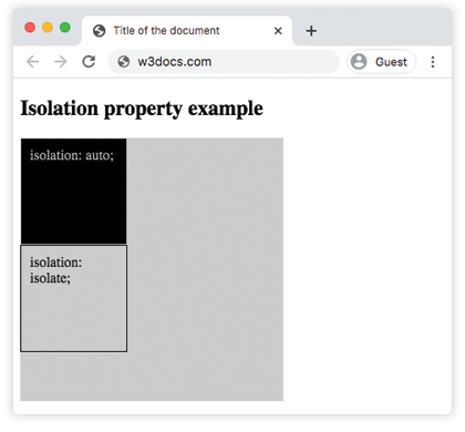
The two boxes below use identical inner markup — a <div> with mix-blend-mode: difference. The only difference is the wrapper: the first uses isolation: auto; the second uses isolation: isolate.
With auto, the difference blend reaches through the wrapper and mixes with the grey page background (#ccc from the outer container). With isolate, a fresh stacking context is created at the wrapper level, so the blend only sees the wrapper's own background — not the surrounding page.
<!DOCTYPE html>
<html>
  <head>
    <title>Title of the document</title>
    <style>
      .a {
        background-color: #ccc;
      }
      #isolation-example {
        width: 300px;
        height: 300px;
      }
      .c {
        width: 100px;
        height: 100px;
        border: 1px solid #000;
        padding: 10px;
        mix-blend-mode: difference;
      }
      #isolation-example1 {
        isolation: auto;
      }
      #isolation-example2 {
        isolation: isolate;
      }
    </style>
  </head>
  <body>
    <h2>Isolation property example</h2>
    <div id="isolation-example" class="a">
      <div id="isolation-example1">
        <div class="a c">isolation: auto;</div>
      </div>
      <div id="isolation-example2">
        <div class="a c">isolation: isolate;</div>
      </div>
    </div>
  </body>
</html>Result
Isolating a blended heading over an image
Here a heading uses mix-blend-mode: overlay to blend with a photo. Without isolation: isolate on the heading, the overlay also blends against the #eee body background wherever the heading extends beyond the image. Adding isolation: isolate confines the blend to the heading's own stacking context, keeping the effect looking consistent across the full width.
<!DOCTYPE html>
<html>
  <head>
    <title>Title of the document</title>
    <style>
      * {
        box-sizing: border-box;
      }
      body {
        background-color: #eee;
        color: #555;
        font-size: 1.1em;
        font-family: Roboto, Helvetica, Arial, sans-serif;
      }
      .isolation-example {
        margin: 1em auto;
        width: 100%;
        max-width: 814px;
        position: relative;
      }
      img {
        width: 100%;
      }
      .isolation-example h1 {
        position: absolute;
        top: 5em;
        color: white;
        text-align: center;
        font-size: 40px;
        width: 100%;
        text-transform: uppercase;
        background-color: #000;
        padding: .5em .25em;
        mix-blend-mode: overlay;
        isolation: isolate;
      }
    </style>
  </head>
  <body>
    <h2>Isolation property example</h2>
    <div class="isolation-example">
      <img src="/uploads/media/default/0001/01/4982c4f43023330a662b9baed5a407e391ae6161.jpeg" alt="Yellow tree." />
      <div class="element">
        <h1>House</h1>
      </div>
    </div>
  </body>
</html>How stacking contexts are created
isolation: isolate is one of many ways to trigger a new stacking context. The table below lists the most common triggers and whether they have visual or layout side effects:
| Trigger | Side effect |
|---|---|
isolation: isolate | None — stacking context only |
opacity less than 1 | Changes element transparency |
transform (any value except none) | Moves or reshapes the element |
filter (any value except none) | Applies a visual effect |
will-change with transform or opacity | May promote element to its own compositor layer |
Non-auto z-index on a positioned element | Changes stacking order |
When you need only the boundary — no transparency, no visual change, no reordering — reach for isolation: isolate.
Things to keep in mind
isolationis not inherited. Setting it on a parent does not cause children to get their own stacking contexts.- The property only takes effect on elements that participate in a stacking context themselves (in practice, all block and inline-level elements, SVG elements, and flex/grid children).
- Inspect stacking context boundaries with browser DevTools: Firefox shows the stacking context icon next to elements in the Layers panel; Chrome shows stacking context information in the Computed tab.
- Browser support is excellent — all evergreen browsers have supported
isolationsince 2015. No prefix is needed.
Related properties
- mix-blend-mode — blends an element with the content beneath it;
isolationcontrols where that blending stops. - background-blend-mode — blends an element's own background layers with each other.
- filter — applies graphical effects such as blur and grayscale; also implicitly creates a stacking context.
- opacity — another stacking context trigger; values below
1make the element semi-transparent. - transform — moves, rotates, or scales an element; also creates a stacking context.
- z-index — controls stacking order within a stacking context.