The border-radius property is used to make rounded corners for the outer border edge of an element.
The border-radius property is one of the CSS3 properties.
This property is a shorthand property for the border-top-left-radius, border-top-right-radius, border-bottom-right-radius and border-bottom-left-radius properties which are used for setting the four corners of an element separately. But the border-radius property can be used to define all the four corners at the same time. It can have from one to four values.
If all four values are set, they represent the top-left, top-right, bottom-right and bottom-left borders respectively. If bottom-left is missed, it is the same as top-right, if bottom-right is omitted, it is the same as top-left, and if only one value is defined, it is used for all four corners equally.
The border-radius property is specified as:
- one, two, three, or four length or percentage values that are used to set a single radius for the corners.
- followed optionally by a slash ( / ) and one, two, three, or four length or percentage values. This is used to set an additional radius, so you can have elliptical corners.
The first set of (1-4) values define the horizontal radius for all four corners. An optional second set of values, preceded by a slash, define the vertical radii for all four corners. If only one set of values is provided, these values will be used to determine both the vertical and horizontal radii equally.
| Initial Value | 0 |
| Applies to | All elements. It also applies to ::first-letter. |
| Inherited | No |
| Animatable | Yes. Each of the properties of the shorthand are animatable. |
| Version | CSS3 |
| DOM Syntax | object.style.borderRadius = "20px"; |
Syntax
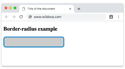
border-radius: 1-4 length | 1-4 length (%) | initial | inherit;Example of the border-radius property:
<!DOCTYPE html>
<html>
  <head>
    <title>Title of the document</title>
    <style>
      div {
        height: 40px;
        width: 50%;
        background: #ccc;
        border: 4px solid #1c87c9;
        border-radius: 10px;
      }
    </style>
  </head>
  <body>
    <h2>Border-radius example</h2>
    <div></div>
  </body>
</html>Result
For the best possible browser support, you should prefix with -moz- for Firefox, and -webkit- for Safari, Chrome, and other browsers.
See an example with -moz- and -webkit- prefixes, where two different values are defined for the border-radius property: with percent and pixel.
Example of the border-radius property with -moz- and -webkit- prefixes:
<!DOCTYPE html>
<html>
  <head>
    <title>Title of the document</title>
    <style>
      .radius-pixel {
        height: 40px;
        background: #ccc;
        border: 4px solid #1c87c9;
        border-radius: 12px;
        -webkit-border-radius: 12px;
        -moz-border-radius: 12px;
      }
      .radius-percent {
        width: 120px;
        height: 120px;
        margin-top: 20px;
        background: #ccc;
        border: 4px solid #1c87c9;
        border-radius: 50%;
        -webkit-border-radius: 50%;
        -moz-border-radius: 50%;
      }
    </style>
  </head>
  <body>
    <h2>Border-radius example with -moz- and -webkit-</h2>
    <div class="radius-pixel"></div>
    <div class="radius-percent"></div>
  </body>
</html>You can also set the border-radius for an element with background color or background image.
Example of the border-radius property with background-color and background-image properties:
<!DOCTYPE html>
<html>
  <head>
    <title>Title of the document</title>
    <style>
      .radius-bg {
        width: 250px;
        height: 200px;
        background: #ccc;
        border: 4px solid #1c87c9;
        border-radius: 12px;
        -webkit-border-radius: 12px;
        -moz-border-radius: 12px;
      }
      .radius-img {
        width: 250px;
        height: 200px;
        margin-top: 20px;
        background-img: lightgray;
        background: url('/uploads/media/default/0001/01/6ef5dc22756f45ab51d0c510ad0371191ec4ff04.jpeg');
        background-position: left top;
        background-repeat: repeat;
        border: 2px solid #1c87c9;
        border-radius: 25px;
        -webkit-border-radius: 25px;
        -moz-border-radius: 25px;
      }
    </style>
  </head>
  <body>
    <h1> Border-radius example with background color</h1>
    <div class="radius-bg"></div>
    <h2> Border-radius example with background image</h2>
    <div class="radius-img"></div>
  </body>
</html>Now let’s see an example full of various boxes with different border-radius values which form the shape of the boxes.
Example of the border-radius property with multiple values:
<!DOCTYPE html>
<html>
  <head>
    <title>Title of the document</title>
    <style>
      div {
        width: 250px;
        height: 150px;
        border: solid 3px #1c87c9;
        background: #1c87c9;
      }
      .radius_1 {
        border-radius: 25px;
        -moz-border-radius: 25px;
        -webkit-border-radius: 25px;
      }
      .radius_2 {
        border-radius: 25% 10%;
        -moz-border-radius: 25% 10%;
        -webkit-border-radius: 25% 10%;
      }
      .radius_3 {
        border-radius: 10% 30% 50% 70%;
        -moz-border-radius: 10% 30% 50% 70%;
        -webkit-border-radius: 10% 30% 50% 70%;
      }
      .radius_4 {
        border-radius: 10% / 50%;
        -moz-border-radius: 10% / 50%;
        -webkit-border-radius: 10% / 50%;
      }
      .radius_5 {
        border-radius: 10px 100px / 120px;
        -moz-border-radius: 10px 100px / 120px;
        -webkit-border-radius: 10px 100px / 120px;
      }
      .radius_6 {
        border-radius: 25% 10%;
        -moz-border-radius: 25% 10%;
        -webkit-border-radius: 25% 10%;
      }
      .radius_7 {
        border-radius: 50% 20% / 10% 40%;
        -moz-border-radius: 50% 20% / 10% 40%;
        -webkit-border-radius: 50% 20% / 10% 40%;
      }
      .radius_8 {
        border-radius: 50%;
        -moz-border-radius: 50%;
        -webkit-border-radius: 50%;
      }
    </style>
  </head>
  <body>
    <h1> Border-radius examples</h1>
    <div class="radius_1"></div>
    <br />
    <div class="radius_2"></div>
    <br />
    <div class="radius_3"></div>
    <br />
    <div class="radius_4"></div>
    <br />
    <div class="radius_5"></div>
    <br />
    <div class="radius_6"></div>
    <br />
    <div class="radius_7"></div>
    <br />
    <div class="radius_8"></div>
  </body>
</html>Values
| Value | Description | Play it |
|---|---|---|
| length | Sets the rounding size of the corners. | Play it » |
| % | Sets the rounding size of the corners in percent. | Play it » |
| initial | Makes the property use its default value. | Play it » |
| inherit | Inherits the property from its parent element. |
Browser support
|
|
|
|
|---|---|---|---|
| 4.0+ | 4.0+ | 5.0+ | 10.5+ |
Practice Your Knowledge
Quiz Time: Test Your Skills!
Ready to challenge what you've learned? Dive into our interactive quizzes for a deeper understanding and a fun way to reinforce your knowledge.