
The grid-area property is used to specify the size and the location of the grid item within the grid row. It is a shorthand property for the following properties:
- grid-row-start, specifying the row on which the item should start.
- grid-column-start, specifying the column on which the item should start.
- grid-row-end, specifying the row on which the item should end.
- grid-column-end, specifying the column on which the item should end.
The grid-area property also specifies a name to a grid item. Then, named grid items can be referenced to by the grid-template-areas property of the grid container.
| Initial Value | auto / auto / auto / auto |
| Applies to | Grid items. |
| Inherited | No. |
| Animatable | Yes. Grid-area is animatable. |
| Version | CSS Grid Layout Module Level 1 |
| DOM Syntax | object.style.gridArea = "1 / 2 / span 2 / span 3"; |
Syntax
grid-area: grid-row-start / grid-column-start / grid-row-end / grid-column-end / itemname | initial | inherit;Example of the grid-area property:
<!DOCTYPE html>
<html>
  <head>
    <title>Title of the document</title>
    <style>
      .box1 {
        grid-area: header;
      }
      .box2 {
        grid-area: left;
      }
      .box3 {
        grid-area: main;
      }
      .box4 {
        grid-area: right;
      }
      .box5 {
        grid-area: footer;
      }
      .grid-container {
        display: grid;
        grid-template-areas: 'header header header header header header' 'left main main main right right' 'left footer footer footer footer footer';
        grid-gap: 5px;
        background-color: #555;
        padding: 10px;
      }
      .grid-container > div {
        background-color: #ccc;
        text-align: center;
        padding: 30px 0;
        font-size: 30px;
      }
    </style>
  </head>
  <body>
    <h2>Grid-area property example</h2>
    <p>You can use the grid-area property to name grid items.</p>
    <div class="grid-container">
      <div class="box1">Header</div>
      <div class="box2">Left</div>
      <div class="box3">Main</div>
      <div class="box4">Right</div>
      <div class="box5">Footer</div>
    </div>
  </body>
</html>Result
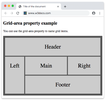
In the following example, we apply the "itemname" value for the box1 which takes up the place of all five columns.
Example of the grid-area property with the “itemname” value:
<!DOCTYPE html>
<html>
  <head>
    <title>Title of the document</title>
    <style>
      .box1 {
        grid-area: itemname;
      }
      .grid-container {
        display: grid;
        grid-template-areas: 'itemname itemname itemname itemname itemname';
        grid-gap: 5px;
        background-color: #8ebf42;
        padding: 5px;
      }
      .grid-container > div {
        background-color: #eee;
        text-align: center;
        padding: 20px 0;
        font-size: 20px;
      }
    </style>
  </head>
  <body>
    <h2>Grid-area property example</h2>
    <div class="grid-container">
      <div class="box1">1</div>
      <div>2</div>
      <div>3</div>
      <div>4</div>
      <div>5</div>
      <div>6</div>
    </div>
  </body>
</html>Values
| Value | Description |
|---|---|
| grid-row-start | Specifies on which row the item should be displayed. |
| grid-column-start | Specifies on which column the item should be displayed. |
| grid-row-end | Specifies on which row-line the item should be stopped, or how many rows to span. |
| grid-column-end | Specifies on which column-line the item should be stopped, or how many columns to span. |
| itemname | Specifies a name for the item. |
| initial | Makes the property use its default value. |
| inherit | Inherits the property from its parents element. |
Browser support

|

|

|

|
|
|---|---|---|---|---|
| 57.0+ | 16.0+ | 52.0+ | 10.1+ | 44.0+ |
Practice Your Knowledge
What is the purpose of the CSS 'grid-area' property?

Correct!

Incorrect!
Quiz Time: Test Your Skills!
Ready to challenge what you've learned? Dive into our interactive quizzes for a deeper understanding and a fun way to reinforce your knowledge.