The filter property is used to apply visual effects to an element (image). The filter property has the following values:
- none
- blur
- brightness
- contrast
- drop-shadow
- grayscale
- hue-rotate
- invert
- opacity
- saturate
- sepia
- url
| Initial Value | none |
| Applies to | Table-cell elements. |
| Inherited | No. |
| Animatable | Yes. |
| Version | CSS3 |
| DOM Syntax | object.style.WebkitFilter = "hue-rotate(360deg)"; |
Syntax
filter: none | blur() | brightness() | contrast() | drop-shadow() | grayscale() | hue-rotate() | invert() | opacity() | saturate() | sepia() | url() | initial | inherit;Example of the filter property:
<!DOCTYPE html>
<html>
<head>
<title>Title of the document</title>
<style>
img {
-webkit-filter: blur(3px); /* Safari 6.0 - 9.0 */
filter: blur(3px);
max-width: 100%;
}
</style>
</head>
<body>
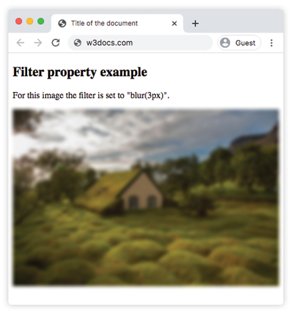
<h2>Filter property example</h2>
<p>For this image the filter is set to "blur(3px)".</p>
<p>
<img src="/uploads/media/default/0001/01/4982c4f43023330a662b9baed5a407e391ae6161.jpeg" alt="Background Image">
</p>
</body>
</html>Result
Example of using the filter property to make the image brighter:
<!DOCTYPE html>
<html>
  <head>
    <title>Title of the document</title>
    <style>
      img {
        -webkit-filter: brightness(150%); /* Safari 6.0 - 9.0 */
        filter: brightness(150%);
        max-width: 100%;
      }
    </style>
  </head>
  <body>
    <h2>Filter property example</h2>
    <p>For this image the filter is set to "brightness(150%)".</p>
    <p>
      <img src="/uploads/media/default/0001/01/4982c4f43023330a662b9baed5a407e391ae6161.jpeg" alt="Background Image">
    </p>
  </body>
</html>In the following examples "greyscale" value makes the image gray:
Example of the filter property with the "greyscale" value:
<!DOCTYPE html>
<html>
  <head>
    <title>Title of the document</title>
    <style>
      img {
        -webkit-filter: grayscale(80%); /* Safari 6.0 - 9.0 */
        filter: grayscale(80%);
        max-width: 100%;
      }
    </style>
  </head>
  <body>
    <h2>Filter example</h2>
    <p>For this image the filter is set to "grayscale(80%)".</p>
    <p>
      <img src="/uploads/media/default/0001/01/4982c4f43023330a662b9baed5a407e391ae6161.jpeg" alt="Background Image">
    </p>
  </body>
</html>Here, "saturate" filter is applied to the image where the given value is 300%.
Example of the filter property with the "saturate" value:
<!DOCTYPE html>
<html>
  <head>
    <title>Title of the document</title>
    <style>
      img {
        -webkit-filter: saturate(300%); /* Safari 6.0 - 9.0 */
        filter: saturate(300%);
        max-width: 100%;
      }
    </style>
  </head>
  <body>
    <h2>Filter example</h2>
    <p>For this image the filter is set to "saturate(300%)".</p>
    <p>
      <img src="/uploads/media/default/0001/01/4982c4f43023330a662b9baed5a407e391ae6161.jpeg" alt="Background Image">
    </p>
  </body>
</html>Example of the filter property with the "sepia" value:
<!DOCTYPE html>
<html>
  <head>
    <title>Title of the document</title>
    <style>
      img {
        -webkit-filter: sepia(70%); /* Safari 6.0 - 9.0 */
        filter: sepia(70%);
        max-width: 100%;
      }
    </style>
  </head>
  <body>
    <h2>Filter example</h2>
    <p>For this image the filter is set to "sepia(70%)".</p>
    <p>
      <img src="/uploads/media/default/0001/01/4982c4f43023330a662b9baed5a407e391ae6161.jpeg" alt="Background Image">
    </p>
  </body>
</html>Example of the filter property with the "contrast" value:
<!DOCTYPE html>
<html>
  <head>
    <title>Title of the document</title>
    <style>
      img {
        -webkit-filter: contrast(40%); /* Safari 6.0 - 9.0 */
        filter: contrast(40%);
        max-width: 100%;
      }
    </style>
  </head>
  <body>
    <h2>Filter example</h2>
    <p>For this image the filter is set to "contrast(40%)".</p>
    <p>
      <img src="/uploads/media/default/0001/01/4982c4f43023330a662b9baed5a407e391ae6161.jpeg" alt="Background Image">
    </p>
  </body>
</html>Example of the filter property with the "opacity" value:
<!DOCTYPE html>
<html>
  <head>
    <title>Title of the document</title>
    <style>
      img {
        -webkit-filter: opacity(0.4);  /* Safari 6.0 - 9.0 */
        filter: opacity(0.4);
        max-width: 100%;
      }
    </style>
  </head>
  <body>
    <h2>Filter example</h2>
    <p>For this image the filter is set to "opacity(0.4)".</p>
    <p>
      <img src="/uploads/media/default/0001/01/4982c4f43023330a662b9baed5a407e391ae6161.jpeg" alt="Background Image">
    </p>
  </body>
</html>Example of the filter property with the "invert" value:
<!DOCTYPE html>
<html>
  <head>
    <title>Title of the document</title>
    <style>
      img {
        -webkit-filter: invert(0.7); /* Safari 6.0 - 9.0 */
        filter: invert(0.7);
        max-width: 100%;
      }
    </style>
  </head>
  <body>
    <h2>Filter example</h2>
    <p>For this image the filter is set to "invert(0.7)".</p>
    <p>
      <img src="/uploads/media/default/0001/01/4982c4f43023330a662b9baed5a407e391ae6161.jpeg" alt="Background Image">
    </p>
  </body>
</html>Example of the filter property with the "hue-rotate" value:
<!DOCTYPE html>
<html>
  <head>
    <title>Title of the document</title>
    <style>
      img {
        -webkit-filter: hue-rotate(90deg); /* Safari 6.0 - 9.0 */
        filter: hue-rotate(90deg);
        max-width: 100%;
      }
    </style>
  </head>
  <body>
    <h2>Filter example</h2>
    <p>For this image the filter is set to "hue-rotate(90deg)".</p>
    <p>
      <img src="/uploads/media/default/0001/01/4982c4f43023330a662b9baed5a407e391ae6161.jpeg" alt="Background Image">
    </p>
  </body>
</html>Values
| Value | Description | Play it |
|---|---|---|
| none | Applies no effect. This is the default value of this property. | Play it » |
| blur | Applies blur on an image. It is specified by px. The larger the value the more blur will be applied. If no value is applied, 0 is used. | Play it » |
| brightness | Makes the image brighter. If the value is 0 the image will be black. 100% is the default value and shows the original image. Values over 100% the image will become brighter. | Play it » |
| contrast | Adjusts contrast of an image. If the value is 0 the image will be black. 100% is the default value and shows the original image. Values over 100% more contrast will be applied to the image. | Play it » |
| drop-shadow | Applies a drop shadow effect on the image. | Play it » |
| grayscale | Changes the image to grayscale. 0% is the value of original image. 100% makes the image grey. Negative values are not allowed. | Play it » |
| hue-rotate | Applies a hue rotation effect on the image. It is specified by degrees. Maximum value is 360 degree. | Play it » |
| invert | Inverts the samples in the image. 0% is default value. 100% makes the image fully inverted. | Play it » |
| opacity | Sets the opacity level for the image. It describes the transparency of the image. If the image has 0% value it is completely transparent. 100% is the current state of the image. | Play it » |
| saturate | Applies saturate effect on the image. 0% makes the image completely un-saturated. 100% is default value of the image. Values over 100% makes the image super-saturated. | Play it » |
| sepia | Converts the image to sepia.Default value is 0%, 100% makes the image completely sepia. | Play it » |
| url | Url function takes the location of an XML file that specifies an SVG filter, and may include an anchor to a specific filter element. | |
| initial | Makes the property use its default value. | |
| inherit | Inherits the property from its parents element. |
Browser support
|
|
|
|
|
|---|---|---|---|---|
|
53.0 18.0 -webkit- |
12.0 -webkit- |
35.0 + 49.0 -webkit- |
6.0 -webkit- |
40.0 + 15.0 -webkit- |
Practice Your Knowledge
What are the different types of effects that can be achieved using the CSS filter property?
Correct!
Incorrect!
Quiz Time: Test Your Skills!
Ready to challenge what you've learned? Dive into our interactive quizzes for a deeper understanding and a fun way to reinforce your knowledge.