CSS background-clip property specifies how far the background-color and background-image should be from the element. If the element has no background-image or background-color, this property will only have a visual effect when the border has transparent regions or partially opaque regions, otherwise, the border shows the difference.
The background-clip property is one of the CSS3 properties.
For clipping a background to a text there is also a vendor-prefixed version of the background-clip property.
| Initial Value | border-box |
| Applies to | All elements. It also applies to ::first-letter and ::first-line. |
| Inherited | No. |
| Animatable | No. |
| Version | CSS3 |
| DOM Syntax | object.style.backgroundClip = "content-box"; |
Syntax
background-clip: border-box | padding-box | content-box | text | initial | inherit;Example of the background-clip property:
<!DOCTYPE html>
<html>
  <head>
    <title>The title of the document</title>
    <style>
      #example {
        border: 3px solid #666;
        padding: 15px;
        background: #ccc;
        background-clip: content-box;
      }
    </style>
  </head>
  <body>
    <h2>Background-clip property example</h2>
    <p>Here the "content-box" value is used.</p>
    <div id="example">
      <p>The background extends to the edge of the content box.</p>
    </div>
  </body>
</html>In the following example find the difference between the "padding-box" and the "border-box" values.
Example of the background-clip property with the "padding-box" and "border-box" values:
<!DOCTYPE html>
<html>
<head>
<title>The title of the document</title>
<style>
#example1 {
border: 5px dashed #666;
padding: 15px;
background: #1c87c9;
background-clip: border-box;
}
#example2 {
border: 5px dashed #666;
padding: 15px;
background: #1c87c9;
background-clip: padding-box;
}
</style>
</head>
<body>
<h2>Background-clip property example</h2>
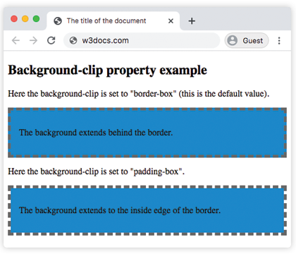
<p>Here the background-clip is set to "border-box" (this is the default value).</p>
<div id="example1">
<p>The background extends behind the border.</p>
</div>
<p>Here the background-clip is set to "padding-box".</p>
<div id="example2">
<p>The background extends to the inside edge of the border.</p>
</div>
</body>
</html>In this example the background is painted within the foreground text.
Result
Example of the background-clip property with the "text" value:
<!DOCTYPE html>
<html>
  <head>
    <title>The title of the document</title>
    <style>
      #example {
        border: 3px dashed #1ebf42;
        padding: 15px;
        background: #1c87c9;
        background-clip: text;
        -webkit-background-clip: text;
        color: transparent;
      }
    </style>
  </head>
  <body>
    <h2>Background-clip property example</h2>
    <p>Here the background-clip is set to "text"</p>
    <div id="example">
      <p>The background is painted within the foreground text.</p>
    </div>
  </body>
</html>Values
| Value | Description | Play it |
|---|---|---|
| border-box | The background appears behind the border. This is default value. | Play it » |
| padding-box | The background appears inside of the border. | Play it » |
| content-box | The background extends to the edge of the content box. | Play it » |
| text | The background is painted within the foreground text. | Play it » |
| initial | Sets the property to its default value. | Play it » |
| inherit | Inherits the property from its parent element. |
Browser support
|
|
|
|
|---|---|---|---|
| 15.0+ |
4.0+ 3.6 -moz- |
7.0+ |
11.5+ 10.1 -o- |
Practice Your Knowledge
Quiz Time: Test Your Skills!
Ready to challenge what you've learned? Dive into our interactive quizzes for a deeper understanding and a fun way to reinforce your knowledge.