With the help of the CSS transform property, a 2D or 3D transformation is applied to the element. It is one of the CSS3 properties. This property allows to rotate, skew, scale or translate the element. It takes none value or from the list of transform functions.
| Initial Value | none |
| Applies to | Transformable elements. |
| Inherited | No. |
| Animatable | Yes. Degree is animatable. |
| Version | CSS3 |
| DOM Syntax | Object.style.transform = "rotate(10deg)"; |
Syntax
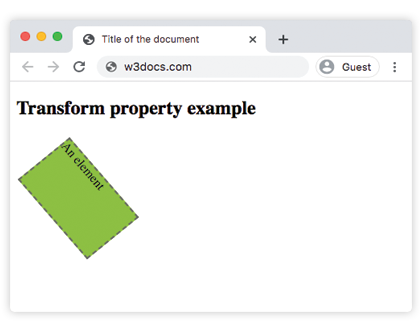
transform: none | transform-functions | initial | inherit;Example of the transform property:
<!DOCTYPE html>
<html>
  <head>
    <title>Title of the document</title>
    <style>
      div {
        border: 2px dashed #666;
        background-color: #8ebf42;
        transform: translate(10px, 40px) rotate(50deg);
        width: 130px;
        height: 80px;
      }
    </style>
  </head>
  <body>
    <h2>Transform property example</h2>
    <div>An element</div>
  </body>
</html>Result
Example of the transform property with the "rotate", "skewY", "scaleY", "translateX", "skew" values:
<!DOCTYPE html>
<html>
  <head>
    <title>Title of the document</title>
    <style>
      div {
        margin: 35px 20px;
      }
      div.box1 {
        width: 130px;
        height: 80px;
        border: 1px solid #000;
        background-color: #1c87c9;
        -ms-transform: rotate(30deg);
        -webkit-transform: rotate(30deg);
        transform: rotate(30deg);
      }
      div.box2 {
        width: 120px;
        height: 80px;
        border: 1px solid #000;
        background-color: #8ebf42;
        -ms-transform: skewY(30deg);
        -webkit-transform: skewY(30deg);
        transform: skewY(30deg);
      }
      div.box3 {
        width: 160px;
        height: 80px;
        border: 1px solid #000;
        background-color: #FFFF00;
        -ms-transform: scaleY(1);
        -webkit-transform: scaleY(1);
        transform: scaleY(1);
      }
      div.box4 {
        width: 160px;
        height: 80px;
        border: 1px solid #000;
        background-color: #ccc;
        -ms-transform: rotate(160deg);
        -webkit-transform: rotate(160deg);
        transform: rotate(160deg);
      }
      div.box5 {
        width: 160px;
        height: 80px;
        border: 1px solid #000;
        background-color: #990099;
        -ms-transform: translateX(50px);
        -webkit-transform: translate(50px);
        transform: translateX(50px);
      }
      div.box6 {
        width: 160px;
        height: 80px;
        border: 1px solid #000;
        background-color: #FF0000;
        -ms-transform: skew(170deg, 170deg);
        -webkit-transform: skew(170deg, 170deg);
        transform: skew(170deg, 170deg);
      }
    </style>
  </head>
  <body>
    <h2>Transform property example</h2>
    <h3>transform: rotate(30deg):</h3>
    <div class="box1"></div>
    <h3>transform: skewY(30deg):</h3>
    <div class="box2"></div>
    <h3>transform: scaleY(1):</h3>
    <div class="box3"></div>
    <h3>transform: transform:rotate(160deg):</h3>
    <div class="box4"></div>
    <h3>transform: translateX(50px):</h3>
    <div class="box5"></div>
    <h3>transform: skew(170deg,170deg):</h3>
    <div class="box6"></div>
  </body>
</html>The "skew" value
The "skewX" and "skewY" transform values are used for somehow tilting an element. There doesn’t exist any shorthand property to skew an element, that’s why both of these values are used.
The "rotate" value
With the help of the "rotate" value, the element is rotated clockwise from the original position. In case of using a negative value, it will be rotated in the opposite direction.
The "translate" value
The "translate" value is used for moving the element up or down, as well as sideways. More values are presented below.
Values
| Value | Description | Play it |
|---|---|---|
| none | No transform is applied. | Play it » |
| translate() | Translates the element by a vector [tx, ty]. Tx is the translation along the x-axis. Ty is the translation along the y-axis. | Play it » |
| translateX() | Translates the element along the x-axis. | Play it » |
| translateY() | Translates the element along the y-axis. | Play it » |
| scale(x,y) | Scales an element up or down. | Play it » |
| scaleX() | Scales an element up or down the direction of the x-axis. | Play it » |
| scaleY() | Scales an element up or down the direction of the y-axis. | Play it » |
| rotate(number) | Rotates an element in the two-dimensional space.The angle is specified in the parameter. | Play it » |
| skew() | Defines a 2D skew transformation along the x-axis and the y-axis. | Play it » |
| skewX() | Defines a 2D skew transformation along the x-axis. | Play it » |
| skewY() | Defines a 2D skew transformation along the y-axis. | Play it » |
| matrix() | Defines a 2D transformation, using a matrix of six values. | Play it » |
| translateZ | Translates an element by the given amount along the z-axis. | |
| translate3d() | Defines a three dimensional translation. | |
| scaleZ() | Scales an element in the third dimension, along the z-axis. | |
| scale3d() | Defines a three dimensional scale transformation. | |
| rotateX() | Rotates an element about the x-axis in three-dimensional space. | Play it » |
| rotateY() | Rotates an element about the y-axis in three-dimensional space. | Play it » |
| rotateZ() | Rotates an element about the z-axis in three-dimensional space. | Play it » |
| rotate3d() | Defines a three dimensional rotate transformation. | |
| matrix3d() | Defines a 3D transformation, using a 4x4 matrix of 16 values. | |
| perspective() | Defines a perspective view for the three dimensional element. | |
| initial | Makes the property use its default value. | |
| inherit | Inherits the property from its parent element. |
Browser support
|
|
|
|
|---|---|---|---|
|
36.0+ 12.0-35.0 -webkit- |
16.0+ 10.0-15.0 -moz- |
4.0+ -webkit- |
23.0+ 15.0-22.0 -webkit- |
Practice Your Knowledge
Quiz Time: Test Your Skills!
Ready to challenge what you've learned? Dive into our interactive quizzes for a deeper understanding and a fun way to reinforce your knowledge.