The :disabled pseudo-class selects and styles elements that are disabled.
These elements are usually form elements, such as buttons (<button>), select menus (<select>), input types (<input>), and textareas (<textarea>).
Disabled elements do not accept clicks, text input, or focus.
Version
CSS Basic User Interface Module Level 3
Syntax
:disabled {
css declarations;
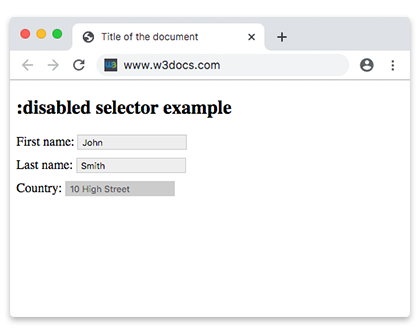
}Example of setting a background color for a disabled <input> element:
<!DOCTYPE html>
<html>
  <head>
    <title>Title of the document</title>
    <style>
      input {
        padding: 2px 5px;
        margin-bottom: 10px;
        border: 1px solid #ccc;
      }
      input[type=text]:enabled {
        background: #eee;
      }
      input[type=text]:disabled {
        background: #ccc;
      }
    </style>
  </head>
  <body>
    <h2>:disabled selector example</h2>
    <form action="">
      <label for="name">First name:</label>
      <input type="text" value="John" id="name">
      <br>
      <label for="lastname">Last name:</label>
      <input type="text" value="Smith" id="lastname">
      <br>
      <label for="country">Country:</label>
      <input type="text" disabled="disabled" value="10 High Street" id="conutry">
    </form>
  </body>
</html>Example of setting a background color for disabled <option> elements:
<!DOCTYPE html>
<html>
  <head>
    <title>Title of the document</title>
    <style>
      option:disabled {
        background: #8ebf42;
      }
    </style>
  </head>
  <body>
    <h2>:disabled selector example</h2>
    <select>
      <option value="paris">Paris</option>
      <option value="london" disabled>London</option>
      <option value="moscow">Moscow</option>
      <option value="rome" disabled>Rome</option>
      <option value="berlin">Berlin</option>
    </select>
  </body>
</html>Example of a disabled <input> element:
<!DOCTYPE html>
<html>
  <head>
    <title>Title of the document</title>
    <style>
      input {
        width: 60%;
        margin: 0;
        border: none;
        outline: 1px solid lightgrey;
        outline-offset: 2px;
      }
      input:disabled {
        background: #cccccc;
        cursor: not-allowed;
      }
      form {
        background: #67a6ec;
        padding: 1.5em;
        max-width: 400px;
        width: 100%;
        outline: 10px solid rgba(17, 58, 103, 0.6);
      }
      hr {
        visibility: hidden;
      }
      label {
        margin-right: 3%;
        text-align: left;
        display: inline-block;
        width: 35%;
      }
    </style>
  </head>
  <body>
    <h2>:disabled selector example</h2>
    <form action="#">
      <label for="name">Enabled Input:</label>
      <input type="text" autofocus>
      <hr>
      <label for="name">Disabled Input:</label>
      <input type="text" disabled>
    </form>
  </body>
</html>Browser support
|
|
|
|
|
|---|---|---|---|---|
| 4.0+ | 12.0+ | 3.5+ | 3.2+ | 10.0+ |
Practice Your Knowledge
What are the characteristics of the 'disabled' attribute in CSS?
Correct!
Incorrect!
Quiz Time: Test Your Skills!
Ready to challenge what you've learned? Dive into our interactive quizzes for a deeper understanding and a fun way to reinforce your knowledge.