
The box-shadow property allows to add multiple shadows around the box specifying values for color, size, blur, offset and inset.
The box-shadow property is one of the CSS3 properties.
You can add effects separated by commas. If you specify a border-radius on the element with a box shadow, the box shadow will take the same rounded corners.
These are two values that set the shadow offset. H-offset specifies the horizontal distance. Positive values give shadow to the right of the element. Negative values place the shadow to the left side of the element. V-offset specifies the vertical distance. Positive value gives shadow below the element. Negative values place the shadow above the element. If both values are 0, the shadow will be behind the element.
The third value is a blur. The higher the number, the bigger the blur, so the shadow becomes bigger and lighter. Negative values are not allowed. If the value is 0, the shadow's edge is sharp.
The fourth value is inset. It adds an inner shadow to the element. If it is a default, the shadow is assumed to be a drop shadow.
The fifth value is spread. Positive values will cause the shadow to expand, and negative values will cause the shadow to shrink. If the value is 0, the shadow will be the same size as the element.
The sixth value is color. It adds colors to the shadow. If this value is 0, the color used depends on the browser.
| Initial Value | none |
| Applies to | All elements. It also applies to ::first-letter. |
| Inherited | No. |
| Animatable | Yes. The shadow of the box is animatable. |
| Version | CSS3 |
| DOM Syntax | object.style.boxShadow = "15px 25px 35px gray"; |
Syntax
box-shadow: none | h-offset v-offset blur spread color | inset | initial | inherit;Let’s try to add shadows to an element.
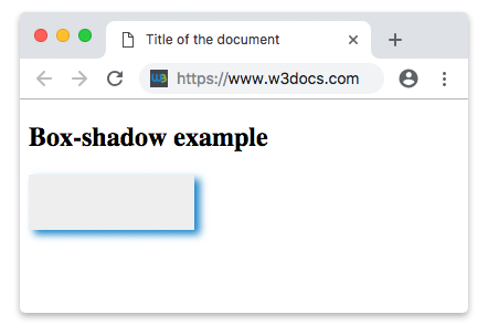
Example of the box-shadow property:
<!DOCTYPE html>
<html>
  <head>
    <style>
      div {
        width: 150px;
        height: 50px;
        background-color: #eee;
        box-shadow: 5px 4px 10px #1c87c9;
        -moz-box-shadow: 5px 4px 10px #1c87c9;
        -webkit-box-shadow: 5px 4px 10px #1c87c9;
      }
    </style>
  </head>
  <body>
    <h2>Box-shadow example</h2>
    <div></div>
  </body>
</html>Result
Multiple shadows
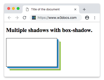
You have the opportunity to comma separate the box-shadow for many times. For example, using the code below will show 3 shadows with multiple colors and positions on the same element.
Example of using the box-shadow property to add multiple shadows to the element:
<!DOCTYPE html>
<html>
  <head>
    <style>
      div {
        width: 50%;
        height: 100px;
        border: 1px solid;
        padding: 10px;
        box-shadow: 5px 5px #1c87c9, 10px 10px #ccc, 15px 15px #8ebf42;
      }
    </style>
  </head>
  <body>
    <h2>Multiple shadows with box-shadow.</h2>
    <div></div>
  </body>
</html>Result
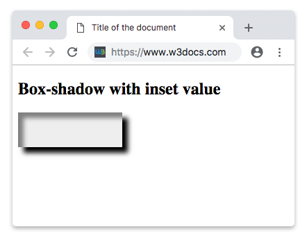
Now let’s give the element an inset value. It adds shadow inside the box.
Example of the box-shadow property with the "inset" value:
<!DOCTYPE html>
<html>
  <head>
    <style>
      div {
        width: 150px;
        height: 50px;
        background-color: #eee;
        box-shadow: inset 8px 8px 10px grey, 8px 8px 10px black;
        -moz-box-shadow: inset 8px 8px 10px grey, 8px 8px 10px black;
        -webkit-box-shadow: inset 8px 8px 10px grey, 8px 8px 10px black;
      }
    </style>
  </head>
  <body>
    <h2>Box-shadow with inset value</h2>
    <div></div>
  </body>
</html>Result
One-edge shadow
If you want to get squeeze in a box shadow and push it off one side of a box use the negative spread radius value.
.shadow {
  box-shadow: 0 10px 8px -4px yellow;
}
Example of the box-shadow property with a negative spread radius value:
<!DOCTYPE html>
<html>
  <head>
    <style>
      .shadow {
        width: 100px;
        height: 100px;
        box-shadow: 0 10px 8px -4px yellow;
        background-color: #cccccc;
      }
    </style>
  </head>
  <body>
    <div class="shadow"></div>
  </body>
</html>Values
| Value | Description | Play it |
|---|---|---|
| none | No shadow is given. | Play it » |
| h-offset | Required. The horizontal offset of the shadow. A positive value gives the shadow on the right side of the box, a negative value gives the shadow on the left side of the box. | Play it » |
| v-offset | Required. The vertical offset of the shadow. A positive value gives the shadow below the box, a negative value gives the shadow above the box. | Play it » |
| blur | Optional. The shadow is blurred. The higher the number, the more blurred the shadow will be. | Play it » |
| spread | Optional. The shadow is spread. A positive value increases the size of the shadow, a negative value decreases the size of the shadow. | Play it » |
| inset | Optional. Turning the outset (outer shadow) into inset (inner shadow). | Play it » |
| color | Optional. The color of the shadow. | Play it » |
| initial | Sets the property to its default value. | Play it » |
| inherit | Inherits the property from its parent element. |
Browser support

|

|

|

|

|
|---|---|---|---|---|
| 4.0+ | 12.0+ | 3.5+ | 5.0+ | 11.5+ |
Practice Your Knowledge


Quiz Time: Test Your Skills!
Ready to challenge what you've learned? Dive into our interactive quizzes for a deeper understanding and a fun way to reinforce your knowledge.