CSS gradients display progressive transitions between two or more specified colors. Gradients can be used in backgrounds.
There are three types of gradients:
Linear Gradients
The linear-gradient creates an image that consists of a smooth transition between two or more colors along a straight line. It can have a starting point and a direction along with the gradient effect.
Syntax
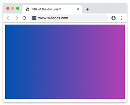
background-image: linear-gradient(direction, color1, color2, ...);Top to Bottom
Linear gradients transition from top to bottom, by default.
Example of a linear gradient from top to bottom:
<!DOCTYPE html>
<html>
  <head>
    <title>Title of the document</title>
    <style>
      .gradient {
        height: 300px;
        background-color: blue;
        background-image: linear-gradient(#0052b0, #b340b3);
      }
    </style>
  </head>
  <body>
    <div class="gradient"></div>
  </body>
</html>Left to Right
Changing a linear-gradient rotation specifying the direction starting from left transitioning to right.
Example of a linear gradient from left to right:
<!DOCTYPE html>
<html>
  <head>
    <title>Title of the document</title>
    <style>
      .gradient {
        height: 300px;
        background-color: blue;
        background-image: linear-gradient(to right, #0052b0 ,#b340b3);
      }
    </style>
  </head>
  <body>
    <div class="gradient"></div>
  </body>
</html>Diagonal gradients
Gradients can be run diagonally specifying both the horizontal and vertical starting positions. It starts at the top left and goes to the bottom right.
Example of the diagonal gradient:
<!DOCTYPE html>
<html>
  <head>
    <title>Title of the document</title>
    <style>
      .gradient {
        height: 300px;
        background-color: blue;
        background-image: linear-gradient(to bottom right, #0052b0, #b340b3);
      }
    </style>
  </head>
  <body>
    <div class="gradient"></div>
  </body>
</html>Using Angles
Define an angle instead of directions to take more control over the gradient direction. 0deg creates a vertical gradient transitioning from bottom to top, 90deg creates a horizontal gradient transitioning from left to right. Specifying negative angles will run in a counterclockwise direction.
Example of a linear gradient with a specified angle:
<!DOCTYPE html>
<html>
  <head>
    <title>Title of the document</title>
    <style>
      .gradient {
        height: 300px;
        background-color: blue;
        background-image: linear-gradient(70deg, #0052b0, #b340b3);
      }
    </style>
  </head>
  <body>
    <div class="gradient"></div>
  </body>
</html>Multiple Colors Effect
CSS gradient colors vary with position producing smooth color transitions. There is no limit in using colors.
Example of a linear gradient with multiple colors effect:
<!DOCTYPE html>
<html>
  <head>
    <title>Title of the document</title>
    <style>
      .gradient {
        height: 300px;
        background-color: blue;
        background-image: linear-gradient(#f50707, #f56e00,#f7df00, #66f507, #0052b0, #520f41, #ff0856);
      }
    </style>
  </head>
  <body>
    <div class="gradient"></div>
  </body>
</html>We can also create a linear gradient with multiple colors effect specifying a direction. You can give each color zero, one, or two percentage or absolute length values. 0% indicates the starting point, while 100% indicates the ending point.
Example of a linear gradient with multiple colors from left to right:
<!DOCTYPE html>
<html>
  <head>
    <title>Title of the document</title>
    <style>
      .gradient {
        height: 300px;
        background-color: blue;
        background-image: linear-gradient(to right, #f50707, #f56e00,#f7df00, #66f507, #0052b0, #520f41, #ff0856);
      }
    </style>
  </head>
  <body>
    <div class="gradient"></div>
  </body>
</html>Example of a linear gradient with multiple colors from right to left:
<!DOCTYPE html>
<html>
  <head>
    <title>Title of the document</title>
    <style>
      .gradient {
        height: 300px;
        background-color: blue;
        background-image: linear-gradient(to left, #f50707, #f56e00,#f7df00, #66f507, #0052b0, #520f41, #ff0856);
      }
    </style>
  </head>
  <body>
    <div class="gradient"></div>
  </body>
</html>Transparency
Gradients support transparency, so you can use multiple backgrounds to achieve a transparent effect. To achieve it, you can use the rgba() function for defining the color stops. The last parameter in the rgba() function can be a value from 0 to 1 which will define the transparency of the color. 0 indicates full transparency, 1 indicates full color.
Example of a linear gradient from full color to transparent:
<!DOCTYPE html>
<html>
  <head>
    <title>Title of the document</title>
    <style>
      .gradient {
        height: 200px;
        background-image: linear-gradient(to left, rgba(235, 117, 253, 0), rgba(235, 117, 253, 1));
      }
    </style>
  </head>
  <body>
    <div class="gradient"></div>
  </body>
</html>Repeating Linear Gradient
Use repeating-linear-gradient() function to repeat a linear gradient. The colors get cycled over and over again as the gradient repeats.
Example of a repeated linear gradient:
<!DOCTYPE html>
<html>
  <head>
    <title>Title of the document</title>
    <style>
      .gradient {
        height: 200px;
        background-color: blue;
        background-image: repeating-linear-gradient(55deg, #d5b6de, #6c008a 7%, #036ffc 10%);
      }
    </style>
  </head>
  <body>
    <div class="gradient"></div>
  </body>
</html>Radial Gradients
Radial gradients radiate out from a central point. For creating a radial gradient at least two color stops must be specified. Radial gradients can be circular or elliptical.
Syntax
background-image: radial-gradient(shape size at position, start-color, ..., last-color);Example of a radial gradient with three colors:
<!DOCTYPE html>
<html>
  <head>
    <title>Title of the document</title>
    <style>
      .gradient {
        height: 250px;
        width: 250px;
        background-color: blue;
        background-image: radial-gradient( #ff0509, #fff700, #05ff33);
      }
    </style>
  </head>
  <body>
    <div class="gradient"></div>
  </body>
</html>Positioning Radial Color Stops
Like linear gradients, radial gradients also take a specified position and absolute length.
Example of differently spaced color stops:
<!DOCTYPE html>
<html>
  <head>
    <title>Title of the document</title>
    <style>
      .gradient {
        height: 250px;
        width: 250px;
        background-color: blue;
        background-image: radial-gradient( #ff0509 10%, #fff700 20%, #05ff33 80%);
      }
    </style>
  </head>
  <body>
    <div class="gradient"></div>
  </body>
</html>Positioning Center of Radial Gradient
You can also specify the center position of the gradient with percentage, or absolute lengths.
Example of a radial gradient with positioned center:
<!DOCTYPE html>
<html>
  <head>
    <title>Title of the document</title>
    <style>
      .gradient {
        height: 250px;
        width: 250px;
        background-color: blue;
        background-image: radial-gradient(at 0% 30%, #ff0509 10px, #fff700 30%, #05ff33 50%);
      }
    </style>
  </head>
  <body>
    <div class="gradient"></div>
  </body>
</html>Radial Gradient Shape
The shape parameter defines the shape of the radial gradient. It can take two values: circle or ellipse. The default value is an ellipse.
Example of radial gradient shape:
<!DOCTYPE html>
<html>
  <head>
    <title> Title of the document</title>
    <style>
      .gradient1 {
        height: 150px;
        width: 200px;
        background-color: blue;
        background-image: radial-gradient(red, yellow, green);
      }
      .gradient2 {
        height: 150px;
        width: 200px;
        background-color: blue;
        background-image: radial-gradient(circle, red, yellow, green);
      }
    </style>
  </head>
  <body>
    <h2>Ellipse:</h2>
    <div class="gradient1"></div>
    <h2>Circle:</h2>
    <div class="gradient2"></div>
  </body>
</html>Sizing Radial Gradient
Unlike linear gradients, the size of the radial gradients can be specified. The values are:
- closest-corner
- closest-side
- farthest-corner(default)
- farthest-side.
Example of radial gradients with specified size:
<!DOCTYPE html>
<html>
  <head>
    <title>Title of the document</title>
    <style>
      .gradient1 {
        height: 150px;
        width: 150px;
        background-color: blue;
        background-image: radial-gradient(closest-side at 60% 55%, #ff0509, #fff700, #103601);
      }
      .gradient2 {
        height: 150px;
        width: 150px;
        background-color: blue;
        background-image: radial-gradient(farthest-side at 60% 55%, #ff0509, #fff700, #103601);
      }
      .gradient3 {
        height: 150px;
        width: 150px;
        background-color: blue;
        background-image: radial-gradient(closest-corner at 60% 55%, #ff0509, #fff700, #103601);
      }
      .gradient4 {
        height: 150px;
        width: 150px;
        background-color: blue;
        background-image: radial-gradient(farthest-corner at 60% 55%, #ff0509, #fff700, #103601);
      }
    </style>
  </head>
  <body>
    <h2>closest-side:</h2>
    <div class="gradient1"></div>
    <h2>farthest-side:</h2>
    <div class="gradient2"></div>
    <h2>closest-corner:</h2>
    <div class="gradient3"></div>
    <h2>farthest-corner:</h2>
    <div class="gradient4"></div>
  </body>
</html>Repeating Radial Gradient
The repeating-radial-gradient() CSS function creates an image that consists of repeating gradients radiating from an origin.
Example of the repeated radial gradient:
<!DOCTYPE html>
<html>
  <head>
    <style>
      .gradient {
        height: 200px;
        width: 200px;
        background-color: blue;
        background-image: repeating-radial-gradient(#f70000, #f7da00 10%, #005cfa 15%);
      }
    </style>
  </head>
  <body>
    <div class="gradient"></div>
  </body>
</html>Conic Gradients
The conic-gradient creates an image that consists of a gradient with color transitions rotating around a center point.
Syntax
background-image: conic-gradient(color1, color2);Example of a basic conic gradient:
<!DOCTYPE html>
<html>
  <head>
    <title>Title of the document</title>
    <style>
      .gradient {
        height: 250px;
        width: 250px;
        background-color: blue;
        background: conic-gradient(#ff0000, #fff200);
      }
    </style>
  </head>
  <body>
    <div class="gradient"></div>
  </body>
</html>Positioning Conic Center
Like radial gradients, the center of the conic gradient can be positioned with percentage, or absolute lengths, with the "at" keyword.
Example of a conic gradient with positioned center:
<!DOCTYPE html>
<html>
  <head>
    <title>Title of the document</title>
    <style>
      .gradient {
        height: 250px;
        width: 250px;
        background-color: blue;
        background: conic-gradient(at 0% 50%, red 10%, yellow 30%, #1eff00 60%);
      }
    </style>
  </head>
  <body>
    <div class="gradient"></div>
  </body>
</html>Changing the Angle
The angle of the conic gradient can be rotated with the "from" keyword.
Example of conic gradient with rotated angle:
<!DOCTYPE html>
<html>
  <head>
    <title>Title of the document</title>
    <style>
      .gradient {
        height: 250px;
        width: 250px;
        background-color: blue;
        background: conic-gradient(from 35deg, #ff0000, #ffa600, #fcf000, #03ff0f, #be05fc, #ff0095);
      }
    </style>
  </head>
  <body>
    <div class="gradient"></div>
  </body>
</html>Repeating Conic Gradient
The repeating-conic-gradient() CSS function creates an image that consists of a repeating gradient with color transitions rotating around a center point.
Example of the repeated conic gradient:
<!DOCTYPE html>
<html>
  <head>
    <title>Title of the document</title>
    <style>
      .gradient {
        height: 250px;
        width: 250px;
        background-color: blue;
        background: repeating-conic-gradient(from -45deg, red 45deg, orange, yellow, green, blue 225deg);
      }
    </style>
  </head>
  <body>
    <div class="gradient"></div>
  </body>
</html>Browser support
|
|
|
|
|
|---|---|---|---|---|
| 26+ | 12+ | 36+ | 3.1+ | 12.1+ |
Practice Your Knowledge
Quiz Time: Test Your Skills!
Ready to challenge what you've learned? Dive into our interactive quizzes for a deeper understanding and a fun way to reinforce your knowledge.