The column-rule-width CSS property defines the width of the rule between columns. The column-rule-width property is one of the CSS3 properties.
Firstly you should define columns or column-rule-style property then the column-rule-width property. An element must have some rules before you can set the width.
This property has the following values:
- medium
- thick
- thin
- length
The specification doesn't define the exact thickness of each keyword. However, they always follow this order: thin ≤ medium ≤ thick.
| Initial Value | medium |
| Applies to | Multicol elements. |
| Inherited | No. |
| Animatable | Yes. The width and color of the rule are animatable. |
| Version | CSS3 |
| DOM Syntax | object.style.columnRuleWidth = "5px"; |
Syntax
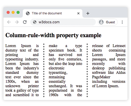
column-rule-width: medium | thin | thick | length | initial | inherit;Example of the column-rule-width property:
<!DOCTYPE html>
<html>
  <head>
    <title>Title of the document</title>
    <style>
      div {
        /* Chrome, Safari, Opera */
        -webkit-column-count: 3;
        -webkit-column-gap: 40px;
        -webkit-column-rule-style: dotted;
        -webkit-column-rule-color: #666;
        -webkit-column-rule-width: thick;
        /* Firefox */
        -moz-column-count: 3;
        -moz-column-gap: 40px;
        -moz-column-rule-style: dotted;
        -moz-column-rule-color: #666;
        -moz-column-rule-width: thick;
        column-count: 3;
        column-gap: 40px;
        column-rule-style: dotted;
        column-rule-color: #666;
        column-rule-width: thick;
        text-align: justify;
      }
    </style>
  </head>
  <body>
    <h1>Column-rule-width property example</h1>
    <div>
      Lorem Ipsum is dummy text of the printing and typesetting industry. Lorem Ipsum has been the industry's standard dummy text ever since the 1500s, when an unknown printer took a galley of type and scrambled it to make a type specimen book. It has survived not only five centuries, but also the leap into electronic typesetting, remaining essentially unchanged. It was popularised in the 1960s with the release of Letraset sheets containing Lorem Ipsum passages, and more recently with desktop publishing software like Aldus PageMaker including versions of Lorem Ipsum.
    </div>
  </body>
</html>Result
Example of the column-rule-width property with the "thin" value:
<!DOCTYPE html>
<html>
  <head>
    <title>Title of the document</title>
    <style>
      div {
        /* Chrome, Safari, Opera */
        -webkit-column-count: 3;
        -webkit-column-gap: 40px;
        -webkit-column-rule-style: solid;
        -webkit-column-rule-width: thin;
        /* Firefox */
        -moz-column-count: 3;
        -moz-column-gap: 40px;
        -moz-column-rule-style: solid;
        -moz-column-rule-width: thin;
        column-count: 3;
        column-gap: 40px;
        column-rule-style: solid;
        column-rule-width: thin;
        text-align: justify;
      }
    </style>
  </head>
  <body>
    <h1>Column-rule-width property example</h1>
    <div>
      Lorem Ipsum is dummy text of the printing and typesetting industry. Lorem Ipsum has been the industry's standard dummy text ever since the 1500s, when an unknown printer took a galley of type and scrambled it to make a type specimen book. It has survived not only five centuries, but also the leap into electronic typesetting, remaining essentially unchanged. It was popularised in the 1960s with the release of Letraset sheets containing Lorem Ipsum passages, and more recently with desktop publishing software like Aldus PageMaker including versions of Lorem Ipsum.
    </div>
  </body>
</html>Example of the column-rule-width property specified as "15px":
<!DOCTYPE html>
<html>
  <head>
    <title>Title of the document</title>
    <style>
      div {
        /* Chrome, Safari, Opera */
        -webkit-column-count: 3;
        -webkit-column-gap: 40px;
        -webkit-column-rule-style: groove;
        -webkit-column-rule-color: #1c87c9;
        -webkit-column-rule-width: 15px;
        /* Firefox */
        -moz-column-count: 3;
        -moz-column-gap: 40px;
        -moz-column-rule-style: groove;
        -moz-column-rule-color: #1c87c9;
        -moz-column-rule-width: 15px;
        column-count: 3;
        column-gap: 40px;
        column-rule-style: groove;
        column-rule-color: #1c87c9;
        column-rule-width: 15px;
        text-align: justify;
      }
    </style>
  </head>
  <body>
    <h1>Column-rule-width property example</h1>
    <div>
      Lorem Ipsum is dummy text of the printing and typesetting industry. Lorem Ipsum has been the industry's standard dummy text ever since the 1500s when an unknown printer took a galley of type and scrambled it to make a type specimen book. It has survived not only five centuries, but also the leap into electronic typesetting, remaining essentially unchanged. It was popularised in the 1960s with the release of Letraset sheets containing Lorem Ipsum passages, and more recently with desktop publishing software like Aldus PageMaker including versions of Lorem Ipsum.
    </div>
  </body>
</html>Values
| Value | Description | Play it |
|---|---|---|
| medium | The rule is medium. This is the default value. | Play it » |
| thick | The rule is thick. | Play it » |
| thin | The rule is thin. | Play it » |
| length | Specifies the rule of the width. | Play it » |
| initial | Sets the property to its default value. | Play it » |
| inherit | Inherits the property from its parent element. |
Browser support
|
|
|
|
|
|---|---|---|---|---|
|
50.0 -webkit- |
12.0 -webkit- |
52.0 + 3.5 -moz- |
3.0 -webkit- |
11.1 + 15.0 -webkit- |
Practice Your Knowledge
What does the 'column-rule-width' property do in CSS?
Correct!
Incorrect!
Quiz Time: Test Your Skills!
Ready to challenge what you've learned? Dive into our interactive quizzes for a deeper understanding and a fun way to reinforce your knowledge.