The shorthand border-image property allows to specify an image as the border around an element.
The border-image property is one of the CSS3 properties.
With the help of the other border-image properties, this property is specified. Omitted values are set to their default values. See some notes about each of the values:
- border-image-source - If the value is "none", or if the image cannot be displayed, the border styles will be used.
- border-image-slice -The middle part of the image is treated as fully transparent, unless the "fill" value is set.
- border-image-width - If this property's value is greater than the element's border-width, the border image will extend beyond the padding (and/or content) edge. You also need to know that this property may be specified using one, two, three, or four values.
- border-image-outset - It may be specified using one, two, three, or four values too.
- border-image-repeat - It can be specified by two values. If the second value is omitted, it is assumed to be the same as the first. And when we set only one value, it applies the same behavior on all four sides, if we set two values, the first applies to the top and bottom, the second to the left and right.
| Initial Value | none 100% 1 0 stretch |
| Applies to | All elements, except internal table elements when border-collapse is "collapse". It also applies to ::first-letter. |
| Inherited | No |
| Animatable | No |
| Version | CSS3 |
| DOM Syntax | object.style.borderImage = "url(border.png) 30 round" |
Syntax
border-image: source slice width outset repeat | initial | inherit;Example of the border-image property:
<!DOCTYPE html>
<html>
<head>
<title>The title of the document</title>
<style>
.border {
border: 10px solid transparent;
padding: 15px;
border-image: url(/uploads/media/default/0001/01/812bf6a749522b8185c1beee20dd99dd6c6c87da.jpeg) round;
border-image-slice: 10%;
}
</style>
</head>
<body>
<h2>Border-image-slice example</h2>
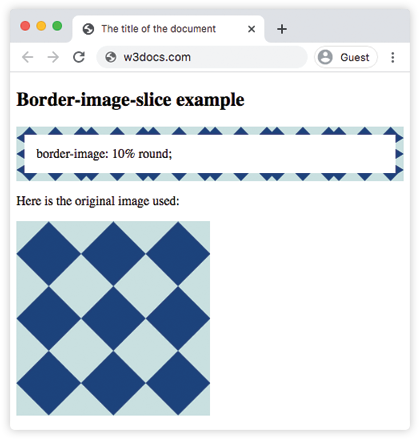
<p class="border">border-image: 10% round;</p>
<p>Here is the original image used:</p>
<img src="/uploads/media/default/0001/01/812bf6a749522b8185c1beee20dd99dd6c6c87da.jpeg" style="width:50%">
</body>
</html>Result
Example of the border-image property with multiple values:
<!DOCTYPE html>
<html>
  <head>
    <title>The title of the document</title>
    <style>
      .border {
        border: 10px solid transparent;
        padding: 15px;
        border-image: url(/uploads/media/default/0001/01/812bf6a749522b8185c1beee20dd99dd6c6c87da.jpeg) round;
        border-image-slice: 30%;
        border-image-repeat: repeat;
        border-image-width: 15px;
      }
      .border2 {
        border: 10px solid transparent;
        padding: 15px;
        border-image: url(/uploads/media/default/0001/01/812bf6a749522b8185c1beee20dd99dd6c6c87da.jpeg) round;
        border-image-slice: 20%;
        border-image-repeat: round;
        border-image-width: 10px;
      }
      .border3 {
        border: 10px solid transparent;
        padding: 15px;
        border-image: url(/uploads/media/default/0001/01/812bf6a749522b8185c1beee20dd99dd6c6c87da.jpeg) round;
        border-image-slice: 15%;
        border-image-repeat: space;
        border-image-width: 20px;
      }
    </style>
  </head>
  <body>
    <h2>Border-image example with all values.</h2>
    <p class="border">border-image: 30% 15px repeat</p>
    <p class="border2">border-image: 20% 10px round;</p>
    <p class="border3">border-image: 15% 20px space;</p>
    <p>Here is the original image used:</p>
    <img src="/uploads/media/default/0001/01/812bf6a749522b8185c1beee20dd99dd6c6c87da.jpeg" style="width:50%">
  </body>
</html>Values
| Value | Description | Play it |
|---|---|---|
| border-image-source | Specifies the source image that is used to create border image. This can be a URL, data URI, CSS gradient, or inline SVG. | |
| border-image-slice | Specifies how to slice the image specified by border-image-source. The image is always sliced into nine sections: four corners, four edges and the middle. | Play it » |
| border-image-width | Specifies the width of the border image. | |
| border-image-repeat | Specifies if the border image is repeated, rounded or stretched. | Play it » |
| initial | Sets the property to its default value. | |
| inherit | Inherits the property from its parent element. |
Browser support
|
|
|
|
|
|---|---|---|---|---|
| 16.0+ | 12.0+ | 15.0+ | 6.0+ | 11.0+ |
Practice Your Knowledge
What is true about the CSS border-image property according to the content on the specified URL?
Correct!
Incorrect!
Quiz Time: Test Your Skills!
Ready to challenge what you've learned? Dive into our interactive quizzes for a deeper understanding and a fun way to reinforce your knowledge.