
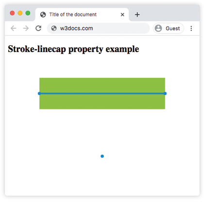
The stroke-linecap property sets the starting and ending points of a border on element.
The presentation attribute will be overridden: e.g. <path stroke-linecap="round" ... />. The inline style won’t be overridden: e.g. <path style="stroke-linecap: round;" .../>.
The stroke-linecap property can be used as a CSS property as a presentation attribute. It can be applied to any element but can have an effect only on the following elements: <altGlyph>, <path>, <polyline>, <line>, <text>, <textPath>, <tref>, and <tspan>.
| Initial Value | butt |
| Applies to | Shapes and text content elements. |
| Inherited | Yes. |
| Animatable | No. |
| Version | SVG 1.1 Specification |
| DOM Syntax | Object.strokeLinecap = "round"; |
Syntax
stroke-linecap: butt | square | round | initial | inherit;Example of the stroke-linecap property:
<!DOCTYPE html>
<html>
  <head>
    <title>Title of the document</title>
  </head>
  <body>
    <h2>Stroke-linecap property example</h2>
    <svg viewBox="0 0 6 4">
      <!-- Effect of the "butt" value -->
      <path d="M1,1 h4" stroke="#8ebf42"
        stroke-linecap="butt" />
      <!-- Effect of the "butt" value on a zero length path -->
      <path d="M3,3 h0" stroke="#8ebf42"
        stroke-linecap="butt" />
      <!--
        the following pink lines highlight the
        position of the path for each stroke
        -->
      <path d="M1,1 h4" stroke="#1c87c9" stroke-width="0.05" />
      <circle cx="1" cy="1" r="0.05" fill="#1c87c9" />
      <circle cx="5" cy="1" r="0.05" fill="#1c87c9" />
      <circle cx="3" cy="3" r="0.05" fill="#1c87c9" />
    </svg>
  </body>
</html>Result
Example of the stroke-linecap property with the "round" value:
<!DOCTYPE html>
<html>
  <head>
    <title>Title of the document</title>
  </head>
  <body>
    <h2>Stroke-linecap property example</h2>
    <svg viewBox="0 0 6 4">
      <!-- Effect of the "round" value -->
      <path d="M1,1 h4" stroke="#8ebf42" stroke-linecap="round" />
      <!-- Effect of the "round" value on a zero length path -->
      <path d="M3,3 h0" stroke="#8ebf42" stroke-linecap="round" />
      <!--
      the following pink lines highlight the
      position of the path for each stroke
      -->
      <path d="M1,1 h4" stroke="#1c87c9" stroke-width="0.05" />
      <circle cx="1" cy="1" r="0.05" fill="#1c87c9" />
      <circle cx="5" cy="1" r="0.05" fill="#1c87c9" />
      <circle cx="3" cy="3" r="0.05" fill="#1c87c9" />
    </svg>
  </body>
</html>Example of the stroke-linecap property with the "square" value:
<!DOCTYPE html>
<html>
  <head>
    <title>Title of the document</title>
  </head>
  <body>
    <h2>Stroke-linecap property example</h2>
    <svg viewBox="0 0 6 4">
      <!-- Effect of the "square" value -->
      <path d="M1,1 h4" stroke="#8ebf42" stroke-linecap="square" />
      <!-- Effect of the "square" value on a zero length path -->
      <path d="M3,3 h0" stroke="#8ebf42" stroke-linecap="square" />
      <!--
        the following pink lines highlight the
        position of the path for each stroke
        -->
      <path d="M1,1 h4" stroke="#1c87c9" stroke-width="0.05" />
      <circle cx="1" cy="1" r="0.05" fill="#1c87c9" />
      <circle cx="5" cy="1" r="0.05" fill="#1c87c9" />
      <circle cx="3" cy="3" r="0.05" fill="#1c87c9" />
    </svg>
  </body>
</html>Values
| Value | Description |
|---|---|
| butt | Ends the stroke with a sharp angle. On 0 length subpath, the path will not be rendered. This is the default value of this property. |
| square | Extends the stroke beyond the length of the path. |
| round | Makes the start and end points round. |
| initial | Makes the property use its default value. |
| inherit | Inherits the property from its parents element. |
Browser support

|

|
|
|
|
|---|---|---|---|---|
| ✓ | ✓ | ✓ | ✓ | ✓ |
Practice Your Knowledge
What does the 'stroke-linecap' property in CSS affect?

Correct!

Incorrect!
Quiz Time: Test Your Skills!
Ready to challenge what you've learned? Dive into our interactive quizzes for a deeper understanding and a fun way to reinforce your knowledge.