The grid-template property defines the grid columns, rows and areas. It is a shorthand property for the following properties:
The grid-template property sets the rows and columns, separated by a forward slash.
The grid-template property does not affect any gutters (gap) cascading down.
The CSS grid shorthand property resets grid properties to their first values. If you don’t want these values cascade in separately, instead of the grid-template property use the grid property.
| Initial Value | none none none |
| Applies to | Grid containers. |
| Inherited | No. |
| Animatable | Yes. Grid layout is animatable. |
| Version | CSS Grid Layout Module Level 1 |
| DOM Syntax | object.style.gridTemplate ="100px / auto auto"; |
Syntax
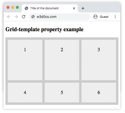
grid-template: none | grid-template-rows / grid-template-columns | grid-template-areas | initial | inherit;Example of the grid-template property:
<!DOCTYPE html>
<html>
  <head>
    <title>Title of the document</title>
    <style>
      .grid-container {
        display: grid;
        grid-template: 170px / auto auto auto;
        grid-gap: 10px;
        background-color: #ccc;
        padding: 10px;
      }
      .grid-container > div {
        background-color: #eee;
        text-align: center;
        padding: 30px 0;
        font-size: 20px;
      }
    </style>
  </head>
  <body>
    <h2>Grid-template property example</h2>
    <div class="grid-container">
      <div>1</div>
      <div>2</div>
      <div>3</div>
      <div>4</div>
      <div>5</div>
      <div>6</div>
    </div>
  </body>
</html>Result
Example of the grid-template property, where "item1" name is given to a grid item:
<!DOCTYPE html>
<html>
  <head>
    <title>Title of the document</title>
    <style>
      .box {
        grid-area: item1;
      }
      .grid-container {
        display: grid;
        grid-template: 'item1 item1 . .' 'item1 item1 . .';
        grid-gap: 10px;
        background-color: #ccc;
        padding: 10px;
      }
      .grid-container > div {
        background-color: #eee;
        text-align: center;
        padding: 30px 0;
        font-size: 20px;
      }
    </style>
  </head>
  <body>
    <h2>Grid-template property example</h2>
    <div class="grid-container">
      <div class="box">1</div>
      <div>2</div>
      <div>3</div>
      <div>4</div>
      <div>5</div>
      <div>6</div>
    </div>
  </body>
</html>Values
| Value | Description | Play it |
|---|---|---|
| none | No size will be defined. This is the default value of this property. | |
| grid-template-rows / grid-template-columns | Specifies the size of the rows and columns. | Play it » |
| grid-template-areas | Specifies the grid layout using named items. | Play it » |
| initial | Makes the property use its default value. | |
| inherit | Inherits the property from its parents element. |
Browser support
|
|
|
|
|
|---|---|---|---|---|
| 57.0+ | 16.0+ | 52.0+ | 10.1+ | 44.0+ |
Practice Your Knowledge
What does the 'grid-template' property in CSS stand for?
Correct!
Incorrect!
Quiz Time: Test Your Skills!
Ready to challenge what you've learned? Dive into our interactive quizzes for a deeper understanding and a fun way to reinforce your knowledge.