The flex-basis property specifies the initial main size of the flexible item. When this property is not included, its value is set to 0%.
The flex-basis property is one of the CSS3 properties.
If there are no flexible items, the flex-basis property won't have any effect.
The flex-basis property will have a priority when both flex-basis with a value other than auto and width (or height in case of flex-direction with a value set to column) are set.
| Initial Value | auto |
| Applies to | Flex items, including in-flow pseudo-elements. |
| Inherited | No. |
| Animatable | Yes. Items are animatable. |
| Version | CSS3 |
| DOM Syntax | object.style.flexBasis = "100px"; |
Syntax
flex-basis: number | auto | initial | inherit;Example of the flex-basis property:
<!DOCTYPE html>
<html>
<head>
<title>Title of the document</title>
<style>
.box {
width: 300px;
height: 80px;
border: 1px solid #666;
display: -webkit-flex; /* Safari */
display: flex;
}
.box div {
-webkit-flex-grow: 0; /* Safari 6.1+ */
-webkit-flex-shrink: 0; /* Safari 6.1+ */
-webkit-flex-basis: 40px; /* Safari 6.1+ */
flex-grow: 0;
flex-shrink: 0;
flex-basis: 40px;
}
.box div:nth-of-type(2) {
-webkit-flex-basis: 140px; /* Safari 6.1+ */
flex-basis: 140px;
}
</style>
</head>
<body>
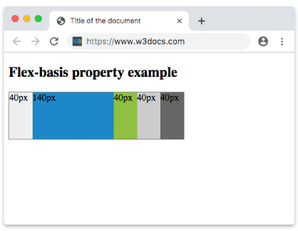
<h2>Flex-basis property example</h2>
<div class="box">
<div style="background-color: #eeeeee;">40px</div>
<div style="background-color: #1c87c9;">140px</div>
<div style="background-color: #8ebf42;">40px</div>
<div style="background-color: #cccccc;">40px</div>
<div style="background-color: #666666;">40px</div>
</div>
</body>
</html>Result
Example of the flex-basis property with all the values:
<!DOCTYPE html>
<html>
  <head>
    <title>Title of the document</title>
    <style>
      .box {
        height: 70px;
        display: flex;
      }
      .box div {
        flex-grow: 0;
        flex-shrink: 0;
        flex-basis: 60px;
        padding: 15px;
        /* For Safari 6.1 and above browsers */
        -webkit-flex-grow: 0;
        -webkit-flex-shrink: 0;
        -webkit-flex-basis: 60px;
      }
      .box div:first-child {
        background-color: #40c3da;
      }
      .box div:nth-of-type(2) {
        flex-basis: 40%;
        -webkit-flex-basis: 40%;
        background-color: lightgreen;
      }
      .box div:nth-of-type(3) {
        flex-basis: auto;
        -webkit-flex-basis: auto;
        background-color: yellow;
      }
      .box div:nth-of-type(4) {
        flex-basis: initial;
        -webkit-flex-basis: initial;
        background-color: orange;
      }
      .box div:nth-of-type(5) {
        flex-basis: inherit;
        -webkit-flex-basis: inherit;
        background-color: pink;
      }
    </style>
  </head>
  <body>
    <h2>Flex-basis property example</h2>
    <div class="box">
      <div>
        number 60px
      </div>
      <div>
        percentage 40%
      </div>
      <div>
        auto
      </div>
      <div>
        initial
      </div>
      <div>
        inherit
      </div>
    </div>
  </body>
</html>Example of the flex-basis property specified in pixels:
<!DOCTYPE html>
<html>
  <head>
    <title>Title of the document</title>
    <style>
      .box {
        width: 460px;
        height: 70px;
        display: flex;
      }
      .box div {
        flex-grow: 0;
        flex-shrink: 0;
        flex-basis: 70px;
        padding: 15px;
        /* For Safari 6.1 and above browsers */
        -webkit-flex-grow: 0;
        -webkit-flex-shrink: 0;
        -webkit-flex-basis: 70px;
      }
      .box div:first-child {
        background-color: #40c3da;
      }
      .box div:nth-of-type(2) {
        flex-basis: 100px;
        -webkit-flex-basis: 100px;
        background-color: lightgreen;
      }
      .box div:nth-of-type(3) {
        background-color: #1c87c9;
      }
      .box div:nth-of-type(4) {
        flex-basis: 150px;
        -webkit-flex-basis: 150px;
        background-color: orange;
      }
      .box div:nth-of-type(5) {
        background-color: #8ebf42;
      }
    </style>
  </head>
  <body>
    <h2>Flex-basis property example</h2>
    <div class="box">
      <div>
        70px
      </div>
      <div>
        100px
      </div>
      <div>
        70px
      </div>
      <div>
        150px
      </div>
      <div>
        70px
      </div>
    </div>
  </body>
</html>Values
| Value | Description | Play it |
|---|---|---|
| number | Specifies the length of the item by "auto", "inherit", or a number followed by "%", "px", "em" etc. | Play it » |
| auto | This value is the default value of this property. Length is equal the flexible item's length. If there is no specified item length, it will be according to its content. | Play it » |
| initial | Sets the property to its default value. | Play it » |
| inherit | Inherits this property from its parent element. |
Browser support
|
|
|
|
|---|---|---|---|
|
29.0+ 21-28 -webkit- |
28.0+ |
9.0+ 6.1-8.0 -webkit- |
12.1+ |
Practice Your Knowledge
What does the 'flex-basis' property do in CSS?
Correct!
Incorrect!
Quiz Time: Test Your Skills!
Ready to challenge what you've learned? Dive into our interactive quizzes for a deeper understanding and a fun way to reinforce your knowledge.