How to Make a <div> Fill the Height of the Remaining Space
If you need the content to fill the height of the full screen, you’re in the right place.
In this snippet, we’ll demonstrate four methods of making a <div> fill the height of the remaining space. So, let’s start!
1. The most usual solution to this problem is to use Flexbox. Let’s see how to use it. For this method, we’ll need the CSS flex property as a shorthand for the flex-grow, flex-shrink, and flex-basis properties.
Create HTML
- Use a <div> and add three other <div> ellements iinside.
- Add class attributes to the <div> elements.
- Add <p> elements inside the <div> tag.
<div class="box">
  <div class="row header">
    <p>header (sized to content)</p>
  </div>
  <div class="row content">
    <p>content (fills remaining space)</p>
  </div>
  <div class="row footer">
    <p>footer (fixed height)</p>
  </div>
</div>
Create CSS
- Set the height and margin for the <html> and <body> elements.
- Set the display to “flex”, and add the flex-flow and height properties for the “box” class.
- Set the border for the “box.row”.
- Set the flex property for the “row header”, “row content”, and “row footer” classes, separately.
html,
body {
  height: 100%;
  margin: 0;
}

.box {
  display: flex;
  flex-flow: column;
  height: 100%;
}

.box .row {
  border: 1px dotted #0313fc;
}

.box .row.header {
  flex: 0 1 auto;
}

.box .row.content {
  flex: 1 1 auto;
}

.box .row.footer {
  flex: 0 1 40px;
}
Let’s see the final code.
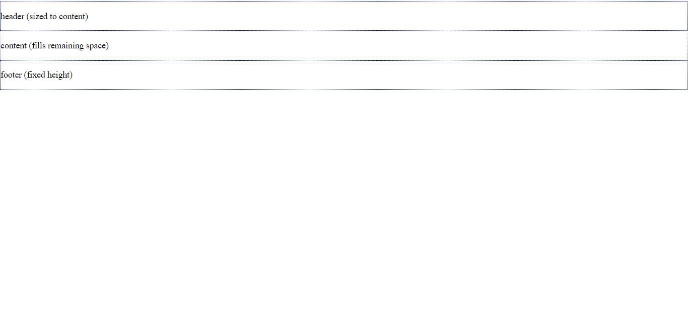
Example of making a <div> fill the remaining space with Flexbox:
<!DOCTYPE html>
<html>
  <head>
    <title>Title of the document</title>
    <style>
      html,
      body {
        height: 100%;
        margin: 0;
      }
      .box {
        display: flex;
        flex-flow: column;
        height: 100%;
      }
      .box .row {
        border: 1px dotted #0313fc;
      }
      .box .row.header {
        flex: 0 1 auto;
      }
      .box .row.content {
        flex: 1 1 auto;
      }
      .box .row.footer {
        flex: 0 1 40px;
      }
    </style>
  </head>
  <body>
    <div class="box">
      <div class="row header">
        <p>header (sized to content)</p>
      </div>
      <div class="row content">
        <p>content (fills remaining space)</p>
      </div>
      <div class="row footer">
        <p>footer (fixed height)</p>
      </div>
    </div>
  </body>
</html>Using flexbox, you can switch between rows and columns having either fixed dimensions, content-sized dimensions, or remaining space dimensions. In the example above, we demonstrated how to add an area with fixed height and set the content area for filling the remaining space.
Let's extend our example and add a container div after the box div.
<div class="box">
  <div class="box-container">
    /* add this line */
    <div class="row header">
      <p>header (sized to content)</p>
    </div>
    <div class="row content">
      <p>content (fills remaining space)</p>
    </div>
    <div class="row footer">
      <p>footer (fixed height)</p>
    </div>
  </div>
  /* end of box-container div */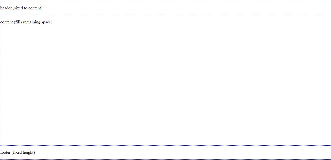
</div>And here's our result:
As we see, our layout's broken!
The solution's pretty simple. We should change the default behaviour of div tags, which is setting the display to be a block-level element. We will use the display: contents, so the contents will determine the size of the element.
.box-container {
  display: contents;
}
Here's the result, same as before:
Let's take a step further by adding an image in our box-container and seeing what happens.
<head>
  <title>Title of the document</title>
  <style>
    html,
    body {
      height: 100%;
      margin: 0;
    }
    .box {
      display: flex;
      flex-flow: column;
      height: 100%;
    }
    .box .row {
      border: 1px dotted #0313fc;
    }
    .box .row.header {
      flex: 0 1 auto;
    }
    .box .row.content {
      flex: 1 1 auto;
    }
    .box .row.footer {
      flex: 0 1 40px;
    }
    .box-container {
      display: contents;
    }
  </style>
</head>
<body>
  <div class="box">
    <div class="box-container">
      <div class="row header">
        <p>header (sized to content)</p>
        <img src="https://img.freepik.com/free-photo/wide-angle-shot-single-tree-growing-clouded-sky-during-sunset-surrounded-by-grass_181624-22807.jpg" height="150px" width="150px" />
        <!-- add this line -->
      </div>
      <div class="row content">
        <p>content (fills remaining space)</p>
      </div>
      <div class="row footer">
        <p>footer (fixed height)</p>
      </div>
    </div>
  </div>
</body>Here's our result:
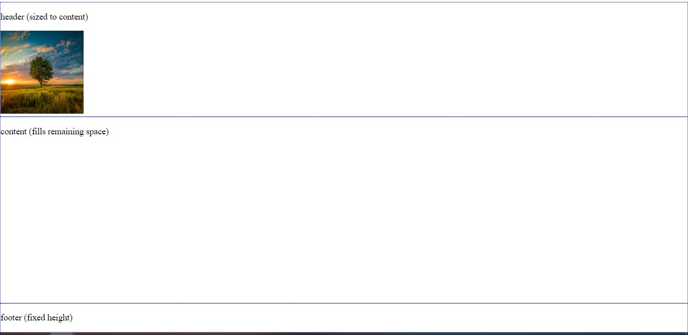
It seems like it's still working, great! So all we had to do was to place display: contents to our box-container div.
2. Another way of making a <div> fill the remaining space is to use the CSS position property. Just set the position to “absolute” to stretch the <div>.
Example of making a <div> fill the remaining space with the position property:
<!DOCTYPE html>
<html>
  <head>
    <title>Title of the document</title>
    <style>
      html,
      body {
        height: 100%;
        width: 100%;
        margin: 0;
      }
      #fixed-height {
        height: 100px;
        background-color: #57c975;
      }
      #remaining-height {
        background-color: #d9deda;
        position: absolute;
        top: 100px;
        bottom: 0;
        width: 100%;
      }
    </style>
  </head>
  <body>
    <div id="fixed-height">
      Fixed height
    </div>
    <div id="remaining-height">
      Remaining height
    </div>
  </body>
</html>3. The next method of making a <div> fill the remaining space is using tables. By setting the display property to “table”, we can distribute the given space. When we set a fixed height for one element, the other will use the remaining space.
<!DOCTYPE html>
<html>
  <head>
    <title>Title of the document</title>
    <style>
      html,
      body {
        height: 100%;
        width: 100%;
        margin: 0;
      }
      #fixed-height {
        height: 100px;
        background-color: #57c975;
      }
      #remaining-height {
        background-color: #d9deda;
        position: absolute;
        top: 100px;
        bottom: 0;
        width: 100%;
      }
    </style>
  </head>
  <body>
    <div id="fixed-height">
      Fixed height
    </div>
    <div id="remaining-height">
      Remaining height
    </div>
  </body>
</html>Example of making a <div> fill the remaining space with the display set to "table":
<!DOCTYPE html>
<html>
  <head>
    <title>Title of the document</title>
    <style>
      html,
      body,
      #outer {
        height: 100%;
        width: 100%;
        margin: 0;
      }
      #outer {
        display: table;
      }
      #fixed-height {
        height: 100px;
        background-color: #ebcaca;
        display: table-row;
      }
      #remaining-height {
        background-color: #ebe6e6;
        display: table-row;
      }
    </style>
  </head>
  <body>
    <div id="outer">
      <div id="fixed-height">
        Fixed height
      </div>
      <div id="remaining-height">
        Remaining height
      </div>
    </div>
  </body>
</html>4. The last method is to use the CSS calc() function. In this way, we can assign a height calculated from the total height minus the height of the other element.
Example of making a <div> fill the remaining space with the calc() function:
<!DOCTYPE html>
<html>
  <head>
    <title>Title of the document</title>
    <style>
      html,
      body {
        height: 100%;
        width: 100%;
        margin: 0;
      }
      #fixed-height {
        height: 100px;
        background-color: #ebcaca;
      }
      #remaining-height {
        background-color: #ebe6e6;
        height: calc(100% - 100px);
      }
    </style>
  </head>
  <body>
    <div id="fixed-height">
      Fixed height
    </div>
    <div id="remaining-height">
      Remaining height
    </div>
  </body>
</html>