The flex property defines the components of a flexible length. It is a shorthand for the following properties:
The flex-shrink and flex-basis are optional, i.e. you don’t have to include them in the flex declaration.
The flex property is one of the CSS3 properties.
This property is a part of the Flexible Box Layout module. If there are no flexible items, the flex property won't have any effect.
When you do not include flex-grow property in the shorthand declaration, the value is set to 1 by default. When you do not include flex-shrink property in the shorthand declaration, the value is set to 1 by default. Note, that the flex-shrink factor is multiplied by the flex-basis when negative space is distributed. When the flex-basis property is not included, its value is set to 0%.
"Auto" is the default value of the flex property. This value sizes the item based on the width/height properties. If the item’s main size property set to "auto", this will size the flex item based on its contents.
"Initial" sizes the item based on its width/height properties (or its content if not set)making the flex item inflexible when there is some free space left, but allowing it to shrink to its minimum size when there is not enough space. The alignment techniques or auto margins are used for aligning the flex items along the main axis.
"None" sizes the item according to the width and height properties. It is fully inflexible.
| Initial Value | 0 1 auto |
| Applies to | Flex items, including in-flow pseudo-elements. |
| Inherited | No. |
| Animatable | Yes. |
| Version | CSS3 |
| DOM Syntax | Object.style.flex = "1"; |
Syntax
flex: flex-grow | flex-shrink | flex-basis | auto | initial | inherit;Example of the flex property:
<!DOCTYPE html>
<html>
<head>
<title>Title of the document</title>
<style>
.box {
width: 350px;
height: 200px;
padding-left: 0;
list-style-type: none;
border: 1px dashed black;
display: -webkit-flex;
display: flex;
}
.box div {
flex: 1;
}
.green {
background-color: #8ebf42;
}
.blue {
background-color: #1c87c9;
}
.gray {
background-color: #666666;
}
</style>
</head>
<body>
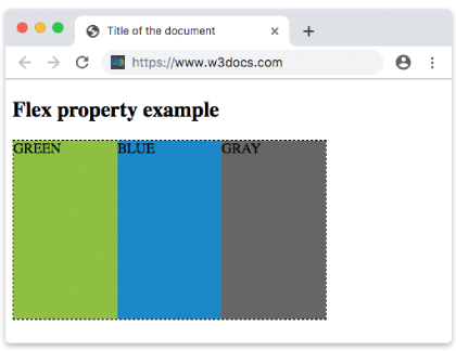
<h2>Flex property example</h2>
<div class="box">
<div class="green">GREEN</div>
<div class="blue">BLUE</div>
<div class="gray">GRAY</div>
</div>
</body>
</html>Result
Example of the flex property with the "flex-grow" value:
<!DOCTYPE html>
<html>
  <head>
    <title>Title of the document</title>
    <style>
      .box {
        width: 320px;
        height: 120px;
        border: 1px solid #666;
        display: -webkit-flex;
        /* Safari */
        display: flex;
      }
      /* Safari 6.1+ */
      .box div:nth-of-type(1) {
        -webkit-flex-grow: 1;
      }
      .box div:nth-of-type(2) {
        -webkit-flex-grow: 4;
      }
      .box div:nth-of-type(3) {
        -webkit-flex-grow: 1;
      }
      .box div:nth-of-type(4) {
        -webkit-flex-grow: 1;
      }
      .box div:nth-of-type(5) {
        -webkit-flex-grow: 1;
      }
      /* Standard syntax */
      .box div:nth-of-type(1) {
        flex-grow: 1;
      }
      .box div:nth-of-type(2) {
        flex-grow: 4;
      }
      .box div:nth-of-type(3) {
        flex-grow: 1;
      }
      .box div:nth-of-type(4) {
        flex-grow: 1;
      }
      .box div:nth-of-type(5) {
        flex-grow: 1;
      }
    </style>
  </head>
  <body>
    <h2>Flex-grow example</h2>
    <div class="box">
      <div style="background-color: #eee;"></div>
      <div style="background-color: #1c87c9;"></div>
      <div style="background-color: #8ebf42;"></div>
      <div style="background-color: #ccc;"></div>
      <div style="background-color: #666;"></div>
    </div>
  </body>
</html>Example of the flex property with the "flex-shrink" value:
<!DOCTYPE html>
<html>
  <head>
    <title>Title of the document</title>
    <style>
      .box {
        width: 320px;
        height: 120px;
        border: 1px solid #666;
        display: -webkit-flex;
        display: flex;
      }
      .box div {
        -webkit-flex-grow: 1;
        -webkit-flex-shrink: 2;
        -webkit-flex-basis: 100px;
        flex-grow: 1;
        flex-shrink: 2;
        flex-basis: 100px;
      }

      .box div:nth-of-type(2) {
        -webkit-flex-shrink: 5;
        flex-shrink: 5;
      }
    </style>
  </head>
  <body>
    <h2>Flex-shrink example</h2>
    <div class="box">
      <div style="background-color: #eeeeee;"></div>
      <div style="background-color: #1c87c9;"></div>
      <div style="background-color: #8ebf42;"></div>
      <div style="background-color: #cccccc;"></div>
      <div style="background-color: #666666;"></div>
    </div>
  </body>
</html>Values
| Value | Description |
|---|---|
| flex-grow | Specifies how much the item will grow relative to the rest of the flexible items of the same container. |
| flex-shrink | Specifies how much the item will shrink relative to the rest of the flexible items of the same container. |
| flex-basis | Specifies the length of the item by "auto", "inherit", or a number followed by "%", "px", "em", etc. |
| auto | Equivalent to 1 1 auto. |
| initial | Equivalent to 1 0 auto. |
| none | Equivalent to 0 0 auto. |
| inherit | Inherits this property from its parent element. |
Browser support
|
|
|
|
|---|---|---|---|
|
29.0+ 21-28 -webkit- |
28.0+ |
9.0+ 6.1-8.0 -webkit- |
12.1+ |
Practice Your Knowledge
Quiz Time: Test Your Skills!
Ready to challenge what you've learned? Dive into our interactive quizzes for a deeper understanding and a fun way to reinforce your knowledge.