
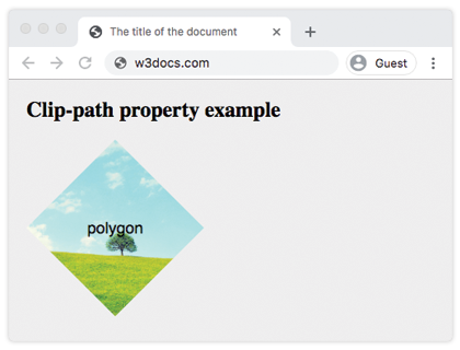
The clip-path property allows to specify a clipping region which sets what part of the element should be shown. Those parts outside the clipping region are hidden. This property has four values:
- clip-source
- basic-shape
- geometry-box
- none
The deprecated clip property will be replaced by the clip-path property.
| Initial Value | none |
| Applies to | All elements. |
| Inherited | No |
| Animatable | Yes, if specified for <basic-shape>. |
| Version | CSS1 |
| DOM Syntax | object.style.clipPath = "none"; |
Syntax
clip-path: clip-source | basic-shape | geometry-box | none | initial | inherit;Example of the clip-path property:
<!DOCTYPE html>
<html>
  <head>
    <title>The title of the document </title>
    <style>
      body {
        margin: 0;
        padding: 0;
        background-color: #eee;
      }
      .container {
        display: grid;
        grid-template-columns: 200px 200px 200px;
        grid-template-rows: 200px 200px 200px;
        grid-gap: 20px;
        justify-content: center;
      }
      .container div {
        background-image: url("/uploads/media/default/0001/01/b408569013c0bb32b2afb0f0d45e93e982347951.jpeg");
        background-position: center;
        background-size: cover;
        color: #000;
        font-size: 18px;
        font-family: sans-serif;
        display: flex;
        justify-content: center;
        align-items: center;
      }
      .example {
        clip-path: polygon(50% 0%, 100% 50%, 50% 100%, 0% 50%);
      }
    </style>
  </head>
  <body>
    <h1>Clip-path property example</h1>
    <div class="container">
      <div class="example">polygon</div>
    </div>
  </body>
</html>Result
Example of the clip-path property with all the values:
<!DOCTYPE html>
<html>
  <head>
    <title>Title of the document </title>
    <style>
      body {
        margin: 0;
        padding: 0;
        background-color: #eee;
      }
      .container {
        display: grid;
        grid-template-columns: 200px 200px 200px;
        grid-template-rows: 200px 200px 200px;
        grid-gap: 20px;
        justify-content: center;
      }
      .container > div {
        background-image: url(/uploads/media/default/0001/01/b408569013c0bb32b2afb0f0d45e93e982347951.jpeg);
        background-position: center;
        background-size: cover;
        color: #000;
        font-size: 18px;
        font-family: sans-serif;
        display: flex;
        justify-content: center;
        align-items: center;
      }
      .box1 {
        clip-path: none;
      }
      .box2 {
        clip-path: inset(25% 0 25% 0 round 0 25% 0 25%);
        /* values are from-top, from-right, from-bottom, from-left */
      }
      .box3 {
        clip-path: circle(50% at 50% 50%);
      }
      .box4 {
        clip-path: polygon(50% 0%, 100% 50%, 50% 100%, 0% 50%);
      }
      .box5 {
        clip-path: ellipse(90px 50px at 100px 100px);
      }
      .box6 {
        clip-path: inherit;
      }
      .box7 {
        clip-path: initial;
      }
      .box8 {
        clip-path: unset;
      }
    </style>
  </head>
  <body>
    <h2>Clip-path property example</h2>
    <div class="container">
      <div class="box1">none</div>
      <div class="box2">inset</div>
      <div class="box3">circle</div>
      <div class="box4">polygon</div>
      <div class="box5">ellipse</div>
      <div class="box6">inherit</div>
      <div class="box7">initial</div>
      <div class="box8">unset</div>
    </div>
  </body>
</html>Values
| Value | Description | Play it |
|---|---|---|
| <clip-source> | The <url> referencing an SVG <clipPath> element. | |
| <basic-shape> | The shape which size and position are defined by the <geometry-box>. | Play it » |
| <geometry-box> | Defines the reference box for the basic shape. | |
| none | Clipping path is not created. | |
| initial | It makes the property use its default value. | |
| inherit | It inherits the property from its parents element. |
Browser support

|

|

|

|
|
|---|---|---|---|---|
|
55.0 (Partial) |
✕ | 54.0+ |
7.0 -webkit- (Partial) |
420 (Partial) |
Practice Your Knowledge
What does the CSS clip-path property do?

Correct!

Incorrect!
Quiz Time: Test Your Skills!
Ready to challenge what you've learned? Dive into our interactive quizzes for a deeper understanding and a fun way to reinforce your knowledge.