The border-image-slice specifies how to slice the image specified by border-image-source into nine regions: four corners, four edges, a middle part. The "middle" part is fully transparent, until the "fill" value is set. It is one of the CSS3 properties.
The border-image-slice property have three values: number, percentage and fill. The number represents an edge offset in pixels for raster images and coordinates for vector images. The percentage represents an edge offset as a percentage of the source image's size. Fill causes the middle part of the image to be displayed like a background image.
This property can take up to four values. Negative values are not allowed. If one value is applied, it makes all four slices at the same distance from their respective sides. If two values are specified, the first one creates slices measured from the top and bottom. The second one creates slices measured from the left and right. If three values are applied, the first creates slices measured from the top, the second from left and right, the third from the bottom. And if four values are specified, they create slices from four sides.
| Initial Value | 100%. |
| Applies to | All elements. It also applies to ::first-letter. |
| Inherited | No. |
| Animatable | No. |
| Version | CSS3 |
| DOM Syntax | object.style.borderImageSlice = "10%"; |
Syntax
border-image-slice: number | % | fill | initial | inherit;Example of the border-image-slice property:
<!DOCTYPE html>
<html>
<head>
<style>
.border {
border: 10px solid transparent;
padding: 15px;
border-image: url("/uploads/media/default/0001/01/812bf6a749522b8185c1beee20dd99dd6c6c87da.jpeg") round;
border-image-slice: 20%;
}
</style>
</head>
<body>
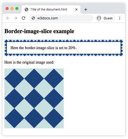
<h2>Border-image-slice example</h2>
<p class="border">Here the border-image-slice is set to 20%.</p>
<p>Here is the original image used:</p>
<img src="/uploads/media/default/0001/01/812bf6a749522b8185c1beee20dd99dd6c6c87da.jpeg" style="width:50%">
</body>
</html>Result
Another example where two values are used. The first value creates slices measured from the top and bottom. The second one creates slices measured from the left and right.
Example of the border-image-slice property with two values:
<!DOCTYPE html>
<html>
  <head>
    <style>
      .border {
        border: 10px solid transparent;
        padding: 15px;
        border-image: url("/uploads/media/default/0001/01/812bf6a749522b8185c1beee20dd99dd6c6c87da.jpeg") round;
        border-image-slice: 30 50;
      }
    </style>
  </head>
  <body>
    <h2>Border-image-slice example</h2>
    <p class="border">Here the border-image-slice is set to 30 and 50.</p>
    <p>Here is the original image used:</p>
    <img src="/uploads/media/default/0001/01/812bf6a749522b8185c1beee20dd99dd6c6c87da.jpeg" style="width:50%">
  </body>
</html>Example of the border-image-slice property with the "%" and "fill" values:
<!DOCTYPE html>
<html>
  <head>
    <style>
      .border {
        border: 10px solid transparent;
        padding: 15px;
        border-image: url("/uploads/media/default/0001/01/812bf6a749522b8185c1beee20dd99dd6c6c87da.jpeg") round;
        border-image-slice: 15% fill;
      }
    </style>
  </head>
  <body>
    <h2>Border-image-slice example</h2>
    <p class="border"><strong>Here the border-image-slice is set to 15 fill.</strong></p>
    <p>Here is the original image used:</p>
    <img src="/uploads/media/default/0001/01/812bf6a749522b8185c1beee20dd99dd6c6c87da.jpeg" style="width:50%">
  </body>
</html>Values
| Value | Description | Play it |
|---|---|---|
| number | Represents an edge offset in pixels for raster images and coordinates for vector images. | Play it » |
| % | Represents an edge offset as a percentage of the source image's size. | Play it » |
| fill | Makes the middle part of the image to be displayed as a background image. | Play it » |
| initial | Sets the property to its default value. | |
| inherit | Inherits the property from its parent element. |
Browser support
|
|
|
|
|
|---|---|---|---|---|
| 15.0+ | 12.0+ | 15.0+ | 6.0+ | 15.0+ |
Practice Your Knowledge
Quiz Time: Test Your Skills!
Ready to challenge what you've learned? Dive into our interactive quizzes for a deeper understanding and a fun way to reinforce your knowledge.