The CSS place-items property is a shorthand for the following properties:
Abovementioned properties have gained use with the introduction of Flexbox and Grid layouts, but are also applied to:
- absolutely-positioned boxes
- block-level boxes
- static-position of absolutely positioned boxes
- table cells
The place-items property behaves differently depending on the user context.
Read about the behavior of the place-items property in different contexts below.
| Initial Value | normal legacy |
| Applies to | All elements. |
| Inherited | No. |
| Animatable | No. |
| Version | CSS3 |
| DOM Syntax | object.style.placeItemsw = "normal"; |
Syntax
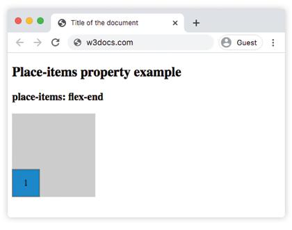
place-items: auto | normal | start | end | flex-start | flex-end | self-start | self-end | center | left | right | baseline | first baseline | last baseline | stretch | initial | inherit;Example of the place-items property:
<!DOCTYPE html>
<html>
  <head>
    <title>Title of the document</title>
    <style>
      #container {
        height: 150px;
        width: 150px;
        place-items: flex-end;
        background-color: #ccc;
      }
      .flex {
        display: flex;
        flex-wrap: wrap;
      }
      div > div {
        box-sizing: border-box;
        border: 1px solid #666;
        width: 50px;
        display: flex;
        align-items: center;
        justify-content: center;
      }
      #box1 {
        background-color: #1c87c9;
        min-height: 50px;
      }
    </style>
  </head>
  <body>
    <h2>Place-items property example</h2>
    <h3>place-items: flex-end</h3>
    <div id="container" class="flex">
      <div id="box1">1</div>
    </div>
  </body>
</html>Result
Example of the place-items property with the "center" value:
<!DOCTYPE html>
<html>
  <head>
    <title>Title of the document </title>
    <style>
      #container {
        height: 200px;
        width: 230px;
        place-items: center;
        background-color: #ccc;
      }
      .flex {
        display: flex;
        flex-wrap: wrap;
      }
      div > div {
        box-sizing: border-box;
        border: 3px solid #ccc;
        width: 50px;
        display: flex;
        align-items: center;
        justify-content: center;
      }
      #box1 {
        background-color: #666;
        min-height: 40px;
      }
      #box2 {
        background-color: #1c87c9;
        min-height: 50px;
      }
      #box3 {
        background-color: #fff;
        min-height: 40px;
      }
      #box4 {
        background-color: #ff0000;
        min-height: 60px;
      }
      #box5 {
        background-color: #eee;
        min-height: 70px;
      }
      #box6 {
        background-color: #8ebf42;
        min-height: 50px;
      }
    </style>
  </head>
  <body>
    <h2>Place-items property example</h2>
    <div id="container" class="flex">
      <div id="box1">1</div>
      <div id="box2">2</div>
      <div id="box3">3</div>
      <div id="box4">4</div>
      <div id="box5">5</div>
      <div id="box6">6</div>
    </div>
  </body>
</html>Values
| Value | Description |
|---|---|
| auto | If the box has no parent, or is absolutely positioned, the "auto" value represents "normal". |
| normal | The effect of this value depends on the layout mode:
|
| start | All elements are positioned against each other on the starting (left) edge of the container. |
| end | All elements are positioned against each other on the ending (right) edge of the container. |
| flex-start | Items are placed at the beginning of the container. |
| flex-end | Items are placed at the end of the container. |
| self-start | Item is allowed to place itself on the container edge based on its own starting side. |
| self-end | Item is allowed to place itself on the container edge based on its own ending side. |
| center | Items are positioned next to each other toward the center of the container. |
| left | Items are placed next to each other toward the left side of the container. If the property’s axis is not parallel with the inline axis, this value behaves like "end". |
| right | Items are placed next to each other toward the right side of the container. If the property’s axis is not parallel with the inline axis, this value behaves like a "start". |
| Baseline first-baseline last-baseline | Aligns all elements within a group by matching up their alignment baselines. |
| stretch | Stretch the element to both edges of the container vertically and horizontally to fit the container. |
| initial | It makes the property use its default value. |
| inherit | It inherits the property from its parents element. |
Browser support
|
|
|
|
|
|---|---|---|---|---|
| 59.0+ | ✕ | 45.0+ | ? | ? |
Practice Your Knowledge
What does the 'place-items' property in CSS do?
Correct!
Incorrect!
Quiz Time: Test Your Skills!
Ready to challenge what you've learned? Dive into our interactive quizzes for a deeper understanding and a fun way to reinforce your knowledge.