The grid-auto-flow property controls how auto-placed items are flowed into the grid.
This property has the following values: row, column, dense, row-dense, column-dense. If neither "row" nor "column" value is provided, "row" is supposed.
The grid-auto-flow property can have either a single keyword (dense, column, or row) or two keywords (column-dense or row-dense).
| Initial Value | row |
| Applies to | Grid containers. |
| Inherited | No. |
| Animatable | Yes. |
| Version | CSS Grid Layout Module Level 1 |
| DOM Syntax | object.style.gridAutoFlow = "row"; |
Syntax
grid-auto-flow: row | column | dense | row dense | column dense | initial | inherit;Example of the grid-auto-flow property:
<!DOCTYPE html>
<html>
  <head>
    <title>Title of the document</title>
    <style>
      .grey-container {
        display: grid;
        grid-template-columns: auto auto auto;
        grid-template-rows: auto auto;
        grid-auto-flow: column;
        grid-gap: 10px;
        background-color: #ccc;
        padding: 10px;
      }
      .grey-container > div {
        background-color: #eee;
        text-align: center;
        padding: 20px 0;
        font-size: 30px;
      }
    </style>
  </head>
  <body>
    <h2>Grid-auto-flow property example</h2>
    <h3>grid-auto-flow: column</h3>
    <div class="grey-container">
      <div>1</div>
      <div>2</div>
      <div>3</div>
      <div>4</div>
    </div>
  </body>
</html>Here, the items are placed by filling each column. In the following example, we can see that the items are placed by filling each row.
The effect of this property depends on the specified value. A 3D element with z>0 becomes larger, a 3D-element with z<0 becomes smaller. The visual effect will be more impressive if the value is smaller.
Example of the grid-auto-flow property with the grid-template-columns property:
<!DOCTYPE html>
<html>
  <head>
    <title>Title of the document</title>
    <style>
      .white-container {
        display: grid;
        grid-template-columns: auto auto auto;
        grid-template-rows: auto auto;
        grid-auto-flow: row;
        grid-gap: 10px;
        background-color: #ccc;
        padding: 10px;
      }
      .white-container > div {
        background-color: #fff;
        text-align: center;
        padding: 20px 0;
        font-size: 30px;
      }
    </style>
  </head>
  <body>
    <h2>Grid-auto-flow property example</h2>
    <h3>grid-auto-flow: row</h3>
    <div class="white-container">
      <div>1</div>
      <div>2</div>
      <div>3</div>
      <div>4</div>
    </div>
  </body>
</html>Example of the grid-auto-flow property with the "row" value:
<!DOCTYPE html>
<html>
<head>
<title>Title of the document</title>
<style>
.grey-container {
height: 250px;
width: 250px;
display: grid;
grid-gap: 20px;
grid-template: repeat(4, 1fr) / repeat(2, 1fr);
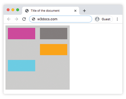
grid-auto-flow: row;
background-color: #ccc;
padding: 10px;
}
.box1 {
background-color: #00f3ff;
grid-row-start: 3;
}
.box2 {
background-color: #ff00d4;
}
.box3 {
background-color: #827c7c;
}
.box4 {
grid-column-start: 2;
background-color: orange;
}
</style>
</head>
<body>
<div class="grey-container">
<div class="box1"></div>
<div class="box2"></div>
<div class="box3"></div>
<div class="box4"></div>
</div>
</body>
</html>Result
Example of the grid-auto-flow property with the "column" value:
<!DOCTYPE html>
<html>
  <head>
    <title>Title of the document</title>
    <style>
      .grey-container {
        height: 250px;
        width: 250px;
        display: grid;
        grid-gap: 20px;
        grid-template: repeat(4, 1fr) / repeat(2, 1fr);
        grid-auto-flow: column;
        background-color: #ccc;
        padding: 10px;
      }
      .box1 {
        background-color: #00f3ff;
        grid-row-start: 3;
      }
      .box2 {
        background-color: #827c7c;
      }
      .box3 {
        background-color: #ff00d4;
      }
      .box4 {
        grid-column-start: 2;
        background-color: #4cbb13;
      }
    </style>
  </head>
  <body>
    <div class="grey-container">
      <div class="box1"></div>
      <div class="box2"></div>
      <div class="box3"></div>
      <div class="box4"></div>
    </div>
  </body>
</html>Example of the grid-auto-flow property with the "column-dense" value:
<!DOCTYPE html>
<html>
  <head>
    <title>Title of the document</title>
    <style>
      .grey-container {
        height: 250px;
        width: 250px;
        display: grid;
        grid-gap: 20px;
        grid-template: repeat(4, 1fr) / repeat(2, 1fr);
        grid-auto-flow: column dense;
        background-color: #ccc;
        padding: 10px;
      }
      .box1 {
        background-color: #0ad6e0;
        grid-row-start: 3;
      }
      .box2 {
        background-color: #841c72;
      }
      .box3 {
        background-color: #827c7c;
      }
      .box4 {
        grid-column-start: 2;
        background-color: #4cbb13;
      }
    </style>
  </head>
  <body>
    <div class="grey-container">
      <div class="box1"></div>
      <div class="box2"></div>
      <div class="box3"></div>
      <div class="box4"></div>
    </div>
  </body>
</html>Example of the grid-auto-flow property with the "row-dense" value:
<!DOCTYPE html>
<html>
  <head>
    <title>Title of the document</title>
    <style>
      .grey-container {
        height: 250px;
        width: 250px;
        display: grid;
        grid-gap: 20px;
        grid-template: repeat(4, 1fr) / repeat(2, 1fr);
        grid-auto-flow: row dense;
        background-color: #ccc;
        padding: 10px;
      }
      .box1 {
        background-color: #0ad6e0;
        grid-row-start: 3;
      }
      .box2 {
        background-color: #841c72;
      }
      .box3 {
        background-color: #827c7c;
      }
      .box4 {
        grid-column-start: 2;
        background-color: #4cbb13;
      }
    </style>
  </head>
  <body>
    <div class="grey-container">
      <div class="box1"></div>
      <div class="box2"></div>
      <div class="box3"></div>
      <div class="box4"></div>
    </div>
  </body>
</html>Values
| Value | Description | Play it |
|---|---|---|
| row | Places items by filling each row, adding new rows if necessary. This is the default value of this property. | Play it » |
| column | Places items by filling each column, adding new columns if necessary. | Play it » |
| dense | Place items to fill any holes in the grid if smaller items come up later. | Play it » |
| row-dense | Places items by filling each row, and fills holes in the grid. | Play it » |
| column-dense | Places items by filling each column, and fills holes in the grid. | Play it » |
| initial | Makes the property use its default value. | |
| inherit | Inherits the property from its parents element. |
Browser support
|
|
|
|
|
|---|---|---|---|---|
| 57.0+ | 16.0+ | 52.0+ | 10.1+ | 44.0+ |
Practice Your Knowledge
Quiz Time: Test Your Skills!
Ready to challenge what you've learned? Dive into our interactive quizzes for a deeper understanding and a fun way to reinforce your knowledge.