CSS font-size Property
The font-size property defines the font size of the text.
Font size can be defined by the following ways:
- absolute-size
- relative-size
- length
- percentage
Absolute font size includes the following values:
- xx-small
- x-small
- small
- medium
- large
- x-large
- xx-large
Relative font size includes the following values:
- smaller
- larger
Lengths can be relative lengths (em, ex, px) and absolute lengths (in, cm, mm, pt, pc). Percentages specify an absolute font size relative to the font size of the parent element.
| Initial Value | medium |
|---|---|
| Applies to | All elements. It also applies to ::first-letter and ::first-line. |
| Inherited | Yes. |
| Animatable | Yes. |
| Version | CSS1 |
| DOM Syntax | object.style.fontSize = "15px"; |
Syntax
Syntax of CSS font-size Property
font-size: medium | xx-small | x-small | small | large | x-large | xx-large | smaller | larger | length | initial | inherit;Example of the font-size property:
Example of CSS font-size Property with px,em,pt,x-small and %(percentage) values
<!DOCTYPE html>
<html>
<head>
<title>Title of the document</title>
<style>
h1 {
font-size: 24pt;
}
h3 {
font-size: 26px;
}
p {
font-size: 1em;
}
a {
font-size: 100%;
}
span {
font-size: x-small;
}
</style>
</head>
<body>
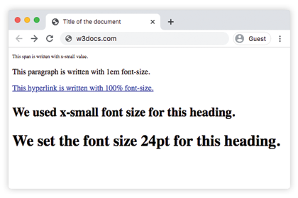
<span>This span is written with x-small value.</span>
<p>This paragraph is written with 1em font-size.</p>
<a href="https://www.w3docs.com/">This hyperlink is written with 100% font-size.</a>
<h3>We used x-small font size for this heading.</h3>
<h1>We set the font size 24pt for this heading.</h1>
</body>
</html>Result
Usage of percentage values
Percentage values are relative to the font-size of the parent element. The code below shows its usage:
Example of the font-size property specified in percentage:
Example of the font-size property specified in percentage:
<!DOCTYPE html>
<html>
  <head>
    <title>Title of the document</title>
    <style>
      h3 {
        font-size: 125%;
      }
    </style>
  </head>
  <body>
    <h3>We used x-small font size for this heading.</h3>
    <span>This span is written with x-small value.</span>
    <p>This paragraph is written with 1em font-size.</p>
  </body>
</html>
Usage of the em unit
The em unit is considered to be a relative unit. It is based on the calculated value of its parent element’s font size. In the code below, the paragraph will be 32px, because 2x16=32, and the heading will have a font-size of 48px because 3x16=48px. This method is very useful because we can be sure that all the child elements will always be relative to each other.
Example of the font-size property with the "em" value:
Example of the font-size property with the "em" value:
<!DOCTYPE html>
<html>
  <head>
    <title>Title of the document</title>
    <style>
      .container {
        font-size: 16px;
      }
      p {
        font-size: 2em;
      }
      h2 {
        font-size: 3em;
      }
    </style>
  </head>
  <body>
    <div class="container">
      <h2>Here is the heading</h2>
      <p>Here is the text.</p>
    </div>
  </body>
</html>Usage of the rem unit
In the case of using the rem unit, the font-size depends on the value of the HTML element. In the example below, the rem unit is inherited from the HTML element, that’s why it is equal to 24px. So, the heading will have a font-size of 24px, because 1.5x16=24px.
Example of the font-size property with the "rem" value:
Example of the font-size property with the "rem" value:
<!DOCTYPE html>
<html>
  <head>
    <title>Title of the document</title>
    <style>
      html {
        font-size: 16px;
      }
      h2 {
        font-size: 1.5rem;
      }
    </style>
  </head>
  <body>
    <div class="container">
      <h2>Here is the heading</h2>
      <p>Here is the text.</p>
    </div>
  </body>
</html>Usage of the ex unit
In the case of the ex unit, 1ex is equal to the calculated height of the letter 'x' in the current element's font. In the code example below, the HTML element is 15px. The x-height of that particular font will determine all the other font-sizes.
CSS font-size Property
.exunit {
  font-size: 15ex;
}
Usage of viewport units
Viewport units (vw and vh) are used for setting the font-size of an element, which is relative to the size of the viewport.
- 1vw = 1% of viewport width
- 1vh = 1% of viewport height
CSS font-size Property
.viewport {
  font-size: 120vh;
}
Example of the font-size property with the "length" value:
Example of the font-size property with the "length" value
<!DOCTYPE html>
<html>
  <head>
    <title>Title of the document</title>
    <style>
      span {
        color: green;
        font-size: 2vh;
      }
      p {
        color: red;
        font-size: 1em;
      }
      .length {
        color: orange;
        font-size: 30px;
      }
      h3 {
        color: lightblue;
        font-size: 3ex;
      }
      h1 {
        color: purple;
        font-size: 24pt;
      }
      a {
        color: blue;
        font-size: 120%;
      }
    </style>
  </head>
  <body>
    <h2>Font-size property</h2>
    <span>This text is written with 2vh font-size.</span>
    <p>This paragraph is written with 1em font-size.</p>
    <div class="length">Example with 30px font-size length </div>
    <h3>Example with 3ex font-size length.</h3>
    <h1>We set the font size 24pt  for this heading.</h1>
    <a href="https://www.w3docs.com/">This hyperlink is written with 100% font-size.</a>
  </body>
</html>Example of the font-size property with the absolute-size values:
Example of the font-size property (absolute-size):
<!DOCTYPE html>
<html>
  <head>
    <title>Title of the document</title>
    <style>
      .font-xxsmall {
        color: grey;
        font-size: xx-small;
      }
      .font-xsmall {
        color: grey;
        font-size: x-small;
      }
      .font-small {
        color: grey;
        font-size: small;
      }
      .font-medium {
        color: grey;
        font-size: medium;
      }
      .font-large {
        color: grey;
        font-size: large;
      }
      .font-xlarge {
        color: grey;
        font-size: x-large;
      }
      .font-xxlarge {
        color: grey;
        font-size: xx-large;
      }
    </style>
  </head>
  <body>
    <h1>Font-size property</h1>
    <div class="font-xxsmall">Example with font-size xx-small property</div>
    <div class="font-xsmall">Example with font-size x-small property</div>
    <div class="font-small">Example with font-size small property</div>
    <div class="font-medium">Example with font-size medium property</div>
    <div class="font-large">Example with font-size large property</div>
    <div class="font-xlarge">Example with font-size x-large property</div>
    <div class="font-xxlarge">Example with font-size xx-large property</div>
  </body>
</html>Example of the font-size property with "smaller" and "larger" values:
Example of the font-size property with "smaller" and "larger" values:
<!DOCTYPE html>
<html>
  <head>
    <title>Title of the document</title>
    <style>
      .smaller {
        color: red;
        font-size: smaller;
      }
      .larger {
        color: red;
        font-size: larger;
      }
    </style>
  </head>
  <body>
    <h1>font-size property</h1>
    <div class="smaller">Example with font-size smaller property</div>
    <div class="larger">Example with font-size larger property</div>
  </body>
</html>Values
| Value | Description | Play it |
|---|---|---|
| medium | Sets the font-size to medium. This is the default value of this property. | Play it » |
| xx-small | Sets the font-size to xx-small. | Play it » |
| x-small | Sets the font-size to x-small. | Play it » |
| small | Sets the font-size to small. | Play it » |
| large | Sets the font-size to large. | Play it » |
| x-large | Sets the font-size to x-large. | Play it » |
| xx-large | Sets the font-size to xx-large. | Play it » |
| smaller | Makes the font-size smaller. | Play it » |
| larger | Makes the font-size larger. | Play it » |
| length | Specifies the font-size by px, em etc. | Play it » |
| % | Sets the font-size to a percent of the parent element's font size. | Play it » |
| initial | Makes the property use its default value. | Play it » |
| inherit | Inherits the property from its parents element. |
Practice
Which units can be used to set the 'font-size' property in CSS?