The transform-style property specifies how the children elements are rendered in three dimensional (3D) space.
This property is one of the CSS3 properties.
It only works with the transform property.
The transform-style property has two values: flat and preserve-3d. If "flat" value is set, the element's children will not exist on their own in the 3D-space.
For maximum browser compatibility extension such as -webkit- for Safari, Google Chrome, and Opera (newer versions) is used with this property.
| Initial Value | flat |
| Applies to | Transformable elements. |
| Inherited | No. |
| Animatable | No. |
| Version | CSS3 |
| DOM Syntax | object.style.transformStyle = "flat"; |
Syntax
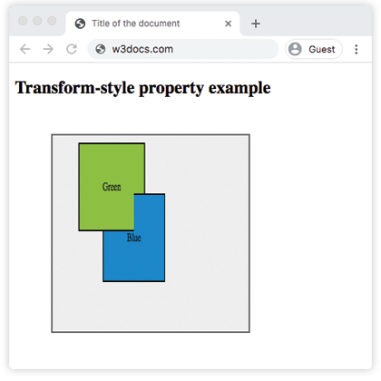
transform-style: flat | preserve-3d | initial | inherit;Example of the transform-style property:
<!DOCTYPE html>
<html>
  <head>
    <title>Title of the document</title>
    <style>
      #element {
        position: relative;
        height: 250px;
        width: 250px;
        margin: 50px;
        padding: 10px;
        border: 2px solid #666666;
        background-color: #eeeeee;
      }
      #element1 {
        padding: 50px;
        position: absolute;
        border: 2px solid #000000;
        background-color: #8ebf42;
        -webkit-transform: rotateY(50deg);
        -webkit-transform-style: preserve-3d;
        transform: rotateY(50deg);
        transform-style: preserve-3d;
      }
      #element2 {
        padding: 50px;
        position: absolute;
        border: 2px solid #000000;
        background-color: #1c87c9;
        -webkit-transform: rotateY(-100deg);
        transform: rotateY(-100deg);
      }
    </style>
  </head>
  <body>
    <h2>Transform-style property example</h2>
    <div id="element">
      <div id="element1">
        Green
        <div id="element2">Blue</div>
      </div>
    </div>
  </body>
</html>Result
Example of the transform-style property with the "flat" value:
<!DOCTYPE html>
<html>
  <head>
    <title>Title of the document</title>
    <style>
      .element {
        position: relative;
        height: 250px;
        margin: 50px;
        padding: 10px;
        border: 2px solid #cccccc;
        background-color: #eeeeee;
      }
      .element1 {
        margin: 20px;
        border: 1px dotted;
        height: 150px;
        width: 150px;
        background-color: green;
        transform: rotateX(15deg);
        transform-style: flat;
      }
      .element2 {
        margin: 20px;
        border: 1px dotted;
        height: 200px;
        width: 200px;
        background-color: lightgreen;
        transform: rotateX(45deg);
      }
    </style>
  </head>
  <body>
    <h2>Transform-style property example</h2>
    <div class="element">
      <div class="element1">
        Green
        <div class="element2">Blue</div>
      </div>
    </div>
  </body>
</html>Values
| Value | Description |
|---|---|
| flat | Defines that children of the elements will not be positioned three dimensional space. This is the default value of this property. |
| preserve-3d | Defines that children of the elements will be positioned in three dimensional space. |
| initial | Sets this property to its default value. |
| inherit | Inherits this property from its parent element. |
Browser support
|
|
|
|
|---|---|---|---|
|
36.0+ 12.0-35.0 -webkit- |
16.0+ 10.0-15.0 -moz- |
4.0+ -webkit- |
23.0+ 15.0-22.0 -webkit- |
Practice Your Knowledge
Transform-style property only works with the
Correct!
Incorrect!
Quiz Time: Test Your Skills!
Ready to challenge what you've learned? Dive into our interactive quizzes for a deeper understanding and a fun way to reinforce your knowledge.