The CSS columns property is a shorthand for the following properties:
- column-count, which defines the maximum number of columns.
- column-width, which defines the minimum width of columns.
These two properties together create multi-column layout which will automatically break down into a single column at narrow browser widths without the need of media queries or other rules.
The columns property is one of the CSS3 properties.
Setting both column-count and column-width is not always make sense, as it can restrict the flexibility and responsiveness of the layout.
If the width and count of columns do not fit into the width of the element, the browser will automatically reduce the column count to fit the specified column widths.
| Initial Value | auto auto |
| Applies to | Block containers except table wrapper boxes. |
| Inherited | No. |
| Animatable | Yes. Width and count of columns are animatable. |
| Version | CSS3 |
| DOM Syntax | object.style.columns = "100px 2"; |
Syntax
columns: auto | column-width column-count | initial | inherit;Example of the columns property:
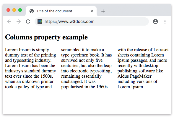
<!DOCTYPE html>
<html>
  <head>
    <title>Title of the document</title>
    <style>
      .example {
        -webkit-columns: 100px 3;
        /* Chrome, Safari, Opera */
        -moz-columns: 100px 3;
        /* Firefox */
        columns: 100px 3;
      }
    </style>
  </head>
  <body>
    <h2>Columns property example</h2>
    <div class="example">
      Lorem Ipsum is dummy text of the printing and typesetting industry. Lorem Ipsum has been the industry's standard dummy text ever since the 1500s when an unknown printer took a galley of type and scrambled it to make a type specimen book. It has survived not only five centuries, but also the leap into e lectronic typesetting, remaining essentially unchanged. It was popularised in the 1960s with the release of Letraset sheets containing Lorem Ipsum passages, and more recently with desktop publishing software like Aldus PageMaker including versions of Lorem Ipsum.
    </div>
  </body>
</html>Result
In the next example the minimum width for each column is set to 50px, and the maximum number of columns to 5:
Example of the columns property with specified width and number of columns:
<!DOCTYPE html>
<html>
  <head>
    <title>Title of the document</title>
    <style>
      .example {
        -webkit-columns: 50px 5;
        /* Chrome, Safari, Opera */
        -moz-columns: 50px 5;
        /* Firefox */
        columns: 50px 5;
      }
    </style>
  </head>
  <body>
    <h2>Columns property example</h2>
    <div class="example">
      Lorem Ipsum is dummy text of the printing and typesetting industry. Lorem Ipsum has been the industry's standard dummy text ever since the 1500s when an unknown printer took a galley of type and scrambled it to make a type specimen book. It has survived not only five centuries, but also the leap into electronic typesetting, remaining essentially unchanged. It was popularised in the 1960s with the release of Letraset sheets containing Lorem Ipsum passages, and more recently with desktop publishing software like Aldus PageMaker including versions of Lorem Ipsum.
    </div>
  </body>
</html>Values
| Value | Description |
|---|---|
| auto | Column-width and column-count properties are set to auto. This is default value. |
| column-width | Sets minimum width for columns. |
| column-count | Sets maximum number of columns. |
| initial | Sets the property to its default value. |
| inherit | Inherits the property from its parent element. |
Browser support
|
|
|
|
|
|---|---|---|---|---|
|
50.0 -webkit- |
12.0 -webkit- |
52.0 + 9.0 -moz- |
3.0 -webkit- |
11.1 + 15.0 -webkit- |
Practice Your Knowledge
What are the properties used to create multi-column layouts in CSS?
Correct!
Incorrect!
Quiz Time: Test Your Skills!
Ready to challenge what you've learned? Dive into our interactive quizzes for a deeper understanding and a fun way to reinforce your knowledge.