The perspective property gives a 3D-positioned element some perspective and determines the distance between the z=0 plane.
A 3D element with z>0 becomes larger, a 3D-element with z<0 becomes smaller.
The perspective property does not take 0 or negative values.
The perspective property is one of the CSS3 properties.
The major difference between the perspective property and the perspective() value of the transform property is the following: the perspective property does not affect how an element is rendered and only the child element gets a perspective view. Whereas the perspective() value only gives an element depth.
For maximum browser compatibility this property is used with -webkit- extension.
| Initial Value | none |
| Applies to | Transformable elements. |
| Inherited | No. |
| Animatable | Yes. The transformation of the perspective is animatable. |
| Version | CSS3 |
| DOM Syntax | object.style.perspective = "70px"; |
Syntax
perspective: length | none | initial | inherit;Example of the perspective property:
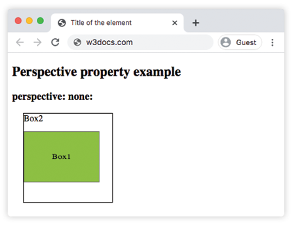
<!DOCTYPE html>
<html>
  <head>
    <title>Title of the element</title>
    <style>
        .element1 {
        padding: 50px;
        position: absolute;
        border: 1px solid #666;
        background-color: #1c87c9;
        background: #8ebf42;
        -webkit-transform-style: preserve-3d;/* Safari 3-8  */
        -webkit-transform: rotateX(40deg);/* Safari 3-8  */
        transform-style: preserve-3d;
        transform: rotateX(40deg);
      }
      .element2 {
        position: relative;
        height: 160px;
        width: 160px;
        margin-left: 20px;
        border: 1px solid #000;
        -webkit-perspective: none;/* Safari 4-8  */
        perspective: none;
    </style>
  </head>
  <body>
    <h2>Perspective property example</h2>
    <h3>perspective: none:</h3>
    <div class="element2">
      Box2
      <div class="element1">Box1</div>
    </div>
  </body>
</html>Result
Example of the perspective property specified as 100px:
<!DOCTYPE html>
<html>
  <head>
    <title>Title of the element</title>
    <style>
        .element1 {
        padding: 50px;
        position: absolute;
        border: 1px solid #666;
        background-color: #1c87c9;
        background: #8ebf42;
        -webkit-transform-style: preserve-3d;/* Safari 3-8  */
        -webkit-transform: rotateX(40deg);/* Safari 3-8  */
        transform-style: preserve-3d;
        transform: rotateX(40deg);
      }
      .element2 {
        position: relative;
        height: 150px;
        width: 150px;
        margin-left: 50px;
        border: 1px solid #000;
        -webkit-perspective: 100px;/* Safari 4-8  */
        perspective: 100px;
    </style>
  </head>
  <body>
    <h2>Perspective property example</h2>
    <h3>perspective: none:</h3>
    <div class="element2">
      Box2
      <div class="element1">Box1</div>
    </div>
  </body>
</html>Values
| Value | Description |
|---|---|
| length | Applies a perspective transform to the element and its content. |
| none | Applies no perspective transform. |
| initial | Makes the property use its default value. |
| inherit | Inherits the property from its parents element. |
Browser support
|
|
|
|
|---|---|---|---|
|
36.0+ 12.0-35.0 -webkit- |
16.0+ 10.0-15.0 -moz- |
4.0+ -webkit- |
23.0+ 15.0-22.0 -webkit- |
Practice Your Knowledge
What does the CSS 'perspective' property do?
Correct!
Incorrect!
Quiz Time: Test Your Skills!
Ready to challenge what you've learned? Dive into our interactive quizzes for a deeper understanding and a fun way to reinforce your knowledge.