The transform-origin property allows to change the position of the elements’ transformation.
The transform-origin property is one of the CSS3 properties.
The transform-origin property works only with the transform property.
This property can be specified using offset keywords, length values, or percentage values.
For maximum browser compatibility, extensions such as -webkit- for Safari, Google Chrome, and Opera (newer versions) are used with this property.
| Initial Value | 50% 50% 0 |
| Applies to | Transformable elements. |
| Inherited | No. |
| Animatable | Yes. Degree is animatable. |
| Version | CSS3 |
| DOM Syntax | Object.style.transform-origin = "10% 30%"; |
Syntax
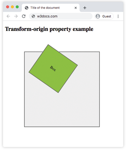
transform-origin: x-offset y-offset z-offset | initial | inherit;Example of the transform-origin property:
<!DOCTYPE html>
<html>
  <head>
    <title>Title of the document</title>
    <style>
      .big {
        position: relative;
        height: 300px;
        width: 300px;
        margin: 80px;
        padding: 5px;
        border: 2px solid #666666;
        background-color: #eeeeee;
      }
      .little {
        padding: 60px;
        position: absolute;
        border: 2px solid #666666;
        background-color: #8ebf42;
        -webkit-transform: rotate(35deg);
        -webkit-transform-origin: 70% 90%;
        transform: rotate(35deg);
        transform-origin: 70% 90%;
      }
    </style>
  </head>
  <body>
    <h2>Transform-origin property example</h2>
    <div class="big">
      <div class="little">Box</div>
    </div>
  </body>
</html>Result
Another example which shows the difference between values.
Example of transform-origin with four values:
<!DOCTYPE html>
<html>
  <head>
    <title>Title of the document</title>
    <style>
      body {
        background-color: #eeeeee;
        font-size: 1.1em;
        font-family: 'Roboto', Helvetica, sans-serif;
      }
      .container {
        margin: 10px auto;
        max-width: 700px;
      }
      .wrap {
        width: 150px;
        height: 150px;
        border: 2px solid #666666;
        display: inline-block;
        margin: 100px;
      }
      .box {
        width: 150px;
        height: 150px;
        position: relative;
        color: #eeeeee;
        text-align: center;
        line-height: 150px;
        -webkit-transform: rotate(25deg);
        transform: rotate(25deg);
      }
      .a {
        background-color: #0747af;
      }
      .b {
        background-color: #40b530;
        -webkit-transform-origin: top left;
        transform-origin: top left;
      }
      .c {
        background-color: #666666;
        -webkit-transform-origin: 90% 120%;
        transform-origin: 90% 120%;
      }
      .d {
        background-color: #ffdb11;
        -webkit-transform-origin: 80px 40px;
        transform-origin: 80px 40px;
      }
    </style>
  </head>
  <body>
    <h2>Transform-origin property example</h2>
    <div class="container">
      <div class="wrap">
        <div class="box a">
          50% 50%
        </div>
      </div>
      <div class="wrap">
        <div class="box b">
          top left
        </div>
      </div>
      <div class="wrap">
        <div class="box c">
          90% 120%
        </div>
      </div>
      <div class="wrap">
        <div class="box d">
          80px 40px
        </div>
      </div>
    </div>
  </body>
</html>Values
| Value | Description |
|---|---|
| x-offset |
Specifies the position of view in x-offset. It can have the following values:
|
| y-offset |
Specifies the position of view in y-offset. It can have the following values:
|
| z-offset |
Specifies where the view is placed at the z-offset for 3D transformations. It can have the following values:
|
| initial | Sets this property to its default value. |
| inherit | Inherits this property from its parent element. |
Browser support
|
|
|
|
|---|---|---|---|
|
36.0+ 12.0-35.0 -webkit- |
16.0+ 10.0-15.0 -moz- |
4.0+ -webkit- |
23.0+ 15.0-22.0 -webkit- |
Practice Your Knowledge
The transform-origin property works only with
Correct!
Incorrect!
Quiz Time: Test Your Skills!
Ready to challenge what you've learned? Dive into our interactive quizzes for a deeper understanding and a fun way to reinforce your knowledge.