The CSS border-top-left-radius specifies the rounding of the top left corner of the element.
The border-top-left-radius property is one of the CSS3 properties.
There are three kinds of rounding. It can be a circle or an ellipse or do not use any value, and the corner is square. If you use background image or color, it will be clipped off at the border. The process of clipping is defined by the value of background-clip property.
CSS border-top-left-radius property is defined by two values: length and percentage. When only one value is used, that value specifies both horizontal and vertical radii of the ellipse. If you use two values, the first value sets the horizontal radius and the second value sets the vertical radius. Percentages for the horizontal radius refer to the box width, percentages for the vertical radius refer to the box height. Negative values are invalid.
| Initial Value | 0 |
| Applies to | All elements. It also applies to ::first-letter. |
| Inherited | No |
| Animatable | Yes. The radius of the border is animatable. |
| Version | CSS1 |
| DOM Syntax | object.style.borderTopLeftRadius = "25px"; |
Syntax
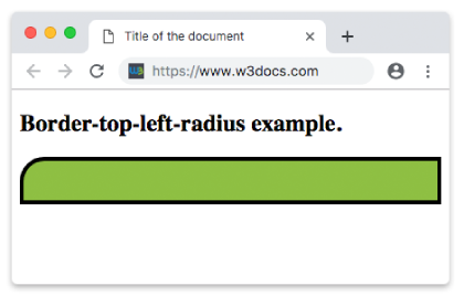
border-top-left-radius: length | % | initial | inherit;Here is an example of border-top-left-radius where only one value is used. When you give only one value, that value specifies both top border and left border of the ellipse.
Example of the border-top-left-radius property:
<!DOCTYPE html>
<html>
  <head>
    <title>Title of the document</title>
    <style>
      div {
        height: 40px;
        background: #8ebf42;
        border: 4px solid #000000;
        border-top-left-radius: 25px;
      }
    </style>
  </head>
  <body>
    <h2>Border-top-left-radius example.</h2>
    <div></div>
  </body>
</html>Result
In the following example, the first value is for the top border and the second one for the left border.
Example of the border-top-left-radius property with two values:
<!DOCTYPE html>
<html>
  <head>
    <title>Title of the document</title>
    <style>
      div {
        height: 40px;
        background: #ccc;
        border: 4px solid #000000;
        border-top-left-radius: 50px 25px;
      }
    </style>
  </head>
  <body>
    <h2>Border-top-left-radius example.</h2>
    <div></div>
  </body>
</html>Let’s define the shape of the box in percentages. Here, also, the first value defines the horizontal radii of the ellipse, the second value defines the vertical radii of the ellipse.
Example of the border-top-left-radius property with the "%" value:
<!DOCTYPE html>
<html>
  <head>
    <title>Title of the document</title>
    <style>
      div {
        height: 40px;
        background: #eee;
        border: 4px solid #000000;
        border-top-left-radius: 50% 60%;
      }
    </style>
  </head>
  <body>
    <h2>Border-top-left-radius example.</h2>
    <div></div>
  </body>
</html>Values
| Value | Description | Play it |
|---|---|---|
| length | Defines the rounding of the top-left corner. | Play it » |
| % | Defines the rounding of the top-left corner in percentage. | Play it » |
| initial | Sets the property to its default value. | Play it » |
| inherit | Inherits the property from its parent element. |
Browser support
|
|
|
|
|---|---|---|---|
| 4.0+ | 4.0+ | 5.0+ | 10.5+ |
Practice Your Knowledge
Quiz Time: Test Your Skills!
Ready to challenge what you've learned? Dive into our interactive quizzes for a deeper understanding and a fun way to reinforce your knowledge.