The grid-auto-rows property specifies the size for the rows in a grid container. It has an effect only on the rows without specified size.
This property has the following values: auto, max-content, min-content, minmax, length and percentages.
| Initial Value | auto |
| Applies to | Grid containers. |
| Inherited | No. |
| Animatable | Yes. Size of the rows are animatable. |
| Version | CSS Grid Layout Module Level 1 |
| DOM Syntax | object.style.gridAutoRows = "40px"; |
Syntax
grid-auto-rows: auto | max-content | min-content | <length> | <percentage> | <flex> | initial | inherit;Example of the grid-auto-rows property:
<!DOCTYPE html>
<html>
<head>
<title>Title of the document</title>
<style>
.box1 {
grid-area: 1 / 1 / 2 / 2;
}
.box2 {
grid-area: 1 / 2 / 2 / 3;
}
.box3 {
grid-area: 1 / 3 / 2 / 4;
}
.box4 {
grid-area: 2 / 1 / 3 / 2;
}
.box5 {
grid-area: 2 / 2 / 3 / 3;
}
.box6 {
grid-area: 2 / 3 / 3 / 4;
}
.auto-box1 {
grid-area: 1 / 1 / 2 / 2;
}
.auto-box2 {
grid-area: 1 / 2 / 2 / 3;
}
.auto-box3 {
grid-area: 1 / 3 / 2 / 4;
}
.auto-box4 {
grid-area: 2 / 1 / 3 / 2;
}
.auto-box5 {
grid-area: 2 / 2 / 3 / 3;
}
.auto-box6 {
grid-area: 2 / 3 / 3 / 4;
}
.grid-container {
display: grid;
grid-auto-rows: 100px;
grid-gap: 10px;
background-color: #ccc;
padding: 10px;
}
.grid-container > div {
background-color: #666;
text-align: center;
padding: 20px 0;
font-size: 20px;
}
.auto-container {
display: grid;
grid-auto-rows: auto;
grid-gap: 10px;
background-color: #ccc;
padding: 10px;
}
.auto-container > div {
background-color: #666;
text-align: center;
padding: 20px 0;
font-size: 20px;
}
</style>
</head>
<body>
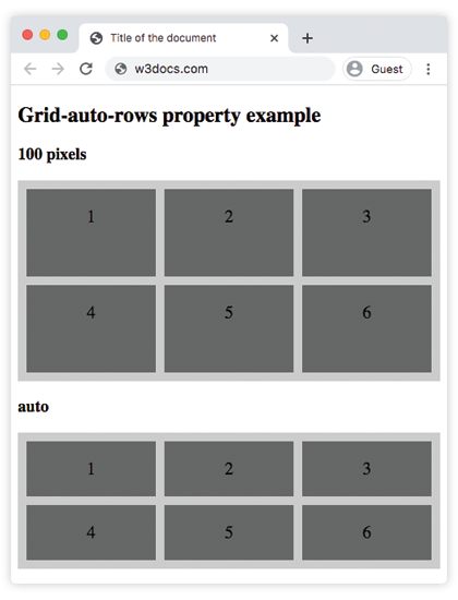
<h2>Grid-auto-rows property example</h2>
<h3>100 pixels</h3>
<div class="grid-container">
<div class="box1">1</div>
<div class="box2">2</div>
<div class="box3">3</div>
<div class="box4">4</div>
<div class="box5">5</div>
<div class="box6">6</div>
</div>
<h3>auto</h3>
<div class="auto-container">
<div class="auto-box1">1</div>
<div class="auto-box2">2</div>
<div class="auto-box3">3</div>
<div class="auto-box4">4</div>
<div class="auto-box5">5</div>
<div class="auto-box6">6</div>
</div>
</body>
</html>Result
Example of the grid-auto-rows property with the several values:
<!DOCTYPE html>
<html>
  <head>
    <title>Title of the document</title>
    <style>
      .box1 {
        grid-area: 1 / 1 / 2 / 2;
      }
      .box2 {
        grid-area: 1 / 2 / 2 / 3;
      }
      .box3 {
        grid-area: 1 / 3 / 2 / 4;
      }
      .box4 {
        grid-area: 2 / 1 / 3 / 2;
      }
      .box5 {
        grid-area: 2 / 2 / 3 / 3;
      }
      .box6 {
        grid-area: 2 / 3 / 3 / 4;
      }
      .grey-box1 {
        grid-area: 1 / 1 / 2 / 2;
      }
      .grey-box2 {
        grid-area: 1 / 2 / 2 / 3;
      }
      .grey-box3 {
        grid-area: 1 / 3 / 2 / 4;
      }
      .grey-box4 {
        grid-area: 2 / 1 / 3 / 2;
      }
      .grey-box5 {
        grid-area: 2 / 2 / 3 / 3;
      }
      .grey-box6 {
        grid-area: 2 / 3 / 3 / 4;
      }
      .auto-box1 {
        grid-area: 1 / 1 / 2 / 2;
      }
      .auto-box2 {
        grid-area: 1 / 2 / 2 / 3;
      }
      .auto-box3 {
        grid-area: 1 / 3 / 2 / 4;
      }
      .auto-box4 {
        grid-area: 2 / 1 / 3 / 2;
      }
      .auto-box5 {
        grid-area: 2 / 2 / 3 / 3;
      }
      .auto-box6 {
        grid-area: 2 / 3 / 3 / 4;
      }
      .min-box1 {
        grid-area: 1 / 1 / 2 / 2;
      }
      .min-box2 {
        grid-area: 1 / 2 / 2 / 3;
      }
      .min-box3 {
        grid-area: 1 / 3 / 2 / 4;
      }
      .min-box4 {
        grid-area: 2 / 1 / 3 / 2;
      }
      .min-box5 {
        grid-area: 2 / 2 / 3 / 3;
      }
      .min-box6 {
        grid-area: 2 / 3 / 3 / 4;
      }
      .max-box1 {
        grid-area: 1 / 1 / 2 / 2;
      }
      .max-box2 {
        grid-area: 1 / 2 / 2 / 3;
      }
      .max-box3 {
        grid-area: 1 / 3 / 2 / 4;
      }
      .max-box4 {
        grid-area: 2 / 1 / 3 / 2;
      }
      .max-box5 {
        grid-area: 2 / 2 / 3 / 3;
      }
      .max-box6 {
        grid-area: 2 / 3 / 3 / 4;
      }
      .grid-container {
        display: grid;
        grid-auto-rows: 150px;
        grid-gap: 10px;
        background-color: #ccc;
        padding: 10px;
      }
      .grid-container > div {
        background-color: #888;
        text-align: center;
        padding: 20px 0;
        font-size: 30px;
      }
      .grey-container {
        display: grid;
        grid-auto-rows: 30%;
        grid-gap: 10px;
        background-color: #ccc;
        padding: 10px;
      }
      .grey-container > div {
        background-color: #888;
        text-align: center;
        padding: 20px 0;
        font-size: 30px;
      }
      .auto-container {
        display: grid;
        grid-auto-rows: auto;
        grid-gap: 10px;
        background-color: #ccc;
        padding: 10px;
      }
      .auto-container > div {
        background-color: #888;
        text-align: center;
        padding: 20px 0;
        font-size: 30px;
      }
      .min-container {
        display: grid;
        grid-auto-rows: min-content;
        grid-gap: 10px;
        background-color: #000;
        padding: 10px;
      }
      .min-container > div {
        background-color: #ccc;
        text-align: center;
        padding: 20px 0;
        font-size: 30px;
      }
      .max-container {
        display: grid;
        grid-auto-rows: max-content;
        grid-gap: 10px;
        background-color: #000;
        padding: 10px;
      }
      .max-container > div {
        background-color: #ccc;
        text-align: center;
        padding: 20px 0;
        font-size: 30px;
      }
    </style>
  </head>
  <body>
    <h2>Grid-auto-rows property example</h2>
    <p>Use the <strong>grid-auto-rows</strong> property to set a default size (height) for all rows.</p>
    <h3>150 pixels</h3>
    <div class="grid-container">
      <div class="box1">1</div>
      <div class="box2">2</div>
      <div class="box3">3</div>
      <div class="box4">4</div>
      <div class="box5">5</div>
      <div class="box6">6</div>
    </div>
    <h3>30%</h3>
    <div class="grey-container">
      <div class="grey-box1">1</div>
      <div class="grey-box2">2</div>
      <div class="grey-box3">3</div>
      <div class="grey-box4">4</div>
      <div class="grey-box5">5</div>
      <div class="grey-box6">6</div>
    </div>
    <h3>auto</h3>
    <div class="auto-container">
      <div class="auto-box1">1</div>
      <div class="auto-box2">2</div>
      <div class="auto-box3">3</div>
      <div class="auto-box4">4</div>
      <div class="auto-box5">5</div>
      <div class="auto-box6">6</div>
    </div>
    <h3>min-content</h3>
    <div class="min-container">
      <div class="min-box1">1</div>
      <div class="min-box2">2</div>
      <div class="min-box3">3</div>
      <div class="min-box4">4</div>
      <div class="min-box5">5</div>
      <div class="min-box6">6</div>
    </div>
    <h3>max-content</h3>
    <div class="max-container">
      <div class="max-box1">1</div>
      <div class="max-box2">2</div>
      <div class="max-box3">3</div>
      <div class="max-box4">4</div>
      <div class="max-box5">5</div>
      <div class="max-box6">6</div>
    </div>
  </body>
</html>Example of the grid-auto-rows property with the "minmax" value:
<!DOCTYPE html>
<html>
  <head>
    <title>Title of the document</title>
    <style>
      .box1 {
        grid-area: 1 / 1 / 2 / 2;
      }
      .box2 {
        grid-area: 1 / 2 / 2 / 3;
      }
      .box3 {
        grid-area: 1 / 3 / 2 / 4;
      }
      .box4 {
        grid-area: 2 / 1 / 3 / 2;
      }
      .box5 {
        grid-area: 2 / 2 / 3 / 3;
      }
      .box6 {
        grid-area: 2 / 3 / 3 / 4;
      }
      .minmax1 {
        grid-area: 1 / 1 / 2 / 2;
      }
      .minmax2 {
        grid-area: 1 / 2 / 2 / 3;
      }
      .minmax3 {
        grid-area: 1 / 3 / 2 / 4;
      }
      .minmax4 {
        grid-area: 2 / 1 / 3 / 2;
      }
      .minmax5 {
        grid-area: 2 / 2 / 3 / 3;
      }
      .minmax6 {
        grid-area: 2 / 3 / 3 / 4;
      }
      .grid-container {
        display: grid;
        grid-auto-rows: 100px;
        grid-gap: 10px;
        background-color: #ccc;
        padding: 10px;
      }
      .grid-container > div {
        background-color: #666;
        text-align: center;
        padding: 20px 0;
        font-size: 20px;
      }
      .minmax-container {
        display: grid;
        grid-auto-rows: minmax(90px, 4cm);
        grid-gap: 10px;
        background-color: #cccccc;
        padding: 10px;
      }
      .minmax-container > div {
        background-color: #f5f5f5;
        text-align: center;
        padding: 20px 0;
        font-size: 20px;
      }
    </style>
  </head>
  <body>
    <h2>Grid-auto-rows property example</h2>
    <h3>100 pixels</h3>
    <div class="grid-container">
      <div class="box1">1</div>
      <div class="box2">2</div>
      <div class="box3">3</div>
      <div class="box4">4</div>
      <div class="box5">5</div>
      <div class="box6">6</div>
    </div>
    <h3>minmax</h3>
    <div class="minmax-container">
      <div class="minmax1">1</div>
      <div class="minmax2">2</div>
      <div class="minmax3">3</div>
      <div class="aminmax4">4</div>
      <div class="minmax5">5</div>
      <div class="minmax6">6</div>
    </div>
  </body>
</html>Here, the grid-auto-rows is used to set a default size (height) for all rows.
Values
| Value | Description | Play it |
|---|---|---|
| auto | The size of the rows takes up the size of the container. This is the default value of the property. | Play it » |
| max-content | The size of each rows depends on the largest item in the rows. | Play it » |
| min-content | The size of each rows depends on the smallest item in the rows. | Play it » |
| minmax(min.max) | The size range is greater than or equal to "min" and less than or equal to "max". | Play it » |
| <length> | The size of the rows is specified by length value. | Play it » |
| <percentage> | The size of the rows is specified by percentages. | Play it » |
| <flex> | A non-negative dimension with the unit "fr" that specifies the track’s flex factor. Each <flex>-sized track shares remaining space in proportion to its flex factor. | |
| initial | Makes the property use its default value. | |
| inherit | Inherits the property from its parents element. |
Browser support
|
|
|
|
|
|---|---|---|---|---|
| 57+ | 16+ | 52+ | 44+ | 10.1+ |
Practice Your Knowledge
What is the function of the 'grid-auto-rows' property in CSS grid layout?
Correct!
Incorrect!
Quiz Time: Test Your Skills!
Ready to challenge what you've learned? Dive into our interactive quizzes for a deeper understanding and a fun way to reinforce your knowledge.