The grid-template-columns property defines the size (width) of each column in the grid layout:
| Initial Value | none |
| Applies to | Grid containers. |
| Inherited | No. |
| Animatable | Yes. Columns are animatable. |
| Version | CSS Grid Layout Module Level 1 |
| DOM Syntax | object.style.gridTemplateColumns = "40px 40px 40px"; |
Syntax
grid-template-columns: none | auto | max-content | min-content | flex | fit-content | repeat | length | initial | inherit;Example of the grid-template-column property:
<!DOCTYPE html>
<html>
<head>
<title>Title of the document</title>
<style>
.example {
display: grid;
grid-template-columns: 1fr 1fr 1fr 1fr;
grid-gap: 10px;
background-color: #ccc;
padding: 10px;
margin-top: 20px;
}
.example > div {
background-color: #eee;
text-align: center;
padding: 30px 0;
font-size: 30px;
}
</style>
</head>
<body>
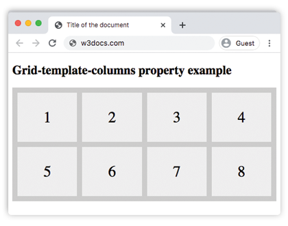
<h2>Grid-template-columns property example</h2>
<div class="example">
<div>1</div>
<div>2</div>
<div>3</div>
<div>4</div>
<div>5</div>
<div>6</div>
<div>7</div>
<div>8</div>
</div>
</body>
</html>Result
Example of the grid-template-column applied to grid-container:
<!DOCTYPE html>
<html>
  <head>
    <title>Title of the document</title>
    <style>
      .grid-container {
        display: grid;
        grid-template-columns: 40px 150px auto 80px;
        grid-gap: 10px;
        background-color: #ccc;
        padding: 10px;
      }
      .grid-container > div {
        background-color: #eee;
        text-align: center;
        padding: 30px 0;
        font-size: 30px;
      }
    </style>
  </head>
  <body>
    <h2>Grid-template-columns property example</h2>
    <div class="grid-container">
      <div>1</div>
      <div>2</div>
      <div>3</div>
      <div>4</div>
      <div>5</div>
      <div>6</div>
      <div>7</div>
      <div>8</div>
    </div>
  </body>
</html>Values
| Value | Description | Play it |
|---|---|---|
| none | This is the default value of the property. | Play it » |
| auto | The size of the columns takes up the size of the container. | Play it » |
| max-content | The size of each columns depends on the largest item in the columns. | Play it » |
| min-content | The size of each columns depends on the smallest item in the columns. | |
| minmax(min.max) | The size range is greater than or equal to "min" and less than or equal to "max". | |
| <length> | The size of the columns is specified by length value. | Play it » |
| <percentage> | The size of the columns is specified by percentages. | |
| <flex> | A non-negative dimension with the unit "fr" that specifies the track’s flex factor. Each <flex>-sized track shares remaining space in proportion to its flex factor. | |
| fit-content | Represents the min(max-content, max(auto, argument)), which is similar to auto (i.e. minmax(auto, max-content)), but the size is greater than the auto minimum. This value is considered to be experimental. |
|
| repeat | Represents a repeated fragment of the track list, allowing a large number of columns that exhibit a recurring pattern to be written in a more compact form. This value is considered to be experimental. |
|
| initial | Makes the property use its default value. | |
| inherit | Inherits the property from its parents element. |
Browser support
|
|
|
|
|
|---|---|---|---|---|
| 57.0+ | 16.0+ | 52.0+ | 10.1+ | 44.0+ |
Practice Your Knowledge
What is the function of the 'grid-template-columns' property in CSS?
Correct!
Incorrect!
Quiz Time: Test Your Skills!
Ready to challenge what you've learned? Dive into our interactive quizzes for a deeper understanding and a fun way to reinforce your knowledge.